
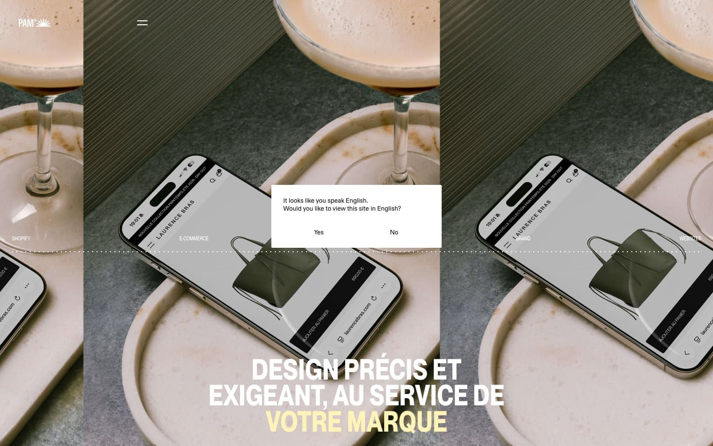
Thisispam. A Swiss-press layout where a single warm cream stock, razor-sharp type, and a zero-chrome surface system turn each scroll into a printed page.
- Studio
- Light theme
- 5 colors
- 2 typefaces
Thisispam operates as a Swiss-influenced editorial design system: a warm butter-yellow canvas paired with stark black ink typography and almost zero chrome. The visual language borrows from print broadsheets — large, confident display headlines sit in tight uppercase clusters, while project images float in a strict grid with caption-level metadata beneath. Color is used with extreme discipline: #fff3b8 functions as both page ground and emphasis highlight, leaving black to carry all text and white to separate content blocks. No shadows, no rounding, no gradients — the system relies on typographic scale, generous whitespace, and the unusual warm background to create atmosphere. Sections alternate between yellow paper, pure white, and ink black, creating a rhythmic editorial flow.
Thisispam design system

Brand1
Dominant page canvas for entire sections, emphasis text on dark photographic backgrounds, hairline link borders, and the third band in the surface stack — a warm cream that replaces white as the design's atmospheric ground
Accent2
Muted input-field fill used on the yellow canvas — a slightly darker cream that lets form fields recede into the warm ground without losing the surface hierarchy
Active-state and current-section indicator in the hamburger nav menu — a single red dash marks the present position in the menu, the only chromatic departure from the black-on-cream system
Neutrals2
Primary text color across all surfaces, hairlines and structural borders, the footer and dark-band background — every word, rule, and icon reads as solid ink on the cream or white ground
White section backgrounds and card surfaces that separate the yellow bands, inverse text on the black footer, and the language modal surface
Try a pairing
Pick any two colors from the palette to check whether text stays readable on top.
Aa
Ink Black on Butter Paper
18.76 : 1 contrast
- Body textPasses AA 4.5
- Large textPasses AA 3
- StrictPasses AAA 7
More DESIGN.md files. Same web, different personalities.

Rauno Freiberg
Studio
Emil Kowalski
Studio

14islands
Studio
19–86
Studio
Aaron Poe & Co
Studio
Acceptandproceed
Studio
ACCOMPANY
Studio
Acolorbright
Studio
Adcker
Studio
Adopt
Studio
Agence Foudre
Studio


