
The Beams. Overlapping ink on white paper.
- Studio
- Light theme
- 2 colors
- 1 typeface
The Beams is an editorial monolith: pure black ink on pure white paper, where typography does all the heavy lifting. A single weight 400 sans-serif scales from 19px body copy to 160px display, with line-heights that compress dramatically at large sizes (0.90 at display) to let letterforms overlap and collide — the signature visual. No shadows, no rounded corners, no gradients, no accent color: the design system strips UI to ink, paper, and an occasional full-bleed photograph. Density is generous and unhurried, sections separated by vast whitespace rather than dividers. The only interaction is text on text, cursor on canvas — a cultural venue that presents itself as a magazine spread rather than a website.
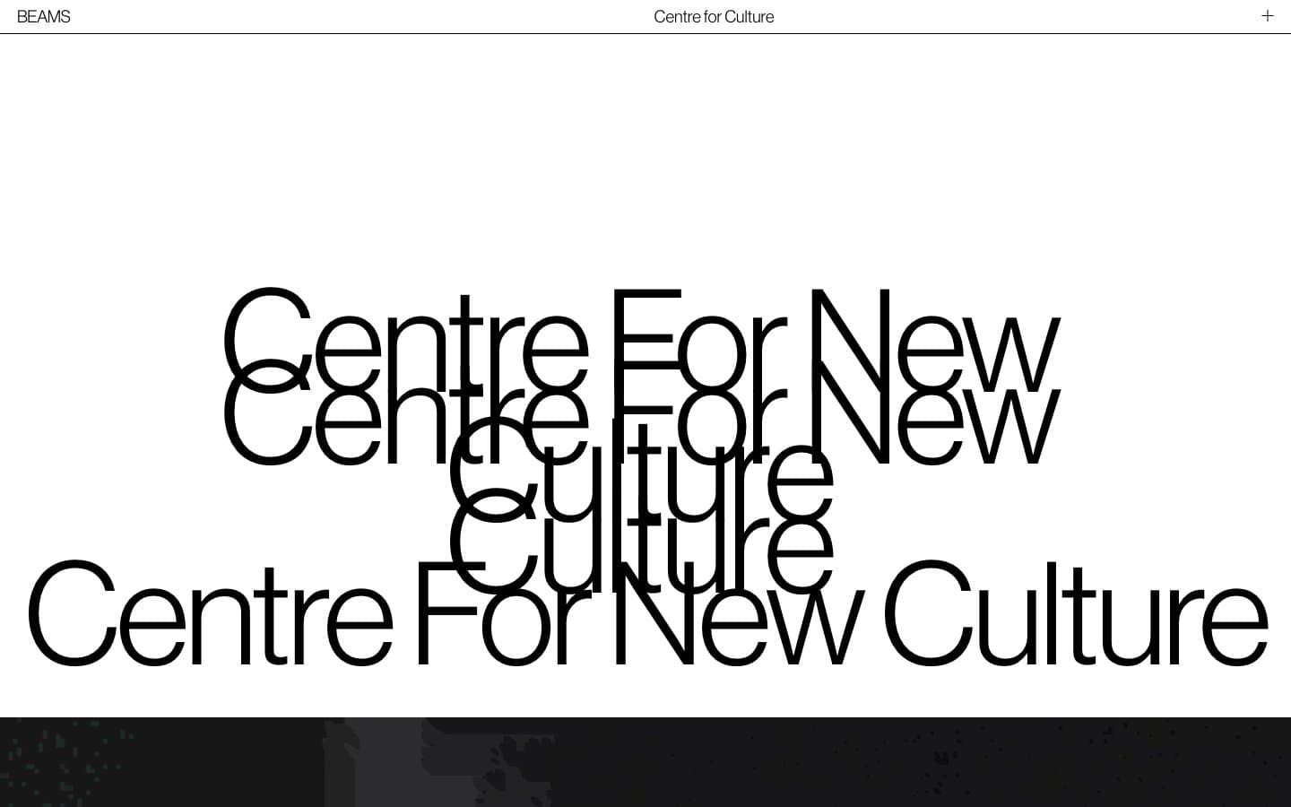
The Beams design system

Neutrals2
Primary text, all borders, structural rules, button text and outlines — the only chromatic signal in the system
Page canvas, surface backgrounds, button interiors, inverse text on dark photography
Try a pairing
Pick any two colors from the palette to check whether text stays readable on top.
Aa
Paper on Ink
21.00 : 1 contrast
- Body textPasses AA 4.5
- Large textPasses AA 3
- StrictPasses AAA 7
More DESIGN.md files. Same web, different personalities.

Rauno Freiberg
Studio
Emil Kowalski
Studio

14islands
Studio
19–86
Studio
Aaron Poe & Co
Studio
Acceptandproceed
Studio
ACCOMPANY
Studio
Acolorbright
Studio
Adcker
Studio
Adopt
Studio
Agence Foudre
Studio


