
Symbolic.ai. Editorial newsroom on cream paper.
- AI
- Light theme
- 15 colors
- 5 typefaces
Symbolic.ai reads like a printed broadsheet reimagined as software: a warm cream canvas (#fdfcf5) with pure black ink type, soft tan shadows instead of cool gray, and a mix of editorial serif headlines (Suisse Works) with a humanist sans (Open Runde) for body and UI. The interface never feels clinical — cards float gently on the cream paper, shadows carry a warm khaki tint (#d5d0b8) that makes even simple elevations feel printed rather than digital. Color is rationed: black handles all primary actions and borders, a deep teal signals verified/correct product states, and a single vivid violet marks AI thinking in progress. Red appears only as a stamp accent. The system trusts whitespace and typography weight to create hierarchy more than color or heavy elevation.
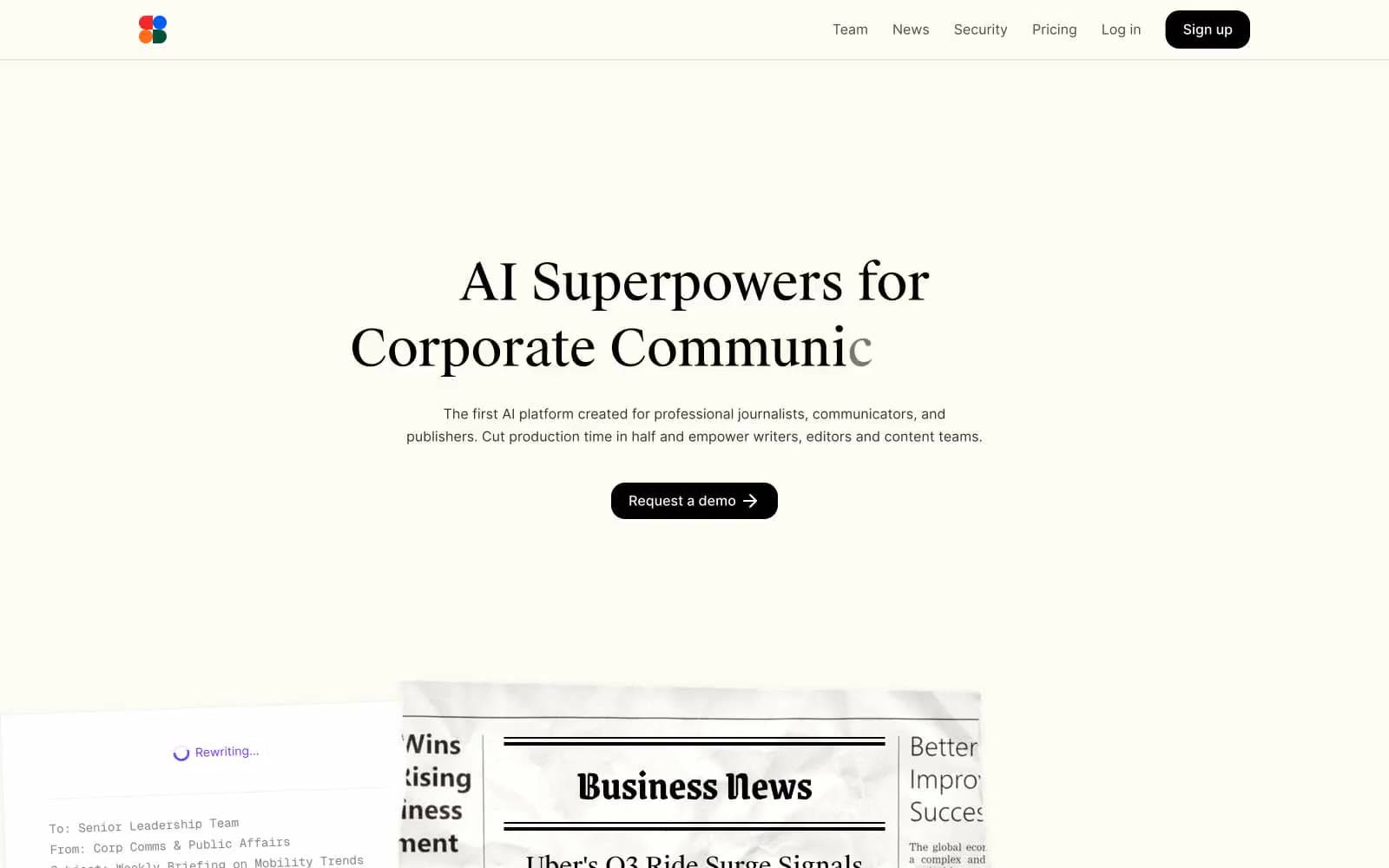
Symbolic.ai design system

Brand1
Teal wash for highlight backgrounds, decorative bands, and soft emphasis behind content.
Accent3
Violet outline accent for tags, dividers, and focused UI edges.
Dark-mode variant of AI Violet for borders and stronger emphasis on processing states
Red wash for highlight backgrounds, decorative bands, and soft emphasis behind content. Do not promote it to the primary CTA color
Neutrals11
Primary text, hairline borders, icon strokes, and the single CTA fill — black-on-cream is the system's only action color, no chromatic buttons
Strong secondary borders and slightly softer heading text — separates structural dividers from Ink Black
Secondary borders, muted body text, link underline tones
Muted body copy and secondary dividers
Captions, helper text, disabled states, tertiary borders
Faint horizontal rules and gentle background tints
Cool-leaning hairline borders, subtle separation lines
The warm shadow tint used across all card elevations — replaces standard cool gray
Subtle section bands, recessed surfaces, and the lighter shadow base
Primary page canvas and white card surfaces.
Card surfaces, elevated content layers, input fills — the brighter sheet the cream canvas holds
Try a pairing
Pick any two colors from the palette to check whether text stays readable on top.
Aa
Paper White on Editorial Teal
5.56 : 1 contrast
- Body textPasses AA 4.5
- Large textPasses AA 3
- StrictFails AAA 7























