
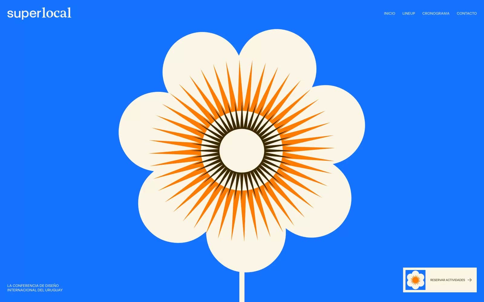
Superlocal. A single sheet of eggshell paper, one bolt of electric blue, and a sharp geometric face that feels printed not designed.
- Studio
- Light theme
- 7 colors
- 3 typefaces
Superlocal reads as a printed festival poster translated to the web. The canvas is a warm eggshell cream (#fbf5e7), never clinical white — every default surface carries that risograph paper warmth. A single full-bleed electric cobalt band (#1673ff) detonates the first screen and acts as the brand's signature anchor, while a deep coffee-brown band (#3d2800) carries schedule content. Typography is dominated by a custom geometric display face (RST Reactor) that swings from a massive 172px headline with brutally tight -0.06em tracking down to 14-17px body, then jumps to positively-tracked uppercase eyebrows for the nav and captions. Controls are flat pill shapes (99px radius), the sponsor system is a sharp-cornered 6-column grid divided by hairlines, and color is rationed: most screens stay cream and monochrome, letting blue and orange erupt only on the hero and the single sunburst illustration.
Superlocal design system

Brand3
Full-bleed hero backgrounds, section anchors — the single saturated chord of the system, reserved for the opening band and any screen that needs to shout over the cream
Dark schedule bands, body text on cream, logo lockup wordmark — a warm near-black that reads as ink, not charcoal
Sunburst illustration accent, flower petal rays — the warm counterweight to cobalt, appears only inside the hero graphic
Accent1
Yellow supporting accent for decorative details and low-frequency emphasis. Do not promote it to the primary CTA color
Neutrals3
Primary body text, logo monogram strokes, illustration line work, hairline dividers, iconography
Secondary surface tint, disabled or inactive background fills, tertiary section background when cream needs a sibling
Page canvas, card surfaces, sponsor grid background, section fills — the warm default that replaces white everywhere
Try a pairing
Pick any two colors from the palette to check whether text stays readable on top.
Aa
Ink Black on Electric Cobalt
4.93 : 1 contrast
- Body textPasses AA 4.5
- Large textPasses AA 3
- StrictFails AAA 7
More DESIGN.md files. Same web, different personalities.

Rauno Freiberg
Studio
Emil Kowalski
Studio

14islands
Studio
19–86
Studio
Aaron Poe & Co
Studio
Acceptandproceed
Studio
ACCOMPANY
Studio
Acolorbright
Studio
Adcker
Studio
Adopt
Studio
Agence Foudre
Studio


