
Stable Audio. Sunlit studio on warm paper.
- AI
- Light theme
- 13 colors
- 1 typeface
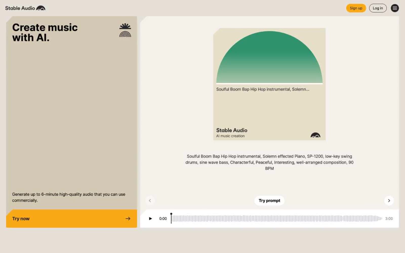
Stable Audio uses a warm-paper studio language: the canvas is cream (#f4f1ec) rather than clinical white, letting bold black headlines and a single amber CTA sit on a surface that feels analog and approachable, like a record sleeve. Full-bleed colored panels — lavender, mustard, sage, khaki — function as oversized section backgrounds behind product mockups, giving the page rhythm the way paint-chip swatches might behind a mixing console. Every interactive element is pill-shaped (9999px) and every card surface is a near-sharp 4px, creating a deliberate contrast between round controls and angular content blocks. A signature half-circle "sun" graphic recurs in every track artwork, and a vivid neon green (#a0f32f) marks every audio-active element, making sound visible across the interface. Product screenshots do the explanatory work; illustration and lifestyle photography are deliberately absent.
Stable Audio design system

Brand2
Yellow supporting accent for decorative details and low-frequency emphasis. Do not promote it to the primary CTA color
Green supporting accent for decorative details and low-frequency emphasis.
Accent4
Text-to-audio feature panel background — large full-bleed section tint
Audio-to-audio feature panel background — full-bleed section tint
Sound effects feature panel background — full-bleed section tint
Secondary panel tint, hero left-column background — warm beige sitting one step darker than the main cream canvas
Neutrals7
Dark supporting neutral for text, icons, and strong contrast. Do not promote it to the primary CTA color
Secondary text, dark app-interface surfaces, filled toggle states — near-black with a slight warm cast
Muted body text, helper text, metadata — mid-gray for tertiary information
Borders, dividers, subtle separators
Cool light-gray structural tone for subtle UI layers beneath the warm cream
Page background, dominant cream surface — every section and most cards sit on this tone
Card surfaces, track cards, elevated panels — the only true white in the system
Try a pairing
Pick any two colors from the palette to check whether text stays readable on top.
Aa
Charcoal on Amber Pulse
10.71 : 1 contrast
- Body textPasses AA 4.5
- Large textPasses AA 3
- StrictPasses AAA 7























