
Spring/Summer. Scandinavian design annual on celadon paper.
- Studio
- Light theme
- 5 colors
- 2 typefaces
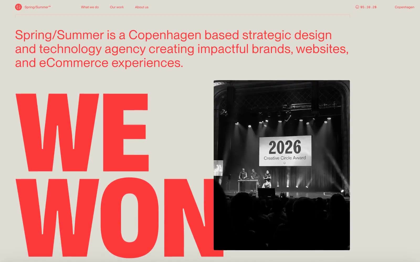
Spring/Summer is an editorial agency annual printed on celadon paper: a single pale sage canvas, massive compressed display type in deep plum, and a near-monochrome palette where the only color decisions are paper, ink, and image. The design is calm and confident — pages breathe with generous whitespace, navigation stays in a whisper-thin top bar, and the display face does all the heavy lifting by being absurdly large rather than by adding weight, gradient, or decoration. Projects are presented as oversized image cards with small white overlay labels, like spreads in a printed portfolio. Color never decorates; it only separates ink from paper.
Spring/Summer design system

Neutrals5
Supporting neutral for secondary UI, dividers, and muted labels. Do not promote it to the primary CTA color
Supporting neutral for secondary UI, dividers, and muted labels. Do not promote it to the primary CTA color
Hairline dividers and structural borders. A warm gray that disappears against the sage canvas but keeps the grid legible
Page canvas — the only background the site uses. A pale desaturated celadon that warms the page without ever reading as a color choice, so the plum ink and photography do all the talking
Card surfaces, image backgrounds, and the white overlay panels sitting on top of project photographs. The only non-canvas surface color in the system
Try a pairing
Pick any two colors from the palette to check whether text stays readable on top.
Aa
Paper White on Plum Ink
10.85 : 1 contrast
- Body textPasses AA 4.5
- Large textPasses AA 3
- StrictPasses AAA 7
More DESIGN.md files. Same web, different personalities.

Rauno Freiberg
Studio
Emil Kowalski
Studio

14islands
Studio
19–86
Studio
Aaron Poe & Co
Studio
Acceptandproceed
Studio
ACCOMPANY
Studio
Acolorbright
Studio
Adcker
Studio
Adopt
Studio
Agence Foudre
Studio


