
Spacelab. Swiss editorial grid on raw paper.
- Studio
- Light theme
- 5 colors
- 2 typefaces
Spacelab is a Swiss-editorial architecture studio site built on near-total monochrome restraint: one typeface, one chromatic accent, and almost no surface decoration. The page behaves like a printed monograph — white canvas, oversized architectural photography, and a left-rail index navigation that recalls a museum catalogue sidebar. Type carries the entire voice: HelveticaNeue at weight 400 with line-heights compressed to 1.0–1.2 sits closer to the baseline than typical web type, making every paragraph feel set rather than typed. The single muted violet-slate (#495472) appears only on filled buttons and a rare card surface, functioning as a quiet navigational signal rather than a brand statement. Components are reduced to their skeleton: hairline borders, 4px corners, no shadows, no gradients — every element earns its weight by occupying negative space rather than filling it.
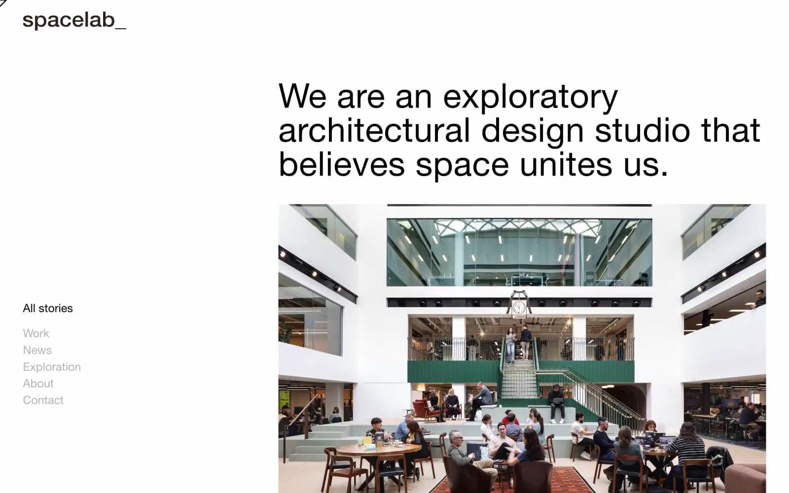
Spacelab design system

Brand1
Filled button background and select card surfaces — the only chromatic voice in the system. A muted violet-slate that reads as architectural blue-grey rather than brand color, so it never shouts over the photography
Neutrals4
Primary text, icon strokes, hairline borders, the logo wordmark. Used for most dividers and structural lines (border frequency 1,156)
Secondary text and the heaviest border color in the system (freq 3,104). A warm-toned near-black that softens harsh contrast on long reads
Muted link color, inactive nav items, tertiary text. Desaturated green-gray that recedes against both paper white and ink black
Page canvas, card surfaces, body text inversion, button labels. The dominant background; everything else sits on top of it
Try a pairing
Pick any two colors from the palette to check whether text stays readable on top.
Aa
Paper White on Slate Iris
7.52 : 1 contrast
- Body textPasses AA 4.5
- Large textPasses AA 3
- StrictPasses AAA 7
More DESIGN.md files. Same web, different personalities.

Rauno Freiberg
Studio
Emil Kowalski
Studio

14islands
Studio
19–86
Studio
Aaron Poe & Co
Studio
Acceptandproceed
Studio
ACCOMPANY
Studio
Acolorbright
Studio
Adcker
Studio
Adopt
Studio
Agence Foudre
Studio


