
Sing-sing. A warm saffron canvas with sea-glass ink.
- Studio
- Light theme
- 4 colors
- 2 typefaces
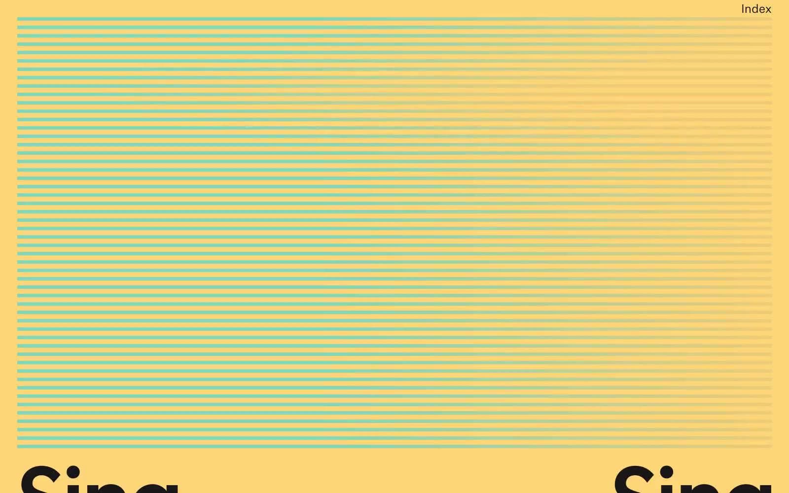
Sing-sing is a sunlit editorial system where the page itself is a warm saffron canvas and the interface sits on top like ink printed on butter paper. Color is structural, not decorative: teal sea-glass lines stripe the top of the page, bleed through a gradient, and underline the wordmark — the rest of the system is austere black type on yellow with no shadows, no cards, and no traditional UI chrome. Typography is the protagonist: a grotesk at near-poster scale (147px) with heavy negative tracking carries identity, while a smaller serif (signifier) plays a supporting role for editorial captions. Layout is art-directed, not gridded — each section behaves like a magazine spread, alternating between full-bleed photography, typographic statements, and the signature striped zone.
Sing-sing design system

Brand3
Page canvas, full-bleed backgrounds, the base layer every other element sits on
Decorative stroke accent — horizontal stripe pattern, top page divider, wordmark underline, gradient terminus
Right terminus of the signature horizontal gradient (teal → warm gold) used for stripe fades and section dividers
Neutrals1
Primary text, nav labels, headings, logo wordmark, and all interface borders
Try a pairing
Pick any two colors from the palette to check whether text stays readable on top.
Aa
Inkstone on Marigold
12.75 : 1 contrast
- Body textPasses AA 4.5
- Large textPasses AA 3
- StrictPasses AAA 7
More DESIGN.md files. Same web, different personalities.

Rauno Freiberg
Studio
Emil Kowalski
Studio

14islands
Studio
19–86
Studio
Aaron Poe & Co
Studio
Acceptandproceed
Studio
ACCOMPANY
Studio
Acolorbright
Studio
Adcker
Studio
Adopt
Studio
Agence Foudre
Studio


