
Simone Sniekers. The image does all the work, the UI almost disappears.
- Studio
- Light theme
- 13 colors
- 1 typeface
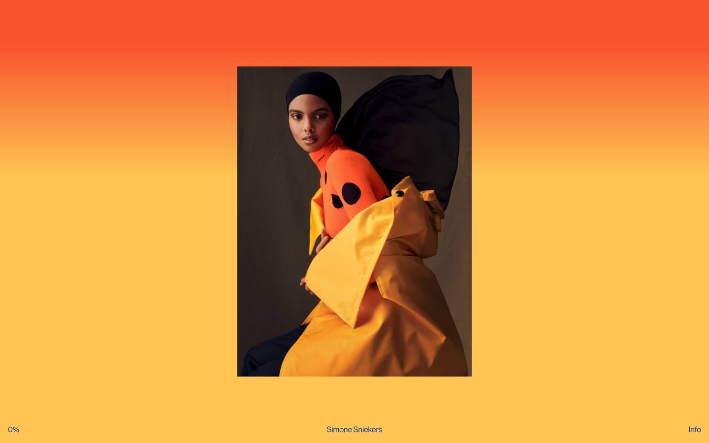
Simone Sniekers is a photography portfolio stripped to its essence: the photograph is the interface. The site uses a single full-bleed editorial image as the entire canvas, with a barely-there UI layer of three text elements — a progress counter bottom-left, a name credit bottom-center, and an 'Info' trigger bottom-right. Typography is unified to one size and one weight across every UI element, treating all chrome as equal-weight caption text. The color palette is almost entirely photographic: warm amber, vermillion, and ochre washes bleed from the imagery itself, while the UI overlay sticks to black on whatever the photo presents. No cards, no borders, no shadows, no gradients in the traditional sense — the image provides all visual richness.
Simone Sniekers design system

Accent4
Photographic accent — vivid magenta-red pulled from editorial imagery, not a UI token
Photographic accent — warm gold from editorial imagery, bleeds into the canvas wash
Photographic accent — vivid red-orange from editorial imagery
Photographic accent — deep saturated gold from editorial imagery
Neutrals9
Dark borders and separators for elevated surfaces and inverted UI
Deep warm neutral for dark photographic zones and shadow anchors
Mid-neutral for subdued text and secondary borders
Dominant canvas wash — the neutral mid-tone the warm gradient settles into at its lower band
Warm cream neutral for lighter photographic sections
Warm-tinted neutral surface — desaturated pink-beige for soft section transitions
Cooler neutral surface variant for section breaks and contrast
Cool-warm neutral surface, secondary canvas tone between photography passages
Inset text on dark photographic zones and button border accents
Try a pairing
Pick any two colors from the palette to check whether text stays readable on top.
Aa
Paper White on Vermillion
4.72 : 1 contrast
- Body textPasses AA 4.5
- Large textPasses AA 3
- StrictFails AAA 7
More DESIGN.md files. Same web, different personalities.

Rauno Freiberg
Studio
Emil Kowalski
Studio

14islands
Studio
19–86
Studio
Aaron Poe & Co
Studio
Acceptandproceed
Studio
ACCOMPANY
Studio
Acolorbright
Studio
Adcker
Studio
Adopt
Studio
Agence Foudre
Studio


