
Simon Liesinger. Drafting table on bone paper.
- Studio
- Light theme
- 5 colors
- 3 typefaces
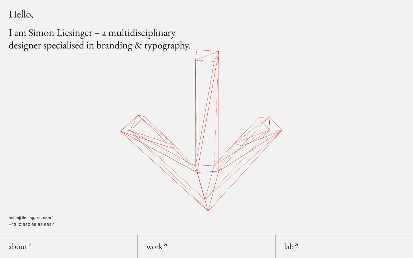
Liesingers is a gallery-wrapped-in-a-browser: a near-monochromatic editorial portfolio where a warm vermillion red is the only chromatic interruption in an otherwise graphite-and-bone-white composition. The system behaves like a printed monograph — Garamond sets the voice for headlines and body copy, while Helvetica with tabular figures handles the metadata column at the foot of the page. The grid is unapologetically wide and columnar, sections stack as full-bleed bands separated by hairline rules, and the navigation lives at the bottom rather than the top. Components are flat, borderless in the traditional sense, and rely on line weight and whitespace for structure rather than fill, shadow, or color blocks. The wireframe illustration in vermillion is the only piece of ornament — everything else earns its place as structure or text.
Simon Liesinger design system

Brand1
Link arrows, the wireframe illustration, the only chromatic accent — a printer’s mark red, not an interface brand color
Neutrals4
Hardest rule weights, foot dividers, densest border lines — the purest black on the page
Primary text, body copy, hairline rules, column dividers — softer than pure black, reads as printed ink
Muted column rules, secondary divider strokes — the gray that softens the grid
Page canvas, card surfaces, section backgrounds — the paper of the monograph
Try a pairing
Pick any two colors from the palette to check whether text stays readable on top.
Aa
Ink on Vermillion
6.41 : 1 contrast
- Body textPasses AA 4.5
- Large textPasses AA 3
- StrictFails AAA 7
More DESIGN.md files. Same web, different personalities.

Rauno Freiberg
Studio
Emil Kowalski
Studio

14islands
Studio
19–86
Studio
Aaron Poe & Co
Studio
Acceptandproceed
Studio
ACCOMPANY
Studio
Acolorbright
Studio
Adcker
Studio
Adopt
Studio
Agence Foudre
Studio


