
Shelby Kay. Two-color ink system on aged paper, with display type that bleeds past the page edge and metadata that whispers from the margins.
- Studio
- Light theme
- 6 colors
- 2 typefaces
Shelby Kay is a botanical editorial portfolio: a warm linen canvas, one dark-olive ink color, and a single sage-green accent that does all the brand expression. Typography is extreme — Ranade display type stretches to 265px and bleeds edge-to-edge, while Switzer handles everything else at a compact 10–20px range, creating a magazine-spread tension between monumental headers and whispering metadata. Navigation is text-only with no buttons, no rounded controls, no shadows — the interface reads as a printed art book, not a software product. Sections shift through warm tonal layers (cream → tan → taupe) rather than alternating hard color blocks, and the overall system rewards restraint: hierarchy comes from scale, weight, and whitespace, never from color or chrome.
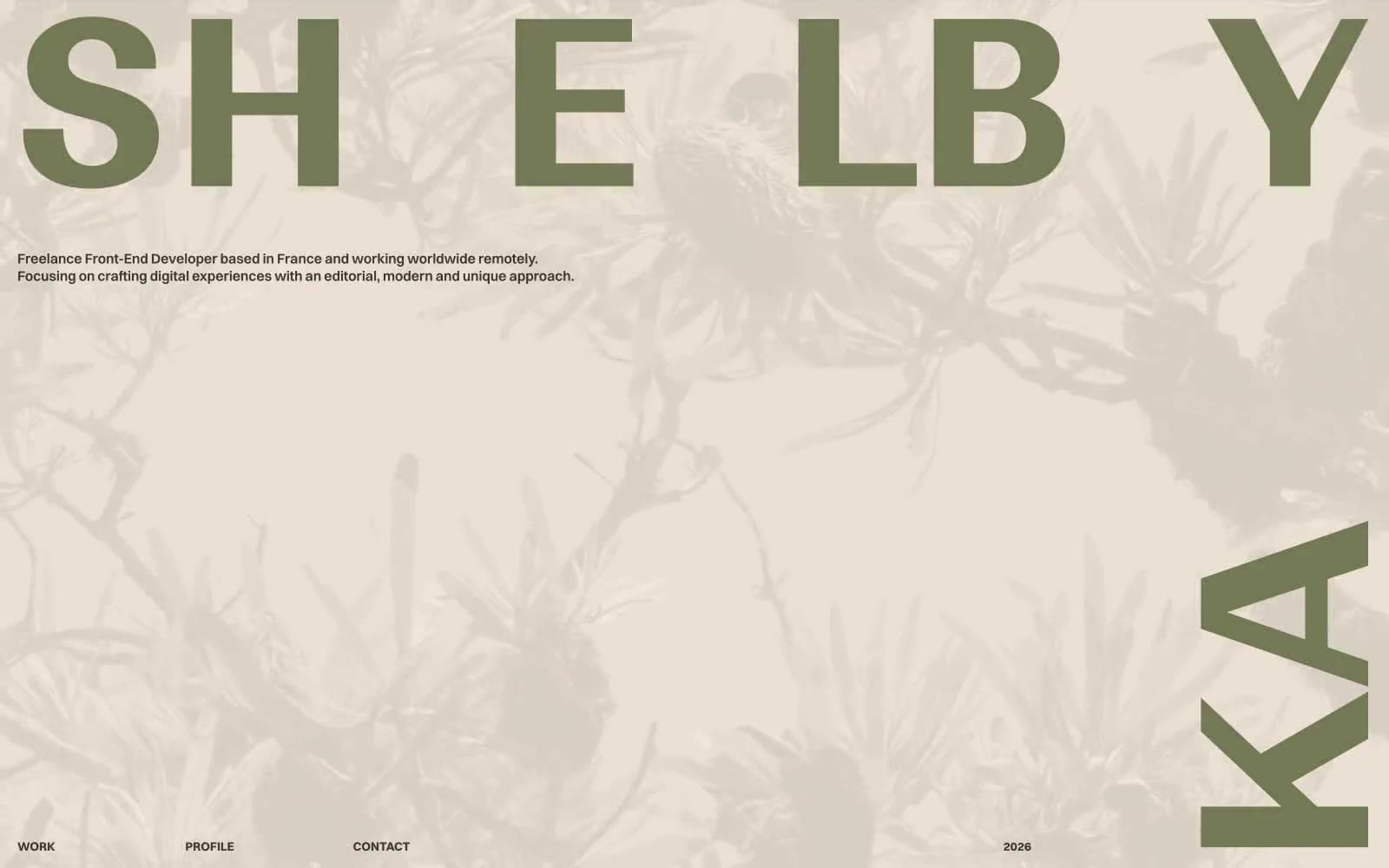
Shelby Kay design system

Brand1
Primary text, borders, and structural strokes — all type from body to display headings, all card and image borders, all interactive outlines
Accent1
Display headings and brand voice — used for the monumental SHELBY wordmark, section anchors, and selective heading accents that carry the brand's botanical identity
Neutrals4
Cool-toned neutral for subtle contrast shifts — secondary surface, hover or muted state for UI elements needing visual separation from the warm base
Tertiary surface and muted helpers — profile-section backdrop, desaturated metadata, low-emphasis UI text and dividers
Orange wash for highlight backgrounds, decorative bands, and soft emphasis behind content.
Primary canvas and card surfaces — page background, card fills, the base warm tone the entire system sits on
Try a pairing
Pick any two colors from the palette to check whether text stays readable on top.
Aa
Linen on Olive Ink
9.17 : 1 contrast
- Body textPasses AA 4.5
- Large textPasses AA 3
- StrictPasses AAA 7
More DESIGN.md files. Same web, different personalities.

Rauno Freiberg
Studio
Emil Kowalski
Studio

14islands
Studio
19–86
Studio
Aaron Poe & Co
Studio
Acceptandproceed
Studio
ACCOMPANY
Studio
Acolorbright
Studio
Adcker
Studio
Adopt
Studio
Agence Foudre
Studio


