
School. Personal desktop for creative souls.
- Studio
- Light theme
- 12 colors
- 2 typefaces
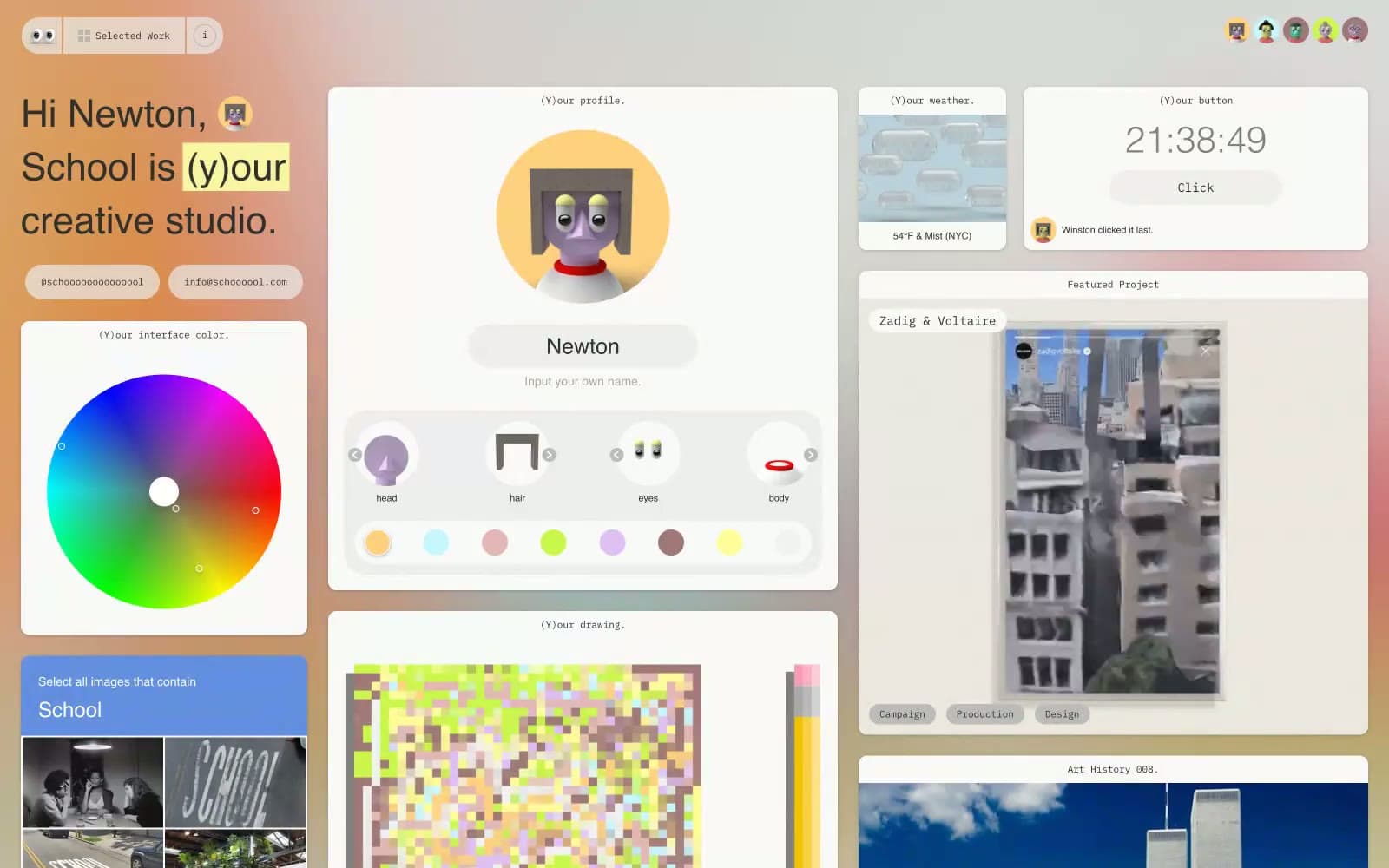
School treats its portfolio as a personal desktop: a light gray canvas (#dbdbdb) tiled with generously rounded white cards, each labeled with a tiny monospace caption in parentheses like (Y)our profile. or (Y)our weather. The entire interface speaks in IBM Plex Mono — body, headings, labels, buttons, timestamps — giving every surface the texture of a terminal session or a developer's scratchpad. Color is almost entirely suppressed: the palette is 99% achromatic, with the only warmth coming from a soft tan (#e2ceb8) and a cool blue-gray (#6a728e) used as background washes, and occasional yellow highlight blocks behind individual letters. There is no hero, no marketing band, no gradient — the grid IS the experience, and each card behaves like a widget on a calm, slightly retro operating system.
School design system

Accent4
Warm background tint on select cards and sections — the only warm chromatic wash in the system, used sparingly to break the cool gray monotony
Gray supporting accent for decorative details and low-frequency emphasis.
Text-block highlight behind individual letters or words (the (y)our treatment) — the only vivid functional accent, used to mark a single altered character in an otherwise unstyled sentence
Secondary text highlight block, paired with yellow for selectable/emphasized letter swaps
Neutrals8
Icon fills, maximum-contrast accents, deep text on light surfaces
Primary text, headings, body copy, icons, link color, input borders, badges — the single dominant ink that holds the whole monochrome system together
Secondary text, meta information, shadow tone, muted border accents
Muted text, disabled labels, badge backgrounds, inactive states
Page canvas, the visible background behind every card — the tone that makes white cards feel floating rather than embedded
Hairline borders, input backgrounds, disabled-state fills
Subtle elevated surfaces, secondary panels, input hover states — a step between canvas and card
Card surfaces, input fields, elevated panels, text on dark fills
Try a pairing
Pick any two colors from the palette to check whether text stays readable on top.
Aa
Pure Black on Sand Wash
13.75 : 1 contrast
- Body textPasses AA 4.5
- Large textPasses AA 3
- StrictPasses AAA 7
More DESIGN.md files. Same web, different personalities.

Rauno Freiberg
Studio
Emil Kowalski
Studio

14islands
Studio
19–86
Studio
Aaron Poe & Co
Studio
Acceptandproceed
Studio
ACCOMPANY
Studio
Acolorbright
Studio
Adcker
Studio
Adopt
Studio
Agence Foudre
Studio


