Sana Agents. Lime spark on editorial white.
- AI
- Light theme
- 6 colors
- 2 typefaces
Sana's design system is an editorial-grade monochrome canvas with a single electric accent — a Swiss-poster discipline applied to a knowledge work product. The page is overwhelmingly white and typographic, with a massive weight-400 serif headline that gives the brand a literary, almost magazine-cover authority rare in AI tooling. Dark surfaces (#0a1217) and one vivid lime (#cdfe00) appear as deliberate punctuation — full-bleed product cards, sign-up panels, and the occasional action button — never as background washes. Rounded geometry is generous: 24px for cards and inputs, full pills for buttons, which together give the system a soft, tactile quality against the otherwise austere type. Components stay flat and unshaded; depth comes from surface color contrast rather than shadows, creating a visual rhythm of white → frost → ink → lime rather than z-axis elevation.
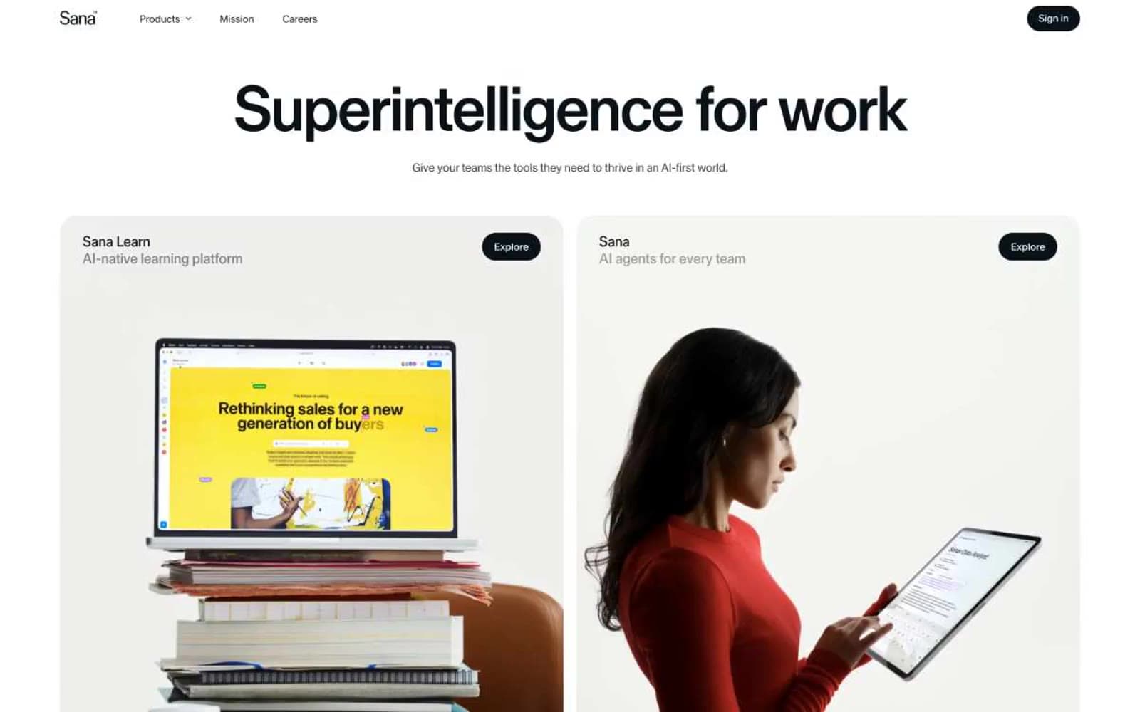
Sana Agents design system
Accent1
Green supporting accent for decorative details and low-frequency emphasis. Do not promote it to the primary CTA color
Neutrals5
Hairline borders, nav text, and input outlines where the sharpest contrast edge is required
Primary text, dark card surfaces, sign-up panel, filled primary buttons on light backgrounds
Muted helper text, footer labels, and desaturated secondary copy
Soft tinted surface for light product cards and secondary panels — the only chromatic step between paper white and ink black
Light supporting surface for subtle backgrounds and section separation. Do not promote it to the primary CTA color
Try a pairing
Pick any two colors from the palette to check whether text stays readable on top.
Aa
Obsidian on Electric Lime
17.77 : 1 contrast
- Body textPasses AA 4.5
- Large textPasses AA 3
- StrictPasses AAA 7























