
Sana. Where the only ornament is letter-spacing and the only color is a single electric blue pressed into white space.
- AI
- Light theme
- 7 colors
- 1 typeface
Sana operates on near-total chromatic restraint: a monochromatic canvas of warm off-white, white, and a near-black ink, with one electric blue and one ember orange appearing only as functional punctuation on the single most important action per surface. The typography is the personality — Sana Sans set aggressively tight (-2.5% at display sizes) so headlines read as carved stone rather than rendered text, with weight staying between 400 and 500 to avoid shouting. Buttons are pill-shaped with large radii, cards are softly rounded, and the entire UI is flat — no shadows, no gradients, no decorative elevation. Sections alternate between white and #efefed bands to create rhythm without color, and the only depth comes from photographic content (editorial product still-lifes, full-bleed testimonial portraits) that floats on the otherwise silent canvas. The system behaves like an architectural monograph: one idea, one typeface, one material.
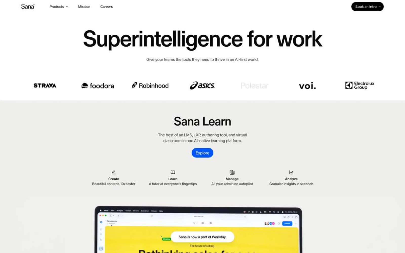
Sana design system

Brand1
Single primary action fill per page — the only chromatic punctuation, reserved for the decisive CTA and never used decoratively
Accent1
Rare secondary action or notification accent — a warm counterpoint to Cobalt Pulse, used at most once per surface
Neutrals5
Icon fills, heading underlines, occasional deep accents where maximum weight is needed
Primary text, hairlines, card and input borders, list dividers, link underlines — the dominant dark anchor of the system
Footer divider, hairline rules where Ink would be too heavy
Section band background, elevated card surface, the warm neutral that gives the white space its temperature
Page background, card surface, text on filled buttons, button borders for ghost controls
Try a pairing
Pick any two colors from the palette to check whether text stays readable on top.
Aa
Bone on Cobalt Pulse
5.74 : 1 contrast
- Body textPasses AA 4.5
- Large textPasses AA 3
- StrictFails AAA 7























