
robot.com. The system behaves like a confident magazine layout, not a software dashboard.
- AI
- Light theme
- 9 colors
- 1 typeface
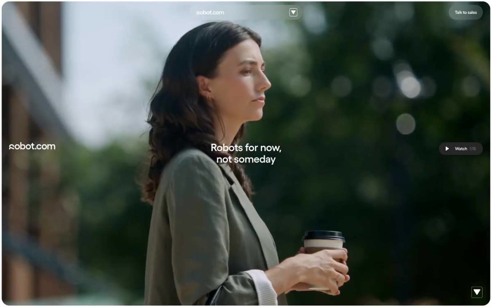
robot.com speaks in a near-monochrome voice — warm off-white canvas, ink-black text, and a single screaming-yellow accent that operates like a highlighter on a printed page. The system feels editorial and confident: aggressive type (custom Yellix at up to 100px with negative tracking), pill-shaped controls (24-30px radii dominate), and section-level color blocks that flip between off-white, near-black, and yellow rather than subtle gradient washes. Product photography is treated as full-bleed cinematic evidence — no crops, no UI chrome around it — while text blocks sit in narrow left-aligned columns that leave generous right-side breathing room. The visual rhythm alternates quiet monochrome bands with bold accent blocks, making the yellow feel earned rather than decorative.
robot.com design system

Accent1
Primary action buttons, section accent blocks, highlight tags, decorative fills — the sole chromatic color, used sparingly to make a single element pop per view
Neutrals8
Primary action button fill, high-contrast decorative fills — reserved for moments demanding maximum weight
Primary text, heading color, dominant border color, dark section fill — near-black with slight warmth, never pure #000
Card-level dark surface, deep accent block alternative to Ink Black
Secondary body text, quiet helper copy, secondary borders
Tertiary body text, subtle borders, caption-weight copy
Quietest neutral surface layer, faint dividers, muted backgrounds
Card surfaces, secondary canvas tone, subtle elevation over pure white
Page canvas, inverted text on dark blocks, filled button text
Try a pairing
Pick any two colors from the palette to check whether text stays readable on top.
Aa
Pure Black on Yellix Yellow
18.59 : 1 contrast
- Body textPasses AA 4.5
- Large textPasses AA 3
- StrictPasses AAA 7























