
Relace. An editor's desk, not a dashboard.
- AI
- Light theme
- 7 colors
- 5 typefaces
Relace operates as a warm-paper devtool: a cream canvas (#fffef2) rather than cold white, with a single rationed amber accent (#fcaa2d) that punctuates CTAs and inline highlights. Typography carries the entire personality — a distinctive geometric sans (Parabole Trial) with aggressively tight tracking at display sizes produces editorial-weight, left-aligned headlines, while a monospace (Decima Mono Pro) handles all UI chrome, version labels, and code. The system is radically sharp: 2px radii dominate, hairlines replace shadows, and structural black borders (#000000) define separation rather than elevation. Landscape photography with code overlays breaks the monochrome rhythm, and the single warm accent is reserved for moments that must land — never decorative.
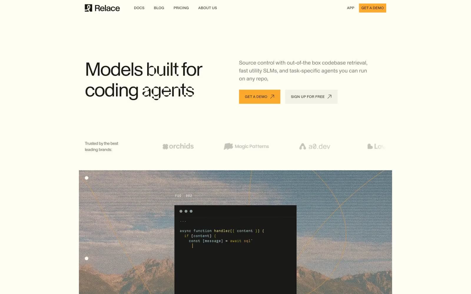
Relace design system

Brand1
Yellow outline accent for tags, dividers, and focused UI edges. Do not promote it to the primary CTA color
Neutrals6
Structural hairlines and borders — 1px lines that define cards, separate sections, and replace shadow as the elevation language
Primary text color, dark surface fills, and code-window backgrounds — warm near-black, never pure optical black
Muted body text, secondary borders, and inactive link states — a warm gray that recedes without going cool
Tertiary dividers and inactive UI elements — a mid-warm gray for the lightest structural lines
Secondary elevated surface — warm light beige for tags, subtle background panels, and hover washes that lift off the cream canvas
Universal page background and card surface — the warm, almost unbleached paper that defines the entire visual temperature
Try a pairing
Pick any two colors from the palette to check whether text stays readable on top.
Aa
Rule Black on Amber Signal
10.93 : 1 contrast
- Body textPasses AA 4.5
- Large textPasses AA 3
- StrictPasses AAA 7























