
Reducto. Magazine on warm paper.
- AI
- Light theme
- 18 colors
- 4 typefaces
Reducto presents a warm-paper editorial system: an off-white canvas paired with a custom serif that behaves like a luxury magazine masthead, grounded by a single high-chroma magenta that punches through without shouting. The aesthetic borrows from print typography — oversized serif headlines (64–136px) set in a custom face with tight tracking, paired with a workmanlike sans for utility — and treats the page as a structured document rather than a product dashboard. Color is rationed: almost everything reads in warm grays and the deep plum #310632, and the vivid magenta #9d17a0 is reserved for the moment a user needs to act. Surfaces are paper-thin, borders are warm beige instead of cold gray, and shadows are essentially absent — depth comes from inset white highlights and subtle border contrast, not from elevation.
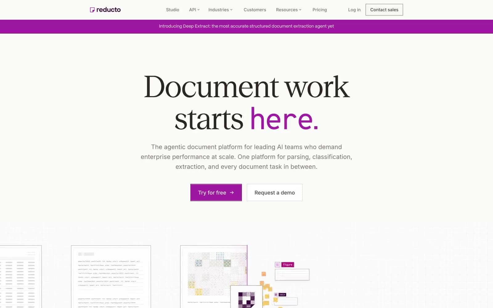
Reducto design system

Brand3
Primary text, headline color, nav active state, link accent, footer text — the deep plum that replaces black across the entire interface, giving body copy a warm violet cast instead of cold gray
Filled primary action background, selected nav indicator, brand icon color — the single vivid hue permitted on a CTA, used sparingly so the click target glows against the paper canvas
Outlined action border, secondary button outline — a darker shade of the action magenta, used when a ghost/outlined button needs chromatic weight without the filled fill
Accent4
Violet text accent for links, tags, and emphasized short phrases. Do not promote it to the primary CTA color
Decorative icon accent, illustrative highlight — used inside product visualizations and tag chips to add warm contrast against the dominant magenta/plum palette
Decorative icon and illustration accent — secondary chromatic note for data visualization callouts, kept low-frequency
Green text accent for links, tags, and emphasized short phrases. Do not promote it to the primary CTA color
Neutrals11
Secondary body text, navigation labels, and subdued headings. Do not promote it to the primary CTA color
Neutral button treatment for secondary actions and selected controls.
Secondary heading text, icon stroke, strong body text — mid-dark warm gray for emphasis without going full black
Body text, nav text, button text on light backgrounds, helper text — the default readable text color, warm and low-contrast
Muted helper text, disabled state, low-priority captions — the lightest readable neutral
Primary border color, hairline dividers, card outlines — the warm beige border that replaces cold gray; the single most-used border token across the system
Nav border, button border, body border — mid-tone warm gray for structural outlines where more contrast is needed than Sand provides
Subtle border, decorative separator, low-contrast outline — lighter than Sand for secondary dividers
Secondary surface, elevated card background, subtle section differentiation
Page canvas, hero background, nav background — the warm off-white that defines the entire site's surface; never pure #ffffff at the top level
Pure card surface, button text on dark/magenta fills, icon fill — only used as a surface lift or as foreground text, never as the page canvas
Try a pairing
Pick any two colors from the palette to check whether text stays readable on top.
Aa
Snow on Aubergine
17.46 : 1 contrast
- Body textPasses AA 4.5
- Large textPasses AA 3
- StrictPasses AAA 7























