
Ragged Edge. Editorial brutalism on white marble.
- Studio
- Light theme
- 10 colors
- 2 typefaces
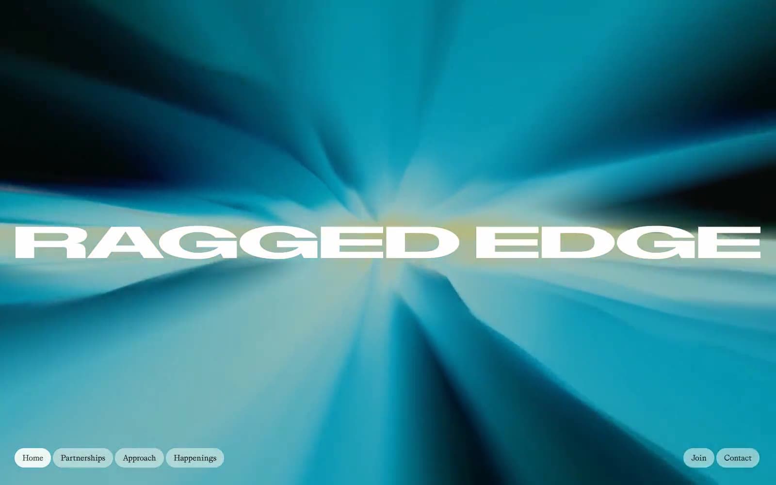
Ragged Edge operates as a confident brand consultancy site built on near-total monochrome discipline: near-black ink on white, with a single saturated violet used sparingly as an outlined accent and a singular full-bleed gradient hero that acts as the only chromatic event on the homepage. Typography is the entire personality — an extremely expanded uppercase display face (ABCDiatypeExpanded) does the shouting while a refined serif (Grit) does the talking, creating a tension between editorial magazine typography and brutalist display letterforms. Layouts are maximalist in scale (full-bleed hero, 180px section gaps) but minimal in palette, and all interactive surfaces are pill-shaped with radii in the 40–64px range, giving every button and nav item a soft capsule form that contrasts against the angular expanded type.
Ragged Edge design system

Brand1
Hero gradient stop — warm yellow anchoring the top of the full-bleed gradient wash
Accent1
Outlined action border only — the sole chromatic accent; appears as a violet ring around secondary call-to-action buttons against monochrome surroundings
Neutrals8
Navigation dividers and surface backing for select blocks
Primary text, hairline borders, filled action buttons — the dominant near-black that carries 90% of the interface
Dark surface blocks for case study framing and image-overlay panels
Secondary body text and subtle icon strokes where a lighter black is needed
Muted helper text, inactive button borders, secondary metadata
Subtle dividers and secondary borders where Obsidian would be too heavy
Soft tinted surface for nav backgrounds and breathing sections — barely-there green to warm the white canvas
Canvas background, inverted text on dark blocks, nav/button borders
Try a pairing
Pick any two colors from the palette to check whether text stays readable on top.
Aa
True Black on Iris Voltage
4.81 : 1 contrast
- Body textPasses AA 4.5
- Large textPasses AA 3
- StrictFails AAA 7
More DESIGN.md files. Same web, different personalities.

Rauno Freiberg
Studio
Emil Kowalski
Studio

14islands
Studio
19–86
Studio
Aaron Poe & Co
Studio
Acceptandproceed
Studio
ACCOMPANY
Studio
Acolorbright
Studio
Adcker
Studio
Adopt
Studio
Agence Foudre
Studio


