
Prisma Labs. A white gallery wall where one beam of yellow light hits.
- AI
- Light theme
- 5 colors
- 2 typefaces
Prisma Labs runs a ruthlessly restrained visual system: pure white canvas, near-black type, and one vivid yellow as the only chromatic signal. Display headlines carry enormous weight (700) at near-1.0 line-height with tight negative tracking, reading like editorial type rather than typical SaaS hero copy. Yellow appears as functional punctuation — filled CTAs, active in-app controls, and as organic blob shapes bleeding behind phone mockups — never as decoration. The layout is split and alternating: text one side, oversized product mockup the other, with generous vertical breathing room (80–120px) between bands. Surfaces are flat; elevation is achieved through color contrast and blob backings rather than shadows.
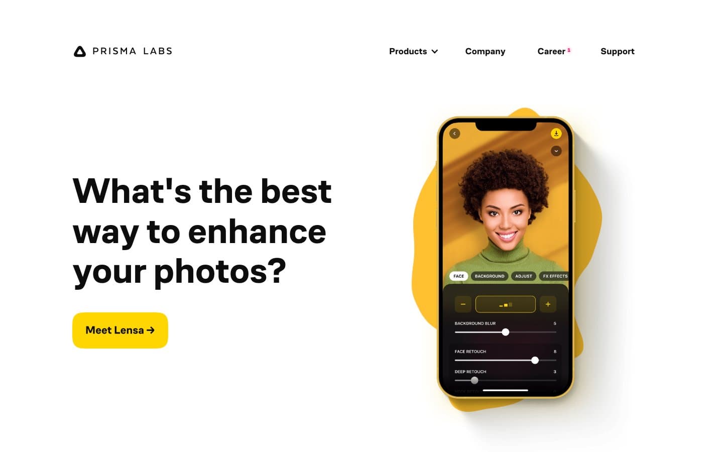
Prisma Labs design system

Brand1
CTA button fill, in-app active tabs, decorative blob shapes behind mockups, active state highlights — the single chromatic accent that makes actions feel switched on
Accent1
Red outline accent for tags, dividers, and focused UI edges
Neutrals3
Primary text, nav links, all borders, button outlines
Secondary text, image borders, link underlines, muted dividers
Page canvas, card surfaces, button text on yellow fill
Try a pairing
Pick any two colors from the palette to check whether text stays readable on top.
Aa
Ink Black on Signal Yellow
13.76 : 1 contrast
- Body textPasses AA 4.5
- Large textPasses AA 3
- StrictPasses AAA 7























