
Pravah. Engineering dossier on warm parchment.
- AI
- Light theme
- 8 colors
- 1 typeface
Pravah's design system operates on a near-monochromatic warm-neutral palette anchored by a parchment-cream canvas and punctuated by deep aubergine-black sections. The visual language is closer to an engineering dossier than a SaaS landing page: wireframe grid illustrations, pointillist pixel-mapped photography, and uppercase tracked labels that read like field notes. Typography is single-family (ABCfavorit Book) and does all the expressive work through two weights, tight display tracking, and open uppercase badges. Contrast is achieved through tonal inversion — full sections flip from cream to near-black — rather than chromatic accents. The result feels measured, scientific, and quietly confident, like infrastructure software that doesn't need to perform.
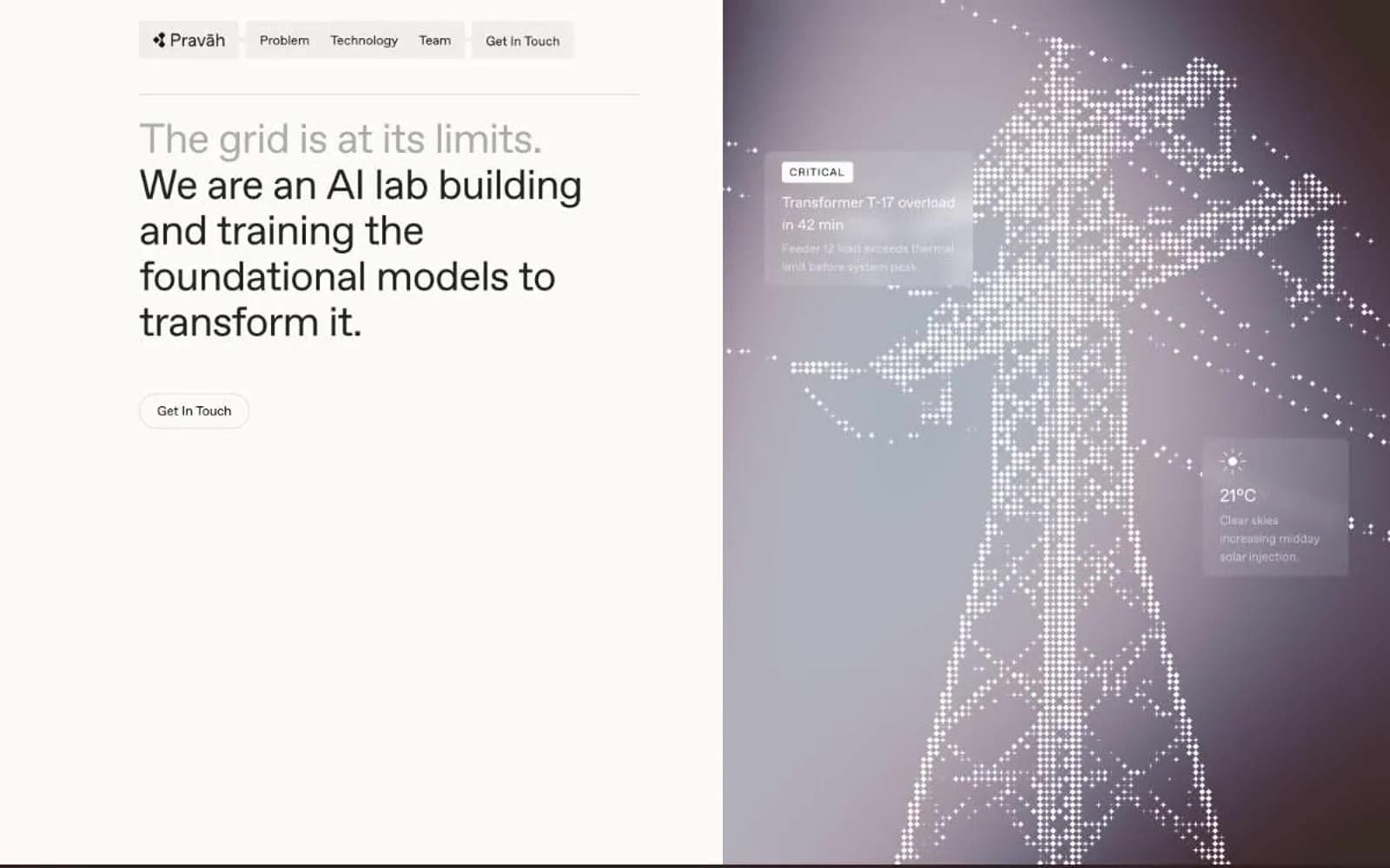
Pravah design system

Brand1
Dramatic dark-section backgrounds (Problem, full-bleed inverse bands) — the only near-saturated tone, used to invert the page temperature
Neutrals7
Primary text, default borders, nav strokes, and structural outlines — the dominant typographic and border color across all contexts
Secondary headings and heavier-weight text where slightly softer than Ink Black is desired
Captions, timestamps, and tertiary metadata where hierarchy needs to recede
Muted text, inactive states, and lighter border treatments where Ink Black would be too heavy
Hairline borders, illustration fills, and low-emphasis dividers — the lightest structural line color
Primary page canvas — the warm off-white that gives the entire system its editorial, non-digital feel
Card surfaces, badge fills, and inset panels — sits one step above the parchment canvas to create gentle elevation without shadows
Try a pairing
Pick any two colors from the palette to check whether text stays readable on top.
Aa
Pure White on Aubergine Black
15.48 : 1 contrast
- Body textPasses AA 4.5
- Large textPasses AA 3
- StrictPasses AAA 7























