
PORTO ROCHA. White-walled design library.
- Studio
- Light theme
- 4 colors
- 2 typefaces
Porto Rocha is an editorial design system dressed in a gallery wall aesthetic: near-total monochrome, surgical use of one Apple-blue accent for links, and typography that behaves like a printed monograph. The interface is structurally two-column — a fixed left rail of agency metadata and project index, and a wide content field of image-led cards arranged in a three-column grid. Surfaces are flat white with hairline gray borders; elevation is communicated through stacking and whitespace, never shadows. The single blue accent (#007aff) is reserved for interactive text and active states, creating a restrained system where color only appears when something is actionable or linked. The design reads as anti-decorative: no gradients, no rounded buttons, no illustrations — content and photography carry every screen.
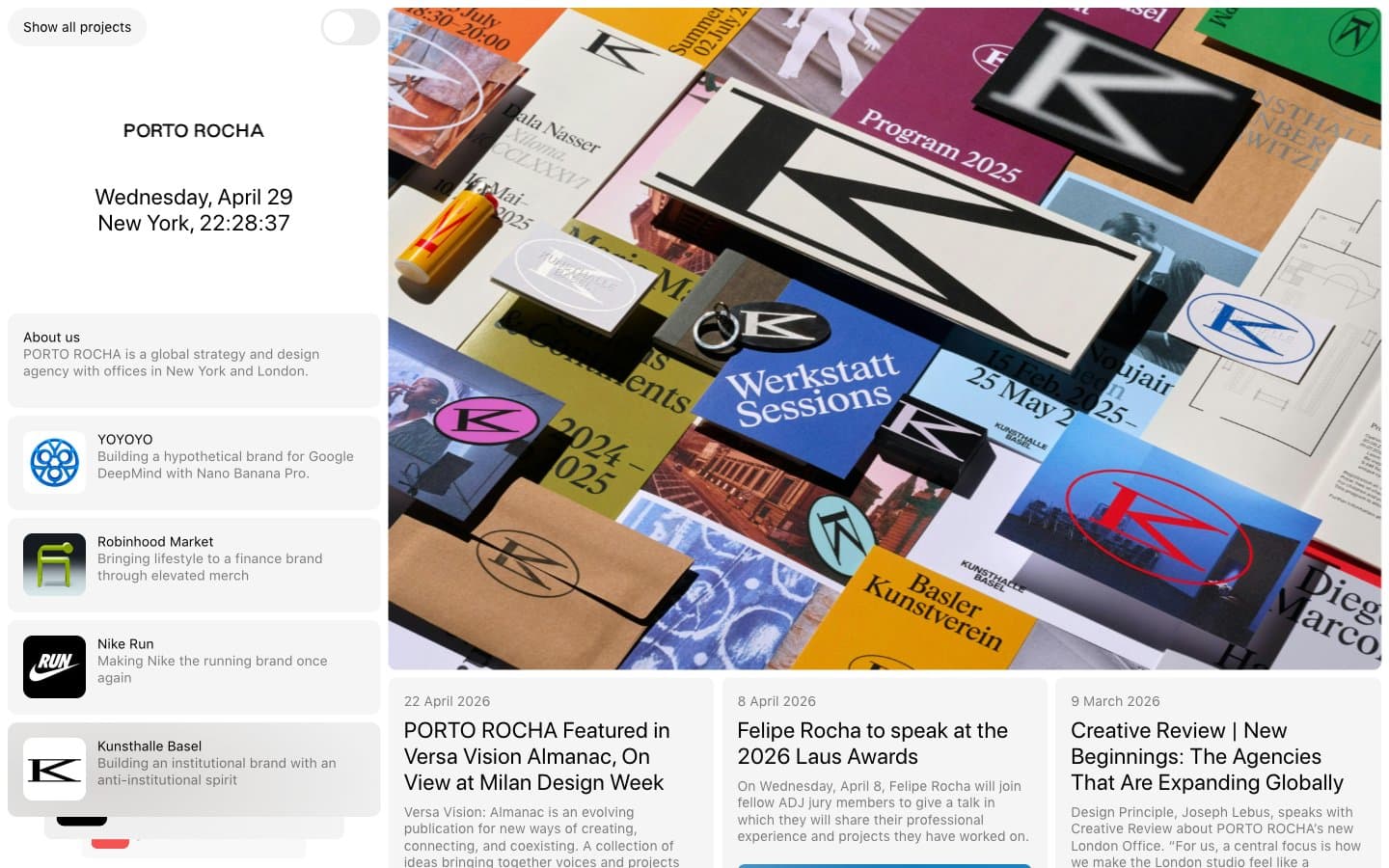
PORTO ROCHA design system

Brand1
Blue wash for highlight backgrounds, decorative bands, and soft emphasis behind content. Do not promote it to the primary CTA color
Neutrals3
Body text, headings, nav borders, card borders, button borders
Secondary text, card borders, nav dividers, muted metadata
Page background, card surfaces, sidebar background
Try a pairing
Pick any two colors from the palette to check whether text stays readable on top.
Aa
Ink Black on System Blue
5.23 : 1 contrast
- Body textPasses AA 4.5
- Large textPasses AA 3
- StrictFails AAA 7
More DESIGN.md files. Same web, different personalities.

Rauno Freiberg
Studio
Emil Kowalski
Studio

14islands
Studio
19–86
Studio
Aaron Poe & Co
Studio
Acceptandproceed
Studio
ACCOMPANY
Studio
Acolorbright
Studio
Adcker
Studio
Adopt
Studio
Agence Foudre
Studio


