
Podscan.fm. A quiet instrument panel where one emerald signal cuts through grayscale data.
- AI
- Light theme
- 25 colors
- 3 typefaces
Podscan.fm reads as a modern data-intelligence console on a crisp white canvas: monochrome foundation, one vivid emerald green as the single navigational north star, and a disciplined palette of categorical colors (violet, pink, blue, teal) used only to differentiate adjacent use-cases or pricing tiers. Typography is a system sans rendered tight — negative tracking at every size creates a compressed, data-display rhythm rather than editorial looseness. Components are flat, lightly bordered, rounded at 8–12px, and rely on hairline #e5e7eb dividers more than shadow for separation. Sentiment badges, colored icon disks, and tier-distinct CTA fills (black, green, violet) carry the color load, so a new page should feel mostly grayscale with green as the verb-action color and secondary hues appearing only as small functional punctuation.
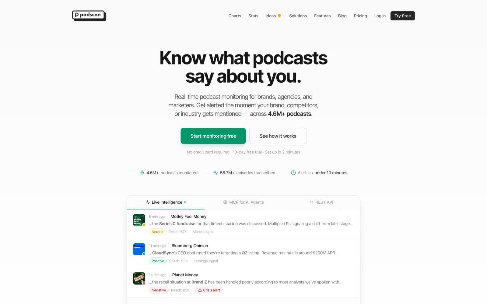
Podscan.fm design system

Brand2
Green action color for filled buttons, selected navigation states, and focused conversion moments.
Secondary green for iconography, category tags, and decorative emphasis where a lighter hue is needed
Accent11
Advanced-plan CTA fill, Partnership/Discovery category icon, premium-tier accent — second tier-color signal
Alternate violet for iconography and link emphasis where a cooler purple reads better
Audience Intelligence category icon, decorative accent strokes
API & Data Platform category icon, link emphasis in body copy
Lighter blue for iconography and secondary accent strokes
Iconography accent, decorative stroke on category visuals
Green wash for highlight backgrounds, decorative bands, and soft emphasis behind content. Use as a supporting accent, not as a status color
Red text accent for links, tags, and emphasized short phrases. Use as a supporting accent, not as a status color
Red text accent for links, tags, and emphasized short phrases. Use as a supporting accent, not as a status color
Green text accent for links, tags, and emphasized short phrases. Use as a supporting accent, not as a status color
Ideas nav marker, small highlight tokens, feature-flag dots
Neutrals12
Primary text, dark CTA fill, logo wordmark, elevated headings — the near-black that anchors every screen
Strong secondary text, button label on light fills, table emphasis
Secondary body text, table cell text, secondary nav items
Muted helper text, link color in body copy, caption-level metadata
Tertiary text, disabled controls, icon strokes at low contrast
Secondary border on links and lighter dividers
Universal hairline border — the dominant structural divider between cards, inputs, table rows, and sections
Soft violet-tint surface wash behind premium-tier highlights
Subtle surface lift for muted cards, table headers, tag backgrounds
Soft blue-tint surface wash behind informational callouts
Primary page canvas and white card surfaces
Page background, card surfaces, button text on dark fills, input fields
Try a pairing
Pick any two colors from the palette to check whether text stays readable on top.
Aa
Onyx Ink on Emerald Signal
4.70 : 1 contrast
- Body textPasses AA 4.5
- Large textPasses AA 3
- StrictFails AAA 7























