
Piet Oudolf. Botanical index on white paper.
- Studio
- Light theme
- 5 colors
- 2 typefaces
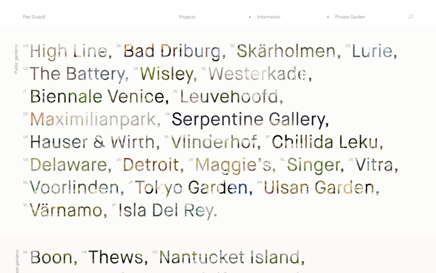
Piet Oudolf's site is a typographic herbarium pressed flat on white paper: a single column of oversized, whisper-weight place names punctuated by tiny two-letter country codes, all rendered in pure grayscale. The system refuses every conventional interface signal — no fills, no shadows, no accent hues, no rounded corners, no gradients — letting scale contrast and a single hairline rule carry the entire hierarchy. Whitespace is the dominant material; elements sit on an infinite white field with surgical, near-calligraphic gaps between them. The mood is botanical index meets art-book colophon: the design disappears so the named gardens can breathe.
Piet Oudolf design system

Neutrals5
SVG icon fills and absolute typographic black where maximum contrast is needed (headings against light imagery)
Primary type, all link and border lines, and the connective tissue of the system — every hairline rule, navigation separator, and body character sits here
Subtle border accent used sparingly to separate tertiary structural elements
Navigation labels, muted metadata, footer text, and the secondary tonal floor that recedes behind lead-gray working type
Page canvas, text on dark inverted sections, and link underline anchor for body copy
Try a pairing
Pick any two colors from the palette to check whether text stays readable on top.
Aa
Field White on Charcoal Black
21.00 : 1 contrast
- Body textPasses AA 4.5
- Large textPasses AA 3
- StrictPasses AAA 7
More DESIGN.md files. Same web, different personalities.

Rauno Freiberg
Studio
Emil Kowalski
Studio

14islands
Studio
19–86
Studio
Aaron Poe & Co
Studio
Acceptandproceed
Studio
ACCOMPANY
Studio
Acolorbright
Studio
Adcker
Studio
Adopt
Studio
Agence Foudre
Studio


