
Photographer. The text IS the architecture.
- Studio
- Light theme
- 9 colors
- 1 typeface
Julia is a visual-first photography portfolio: a white canvas hosting a loose masonry of large editorial frames, interrupted by a massive black wordmark that functions as both identity and graphic device. The interface is deliberately skeletal — no menus, no cards, no buttons — letting high-saturation editorial photography carry the color while the chrome stays black-on-white. Every photographic tile is wrapped in a thin chromatic hairline border drawn from the image's own dominant hue, turning the grid itself into a color study. Type does one thing and does it loudly: an ultra-bold, tightly-tracked wordmark anchors the page and proves the design system is confident enough to let white space do the rest.
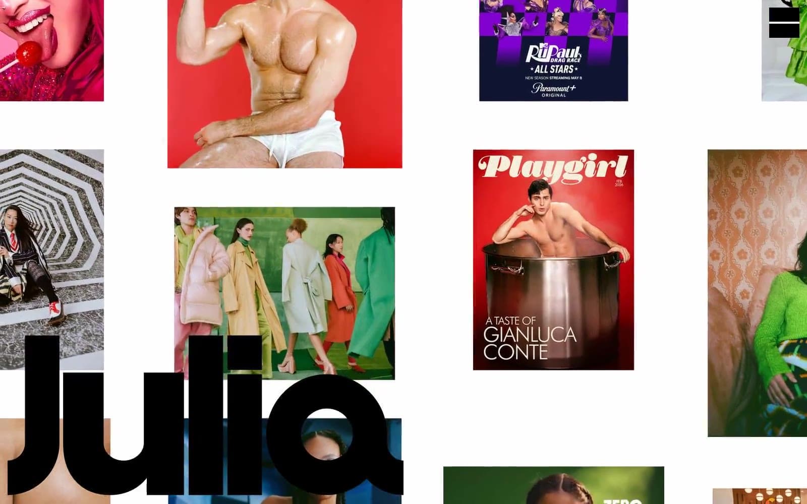
Photographer design system

Accent7
Chromatic hairline borders on photographic tiles whose dominant hue reads red — the most frequent accent border in the grid
Chromatic hairline borders on tiles with blue-dominant photography — paired with Vermillion as the secondary axis of the colored-frame system
Orange accent for outlined action borders, linked labels, and lightweight interactive emphasis.
Chromatic border for green-dominant photography tiles — completes the four-corner color rotation across the masonry
Chromatic border for yellow/golden-toned photography tiles, expanding the color frame vocabulary to five hues
Outlined action border and link accent in navigation and interactive edges — the highest-saturation red in the system
Outlined action border and link accent in navigation, paired with Signal Red for interactive link edges
Neutrals2
The Julia wordmark, all body and nav text, hairline grid borders, and structural lines — the only structural color in the system
Page background, negative space between tiles, surface for the wordmark to read against
Try a pairing
Pick any two colors from the palette to check whether text stays readable on top.
Aa
Canvas White on Vermillion Frame
4.81 : 1 contrast
- Body textPasses AA 4.5
- Large textPasses AA 3
- StrictFails AAA 7
More DESIGN.md files. Same web, different personalities.

Rauno Freiberg
Studio
Emil Kowalski
Studio

14islands
Studio
19–86
Studio
Aaron Poe & Co
Studio
Acceptandproceed
Studio
ACCOMPANY
Studio
Acolorbright
Studio
Adcker
Studio
Adopt
Studio
Agence Foudre
Studio


