
Perplexity AI Computer. Technical interface blooming through botanical haze.
- AI
- Light theme
- 10 colors
- 6 typefaces
Perplexity Computer — naturalistic interface camouflage. The design mimics a lush garden: white flower clusters (cards) float against softly blurred botanical photography, like UI elements composited onto nature footage. Warm sepia text (#271a00 — nearly brown) and cream surfaces (#faf8f5) create the impression of aged parchment overlaid on living greenery. Serif headlines at display sizes contrast with sans-serif UI, echoing the organic/digital tension. 4px and 12px radii appear across all elements except nav pills (40px), maintaining subtle roundness without full-pill uniformity. Generous whitespace (28-40px vertical rhythm) lets content breathe like clearings in foliage. The typeface suite — pplxSans for interface, pplxSerif for declarations — reinforces brand identity through custom letterforms rather than stock choices.
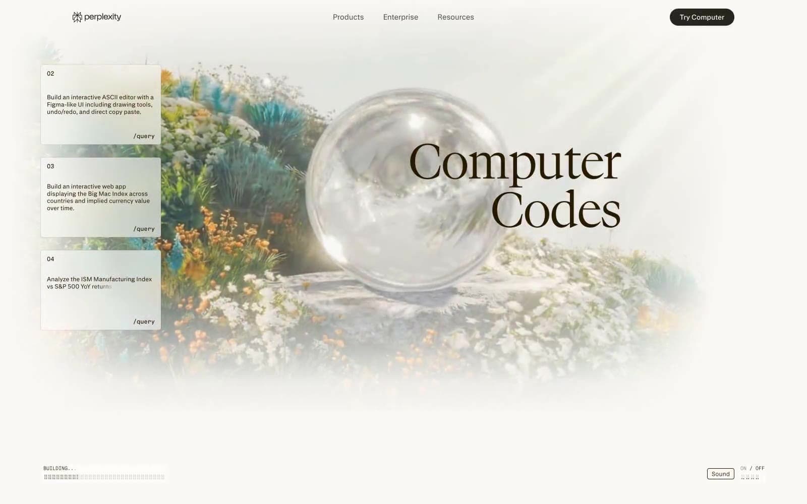
Perplexity AI Computer design system

Brand1
Primary text, borders, icons, strokes — the near-brown warmth softens digital harshness without sacrificing legibility. Appears across every UI context from nav to body to buttons.
Accent1
Nav active states, subtle highlights — the only cool color in a warm palette, used sparingly for interactive focus.
Neutrals8
Footer backgrounds, high-contrast text inversion — appears sparingly, reserved for terminal anchoring at page bottom.
Headline text, button borders — nearly black but slightly warmer, used for maximum contrast without harshness.
Nav backgrounds on scroll, elevated surfaces — a near-black with faint greenish tint echoing the botanical imagery.
Secondary body text, muted labels — a desaturated brown-gray for deemphasized content.
Button fills, borders, dividers — a muted gray-beige midtone that bridges Parchment and Aged Sepia without introducing new chromatic energy.
Tertiary text, disabled states — lightest text color before transitioning to pure white.
Page backgrounds, card surfaces, heading text on dark — the cream canvas against which all content rests. Acts as both background and reversed foreground.
Card backgrounds, reversed text, button fills — pristine whites float above Parchment base, creating layered depth.
Try a pairing
Pick any two colors from the palette to check whether text stays readable on top.
Aa
Pure White on Aged Sepia
17.02 : 1 contrast
- Body textPasses AA 4.5
- Large textPasses AA 3
- StrictPasses AAA 7























