
Pentagram. Gallery wall of compressed restraint.
- Studio
- Light theme
- 9 colors
- 1 typeface
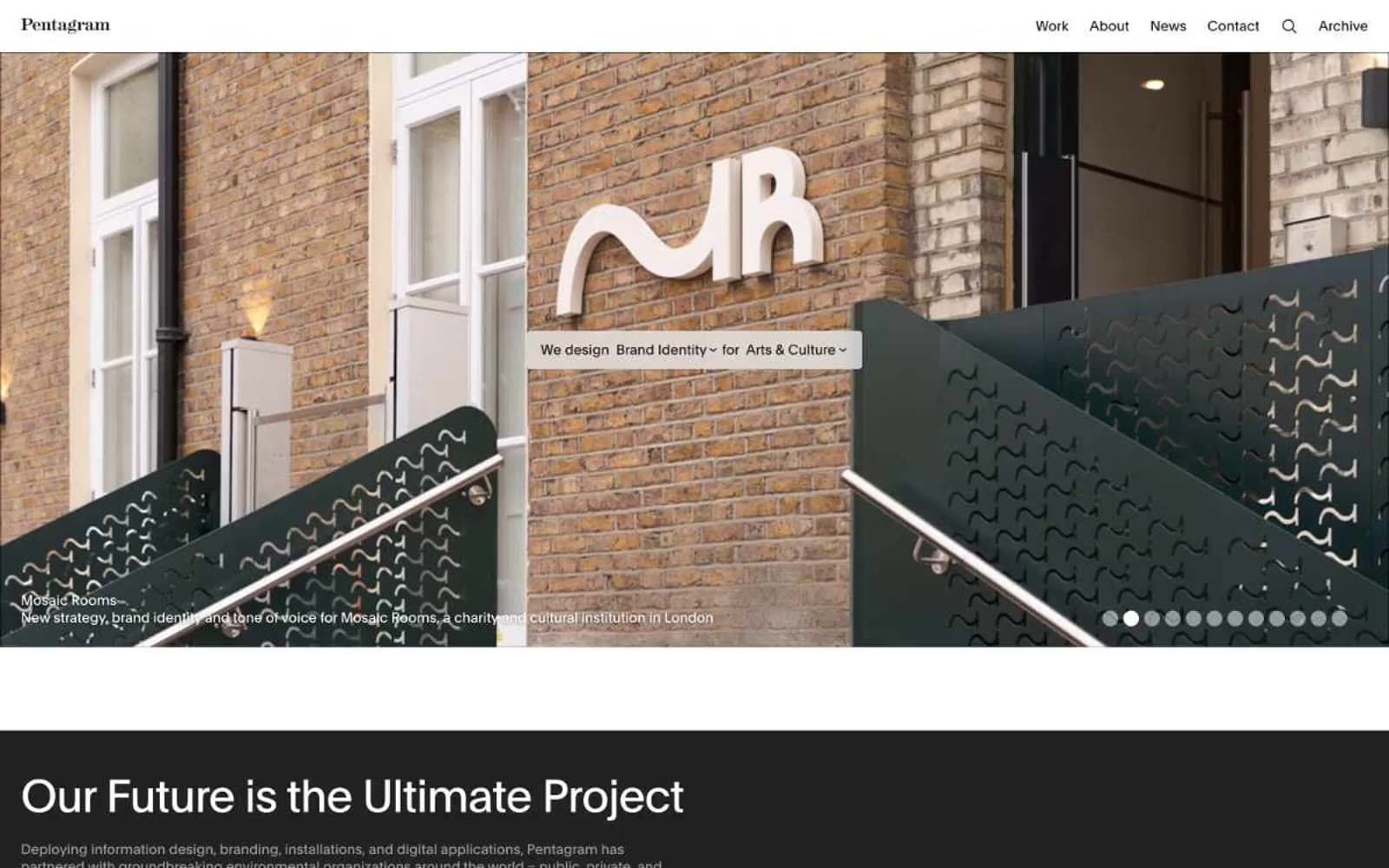
Pentagram's interface behaves like a curated gallery catalog: pure achromatic canvas where the only color that appears is the work itself. Every structural decision is typographic — no icons, no badges, no filled buttons, no decorative chrome. The site alternates between white and near-black bands with massive compressed type, then presents projects as oversized solid blocks that read as color swatches before resolving into actual work. Navigation is a single row of text links. Cards are borderless or hairline-bordered. The system earns its authority through restraint: the same tight tracking and modest weights across every role, so a 52px display heading feels as composed as 13px caption text.
Pentagram design system

Neutrals9
Solid surface fills for dark bands, inverted text backgrounds, inverted footer
Primary body text, heading text, hairline borders, link color — the near-black that carries 90% of all strokes
Elevated dark surface, input field fills on dark contexts
Card border on light surfaces, subtle structural dividers
Muted body text, secondary metadata, less-prominent captions
Light borders, low-emphasis dividers, placeholder text
Subtle alt-row surface, hover wash, low-contrast card fill
Tinted light surface between pure white and true black bands
Page canvas, card surfaces, text on dark bands
Try a pairing
Pick any two colors from the palette to check whether text stays readable on top.
Aa
Paper White on True Black
21.00 : 1 contrast
- Body textPasses AA 4.5
- Large textPasses AA 3
- StrictPasses AAA 7
More DESIGN.md files. Same web, different personalities.

Rauno Freiberg
Studio
Emil Kowalski
Studio

14islands
Studio
19–86
Studio
Aaron Poe & Co
Studio
Acceptandproceed
Studio
ACCOMPANY
Studio
Acolorbright
Studio
Adcker
Studio
Adopt
Studio
Agence Foudre
Studio


