Patrick Miller. A portfolio that behaves like a printed poster.
- Studio
- Light theme
- 9 colors
- 2 typefaces
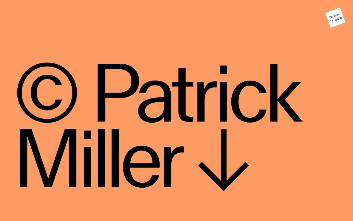
Patrick Miller's site treats every viewport as a single editorial spread: full-bleed color fields carry one oversized typographic statement, then a split-screen gallery follows with almost no UI. The palette is warm and chalky — salmon, blush linen, candlelight cream, and a whisper of sage — never digital or saturated, more like pastel chalk dusted across a wall. MlrStandard, a custom sans, does the heavy lifting at extreme sizes (331px hero) with tight tracking, while a near-invisible secondary chrome handles wayfinding: tiny centered labels, hairline arrows, and one small dark circle as the only solid interactive element. There are no cards, no grids, no shadows — content is presented as flat color blocks and monumental type, the way a magazine cover treats a masthead.
Patrick Miller design system
Brand1
Solid circle action button, link underlines and text — the only dark saturated mark against the chalky fields, dense and editorial
Accent4
Hero full-bleed section background — warm terracotta field that carries the massive name lockup
Section background, split-screen left or right panel — dusty rose that softens adjacent fields
Section background, split-screen panel — off-white cream that recedes behind type
Accent full-bleed background for occasional sections — desaturated eucalyptus that cools the warm system
Neutrals4
All typography, hairline borders, icon strokes, arrow marks — the sole ink color across every surface
Alternate muted button or surface fill — warm-leaning gray-green for secondary controls
Muted section background, quiet tonal step between cream and white
Canvas background, inverse text on dark button, rotated Contact badge fill
Try a pairing
Pick any two colors from the palette to check whether text stays readable on top.
Aa
Paper on Inkwell Blue
9.02 : 1 contrast
- Body textPasses AA 4.5
- Large textPasses AA 3
- StrictPasses AAA 7
More DESIGN.md files. Same web, different personalities.

Rauno Freiberg
Studio
Emil Kowalski
Studio

14islands
Studio
19–86
Studio
Aaron Poe & Co
Studio
Acceptandproceed
Studio
ACCOMPANY
Studio
Acolorbright
Studio
Adcker
Studio
Adopt
Studio
Agence Foudre
Studio


