
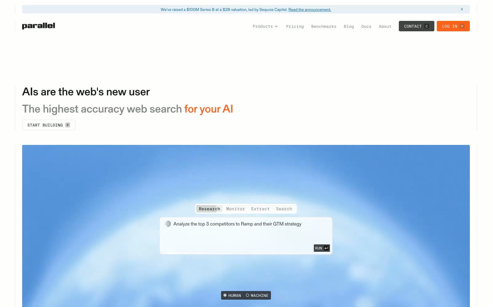
Parallel Web Systems. A technical reading room where data streams replace photography and the type does the talking.
- AI
- Light theme
- 12 colors
- 2 typefaces
Parallel reads like an engineering journal printed on cream paper: a light, editorial canvas in warm off-white, a single serif (gerstnerProgramm) carrying all reading content, and a monospaced secondary voice (ftSystemMono) governing every piece of UI chrome — nav items, buttons, toggles, tags. The palette is almost entirely grayscale with two saturated accent punctuation marks: a steel blue that fills a large data-visualization hero panel, and a vivid orange that lands on exactly one CTA and one inline emphasis phrase. Surfaces are flat and hairline-divided rather than shadowed; radii are brutally small (2px), giving the whole system the feel of a technical schematic. The single dark moment is a dithered, data-textured footer band that mirrors the hero, closing the page in the same visual language it opened with.
Parallel Web Systems design system

Brand1
Hero data-visualization panels, inline emphasis phrases, link/heading accents — the cool, restrained blue of a blueprint or oscilloscope trace, used at scale to make a single colored block dominate a page
Accent1
Orange supporting accent for decorative details and low-frequency emphasis. Do not promote it to the primary CTA color
Neutrals10
Primary text, dark filled buttons (CONTACT), the HUMAN/MACHINE pill toggle — a near-black that is softer than pure #000, the default reading color across all body and headings
Secondary nav and button text, footer secondary links — the mid-tier of the neutral scale, sits between Ink Black and Slate
Body muted text, captions — sits just above Slate in the gray scale for slightly more emphasis
Supporting neutral for secondary UI, dividers, and muted labels.
Inert dividers in nested layouts, scroll-track backgrounds
Inactive chips, tag backgrounds, low-emphasis surface fills
All borders, dividers, and 0.5px inset shadows — the single most-used color on the site, defines every edge
Secondary surface, subtle background bands, disabled-state wash
Page canvas and card surfaces — a warm off-white, never pure white; this tint is the signature that makes the site feel like printed paper rather than a screen
Elevated card surface, button text on dark fills, occasional contrast backgrounds — used sparingly to lift elements above the cream canvas
Try a pairing
Pick any two colors from the palette to check whether text stays readable on top.
Aa
Pure White on Schematic Blue
5.54 : 1 contrast
- Body textPasses AA 4.5
- Large textPasses AA 3
- StrictFails AAA 7























