
Paradigm. A dark first screen cracks into a bright, data-rich scroll.
- AI
- Light theme
- 31 colors
- 4 typefaces
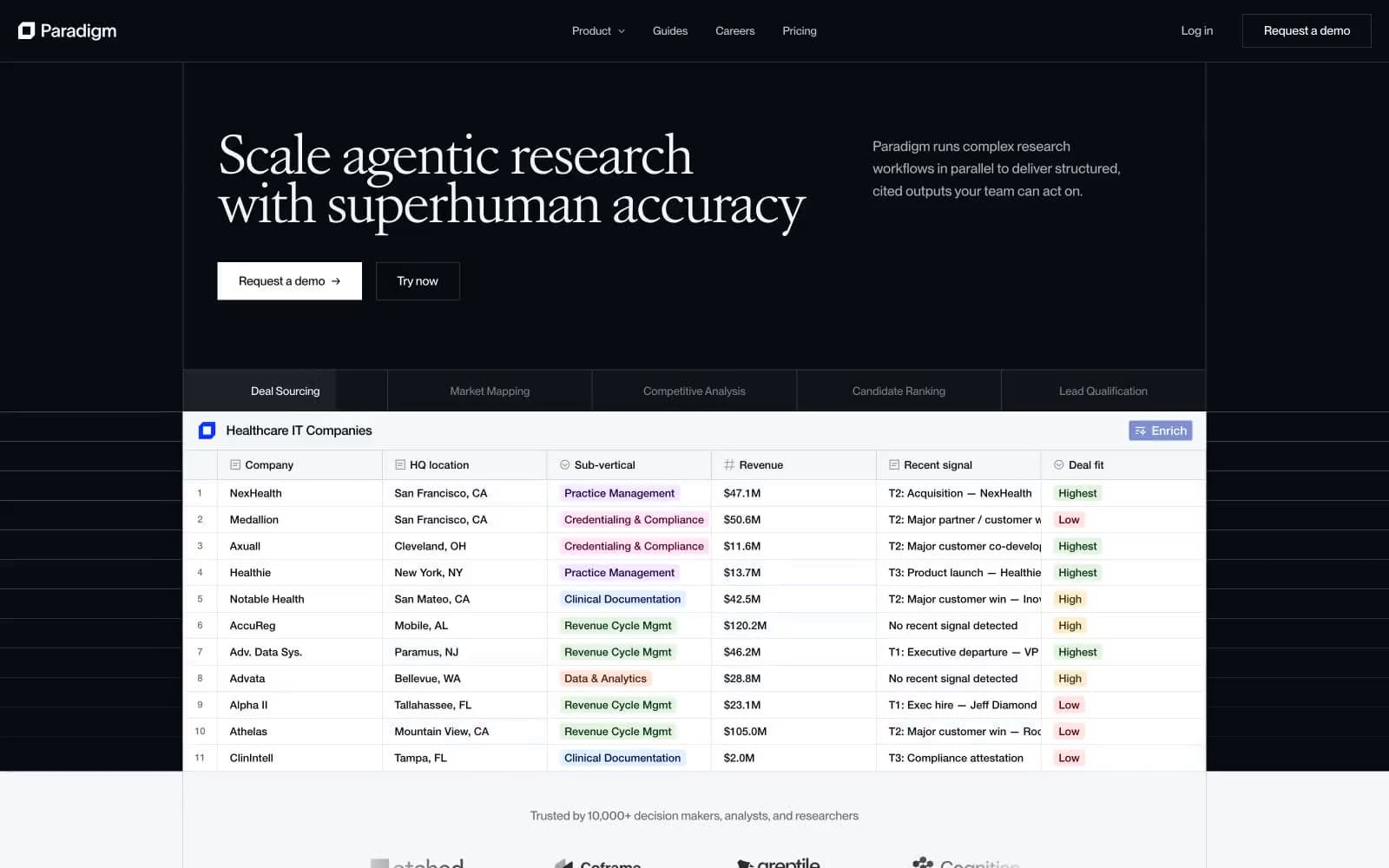
Paradigm opens in a dark observatory atmosphere — near-black canvas, white serif display type, and a live data table that already proves the product — then dissolves into a daylight research interface of white paper, soft tinted surfaces, and pastel status badges. The signature move is the Atacama VAR serif at 44–54px with -0.06em tracking, paired against a workhorse PP Neue Montreal that carries the entire UI at 14–22px with tabular numerals. Color is rationed: one vivid blue (#0a33ff) punctuates the brand through active states and step indicators, status is communicated through six dark-ink + pastel-wash badge pairs (forest, sapphire, mulberry, amber, crimson, plum), and the rest of the system lives in carefully tuned warm and cool grays. Components feel like research instruments — 4px corners, hairline borders, a signature white inner-glow on product mockup cards, and almost no drop shadows.
Paradigm design system

Brand3
Brand accent — active tab indicator, step pill, the Enrich action, selected row check, brand wordmark dot — the single chromatic punctuation across an otherwise neutral system
Muted action fill, secondary blue surfaces, desaturated hover state for the brand blue
Hero gradient terminus — the deepest point of the dark-to-light blue backdrop
Neutrals15
Primary text, hero background, card borders, table rules — the structural near-black that anchors both dark and light regions
Deep text for body emphasis on light backgrounds
Strong secondary borders, card outline emphasis, footer text
Body text secondary level, icon stroke weight
Tertiary body text, supporting metadata
Cool gray border used at extremely high frequency (392) — the workhorse rule-line color for structural divisions
Medium cool border for outlined buttons and inputs
Muted icons, placeholder text, inactive controls
Icon stroke and muted body text on light surfaces
Light borders on secondary controls, list separators
Table column dividers, neutral hairline borders
Tinted table surface and the dominant data-grid border — a barely-violet line that sets the product interface apart from generic grays
Quiet button backgrounds, nested surface tint
Subtle surface lift for secondary panels, table zebra rows, input wells
Page background, card surfaces, inverted button fill in dark hero
semantic13
Info badge background wash
Info badge dark text and border
Success badge background wash
Green state accent for badges, validation surfaces, and short status labels.
Light success badge alternative background
Warning badge background wash
Warning badge dark text and border
Pink/magenta tag badge background — category label
Pink/magenta tag badge dark text and border
Deep violet tag badge dark text and border — alternative category color
Red state accent for badges, validation surfaces, and short status labels.
Orange/copper tag badge background
Orange/copper tag badge dark text and border
Try a pairing
Pick any two colors from the palette to check whether text stays readable on top.
Aa
Paper on Electric Iris
7.17 : 1 contrast
- Body textPasses AA 4.5
- Large textPasses AA 3
- StrictPasses AAA 7























