
Opennote. The interface feels hand-bound, not engineered.
- AI
- Light theme
- 13 colors
- 2 typefaces
Opennote speaks in the voice of a well-loved notebook: warm cream paper, serif headlines that feel hand-set, and a dark-sepia CTA that reads like a leather binding rather than a SaaS button. The palette is almost entirely achromatic — ivory canvas, charcoal ink, hairline graphite rules — with four dark chromatic accents (sepia, ink-violet, forest, oxblood) used sparingly as marginalia, never as fills. Chrome is minimal: a 10px radius, a single border tone, and almost no shadow. Whitespace carries the layout, broken up by hand-drawn line illustrations that float like doodles in a margin. The result is a product that looks like it was designed in a studio with good natural light, not a dashboard that was optimized in a sprint.
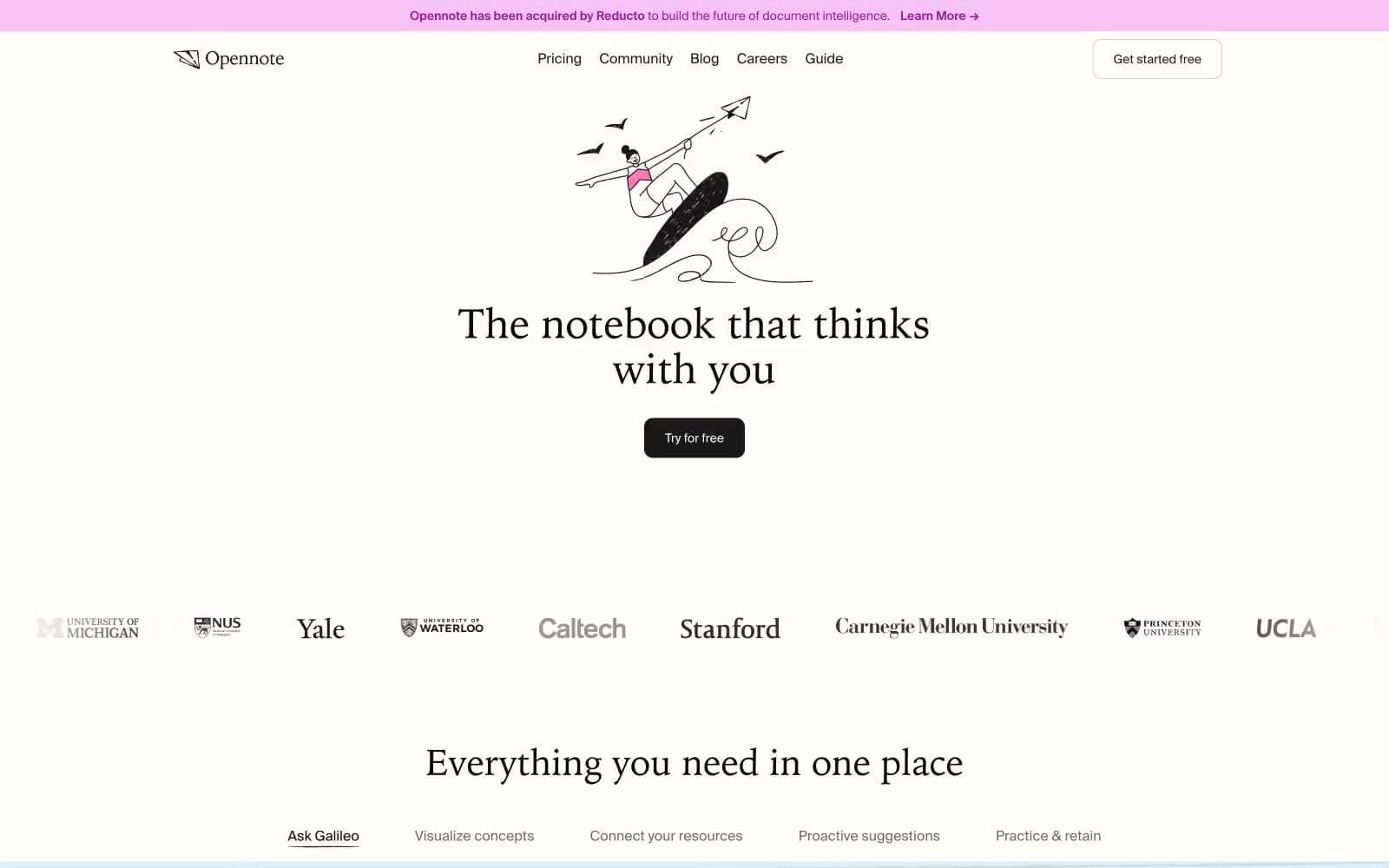
Opennote design system

Brand1
Primary action fill, filled CTA buttons, key accent text. Dark warm brown reads as leather binding — the brand's single chromatic commitment to interface weight
Accent4
Feature-panel surface, deep accent headings, large display blocks. The nocturnal counterpart to ivory — used as a full bleed to break the paper rhythm
Secondary accent text, category tags, decorative strokes. Saturated dark green used the way a fountain-pen user might switch inks
Tertiary accent, pull-quote emphasis, rare highlight text. The most restrained of the ink colors — deployed once or twice per page at most
Decorative highlighter wash, accent backgrounds, illustration fill. The single vivid color — used as a flat block behind a handful of illustrations and never on chrome
Neutrals8
Illustration fill, SVG marks, fine ink details. Hard black reserved for the hand-drawn graphics layer
Primary text, icon strokes, body copy. Near-black with a touch of warmth against the ivory canvas
Secondary body copy, subdued icon detail, supporting prose
Muted helper text, captions, secondary metadata. Reads as pencil-gray against ivory
Button borders, outlined-control frames, slightly heavier than Graphite Rule
Hairline borders, dividers, card outlines, image frames. The dominant structural neutral — everything thin on the page is drawn with this
Alternate surface, recessed panels, secondary card backgrounds beneath the primary ivory
Primary canvas, page background, card surface. Warm off-white reads as paper, not screen
Try a pairing
Pick any two colors from the palette to check whether text stays readable on top.
Aa
Ivory Page on Sepia
12.37 : 1 contrast
- Body textPasses AA 4.5
- Large textPasses AA 3
- StrictPasses AAA 7























