
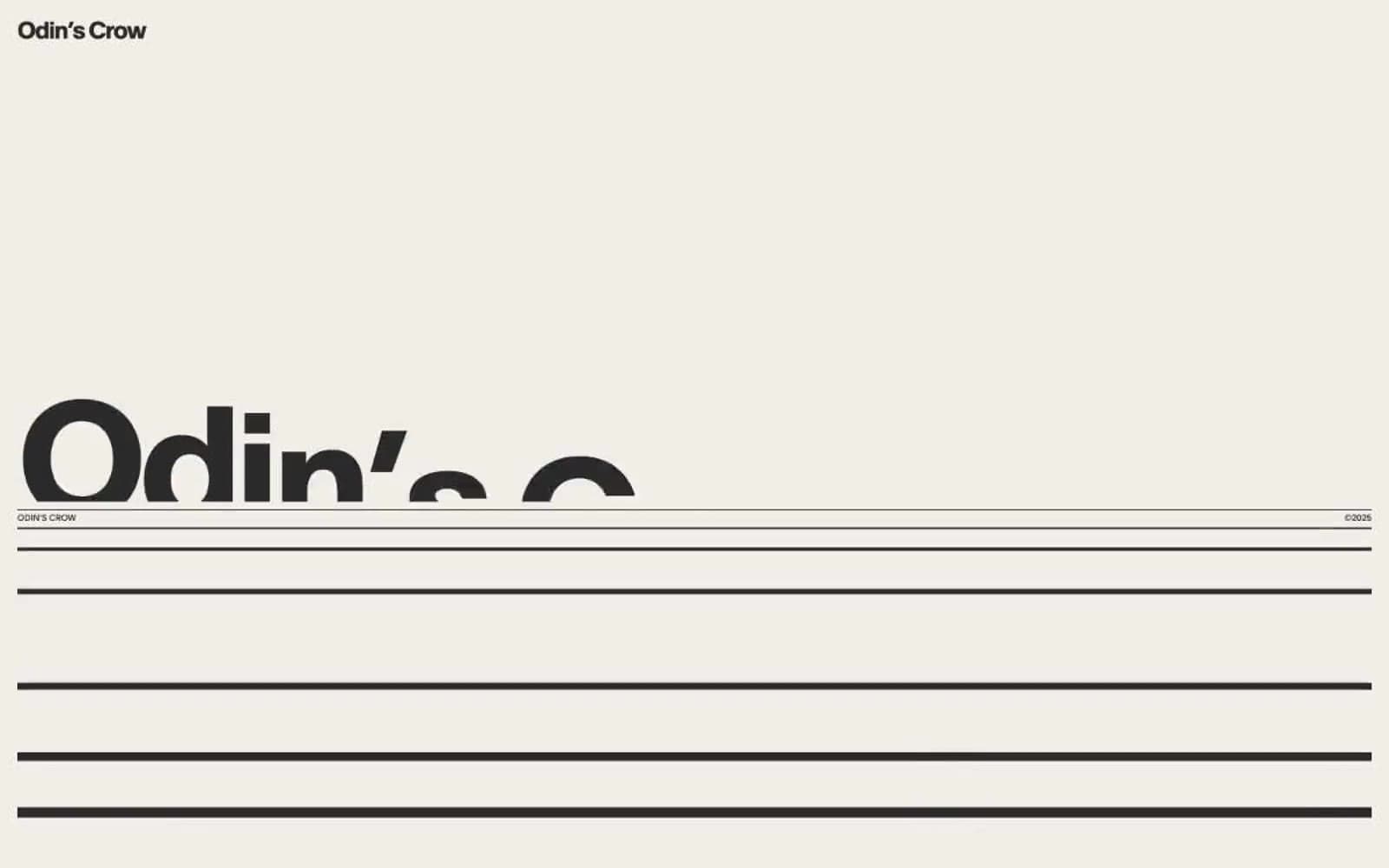
Odin's Crow. A single typographic grid held together by hairline rules, where one massive headline bleeds past the fold while a 10px wordmark anchors the corner.
- Studio
- Light theme
- 8 colors
- 1 typeface
Odin's Crow operates as a typographic broadsheet — a Swiss editorial design language where type, rules, and negative space do all the work. The palette is almost entirely warm bone-and-ink: a single near-black text color sits on warm parchment surfaces, separated not by cards or shadows but by full-bleed horizontal rules in stone gray. Scale is weaponized: a 10px wordmark in the top corner exists in the same composition as 190px display headlines that deliberately bleed off the right edge. Section organization uses a numbered system (1.1, 1.2…) paired with short labels, mimicking manuscript chapters. There are no buttons, no gradients, no shadows, no imagery — the design system is purely typographic and structural, trusting the geometry of the page to carry the entire visual identity.
Odin's Crow design system

Neutrals8
Primary text and graphic fill — near-black with no pure-black harshness, used for all type at every size and for icon/illustration fills
Secondary text and muted borders — for sub-labels, metadata, and the dimmer secondary rule lines
Subtle warm-gray accent — the only chromatically-tinged neutral, reserved for occasional emphasis on a word or number
Deepest warm surface — tan accent band, used sparingly as a third surface level for footer blocks or inverted sections
Muted UI surface for disabled controls, low-emphasis panels, and placeholder blocks.
Warm section surface — slightly more saturated beige used to differentiate bands or sidebar zones from the main bone canvas
Primary page canvas — warm off-white that carries the entire reading surface; everything else floats on or beside it
Structural divider lines and hairline borders — the single most-used color in the system at 2300+ occurrences, used exclusively to draw the rules that separate sections
Try a pairing
Pick any two colors from the palette to check whether text stays readable on top.
Aa
Ash on Inkstone
11.44 : 1 contrast
- Body textPasses AA 4.5
- Large textPasses AA 3
- StrictPasses AAA 7
More DESIGN.md files. Same web, different personalities.
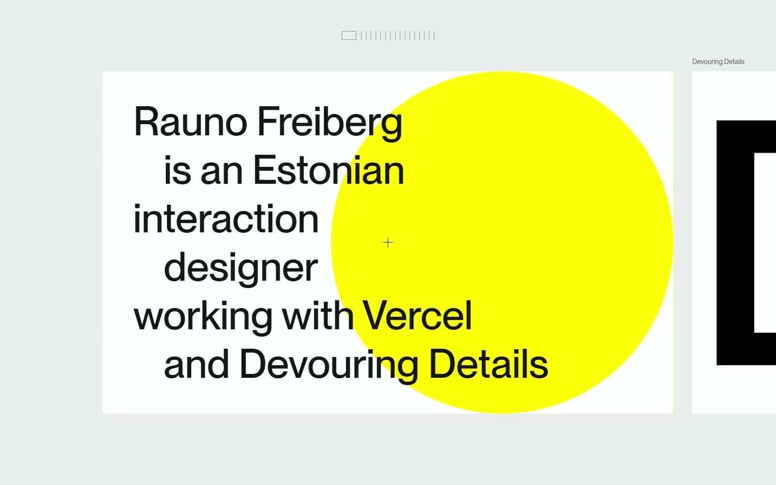
Rauno Freiberg
Studio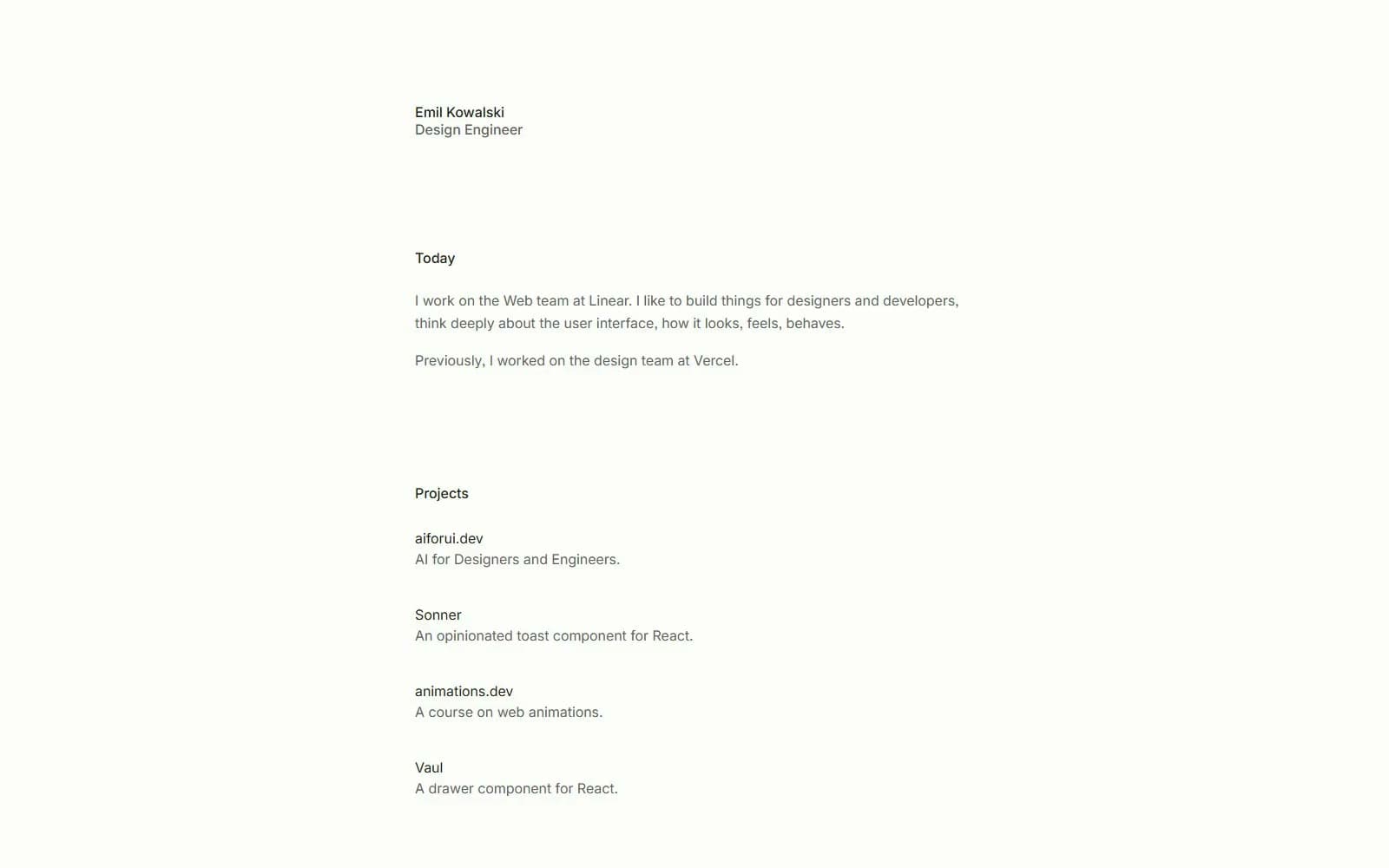
Emil Kowalski
Studio
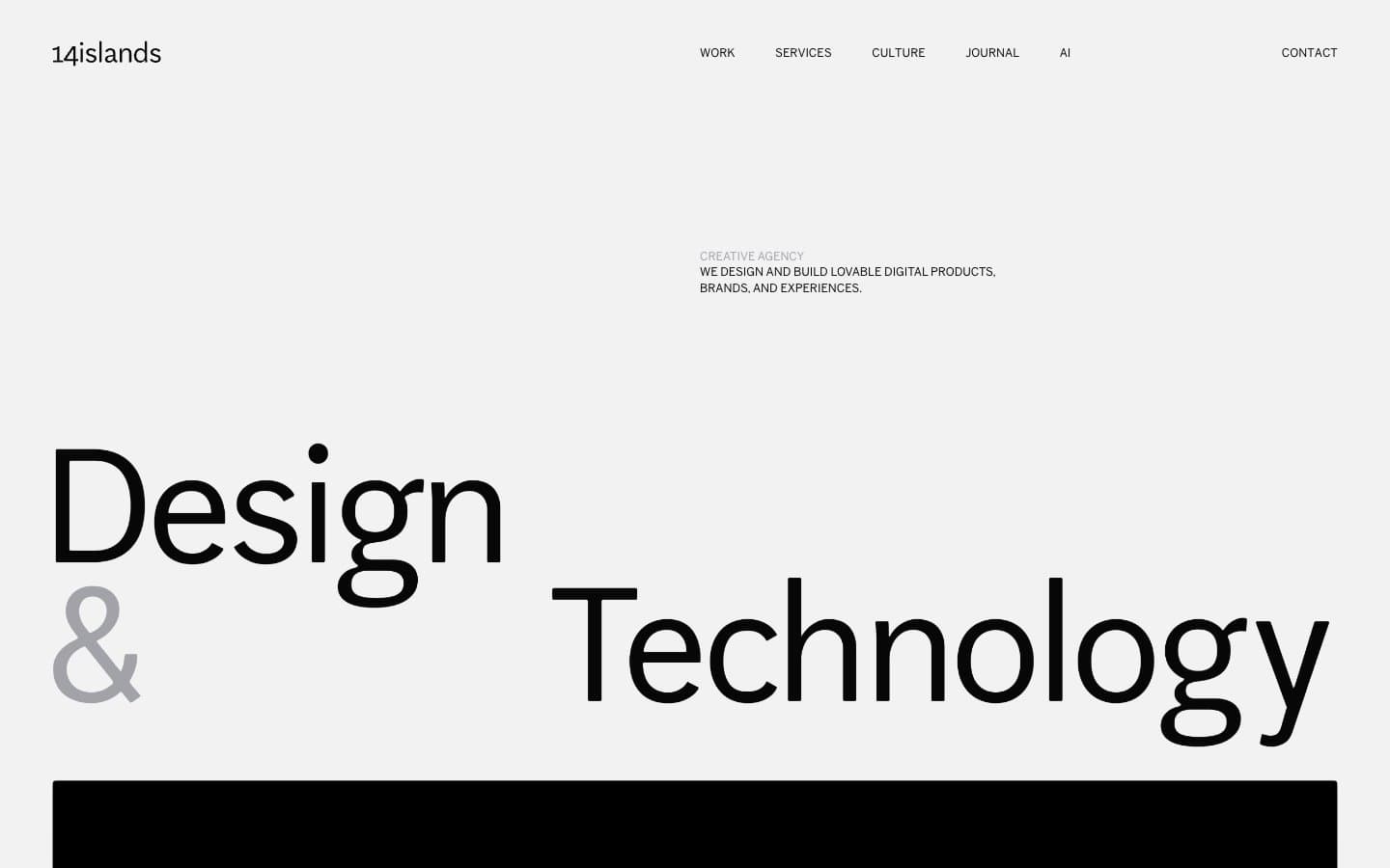
14islands
Studio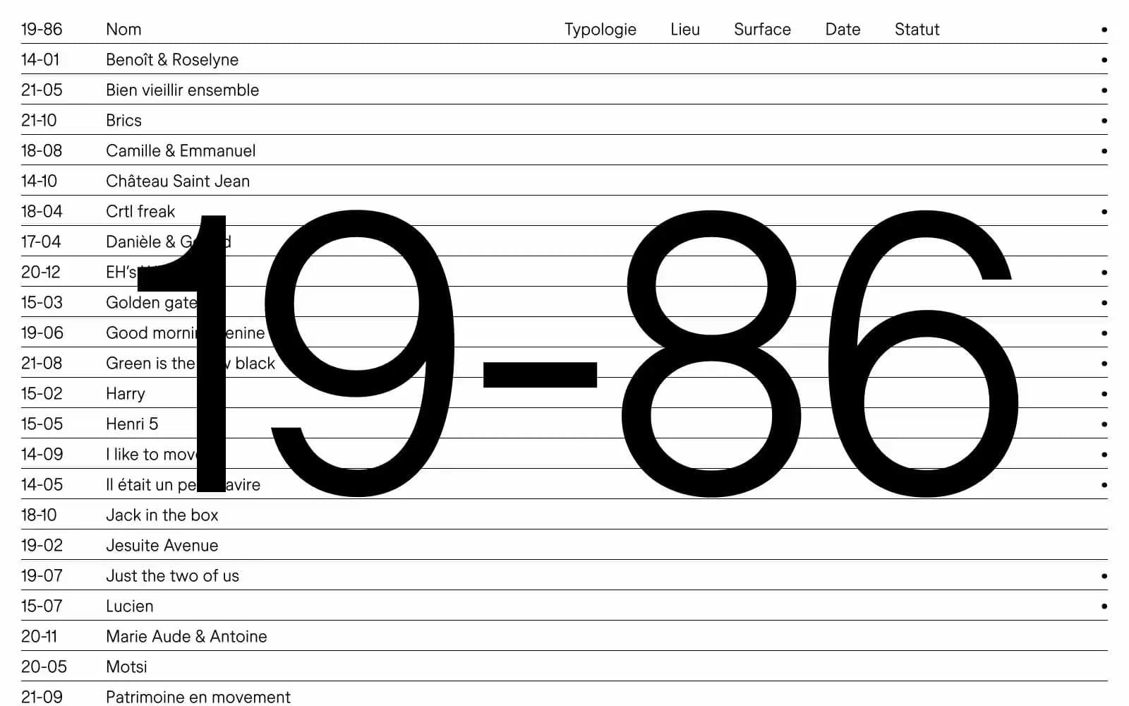
19–86
Studio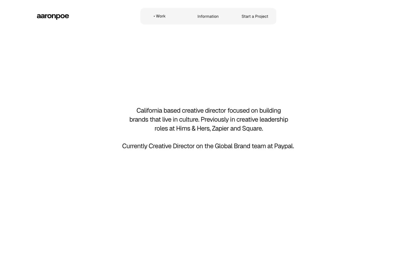
Aaron Poe & Co
Studio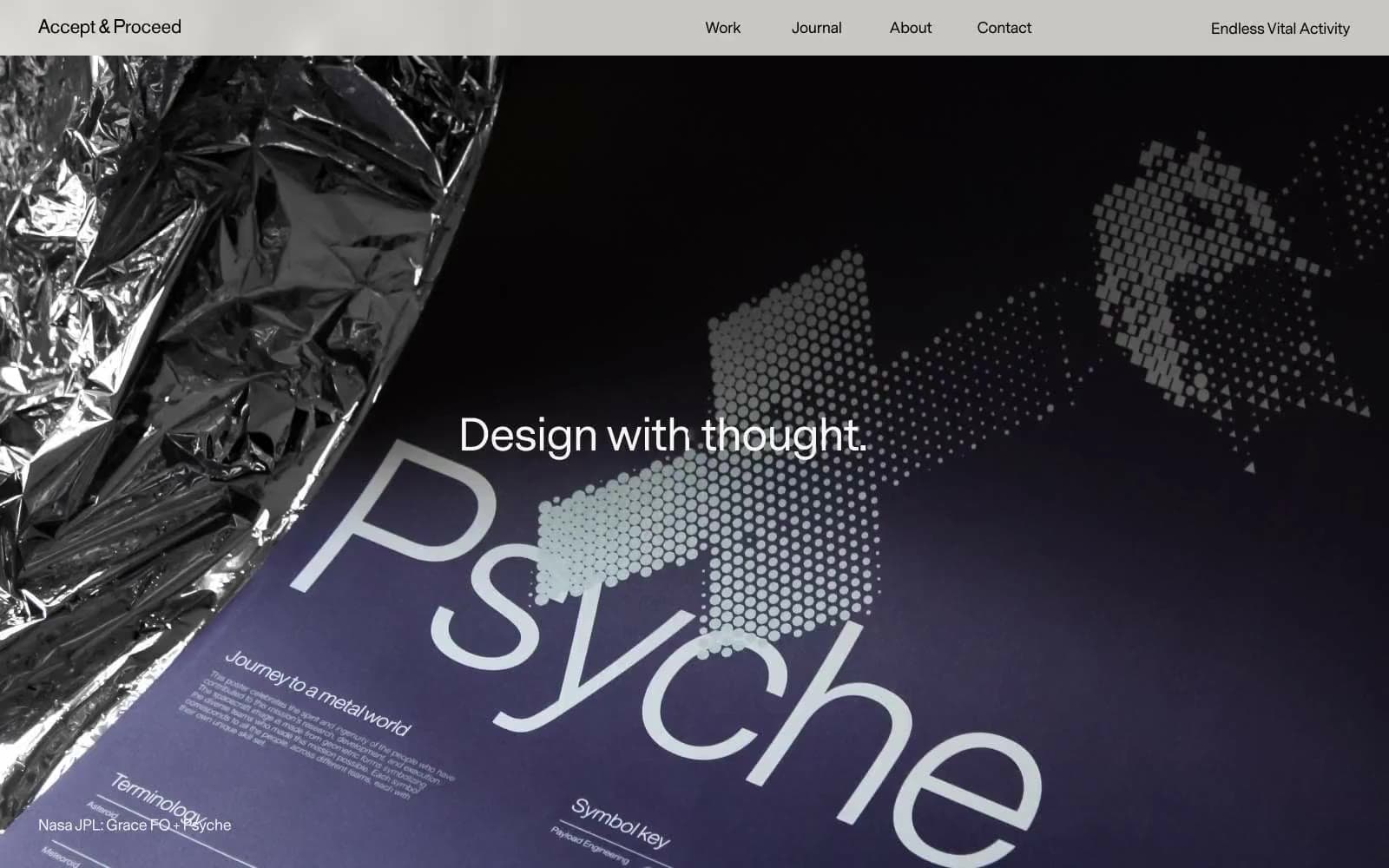
Acceptandproceed
Studio
ACCOMPANY
Studio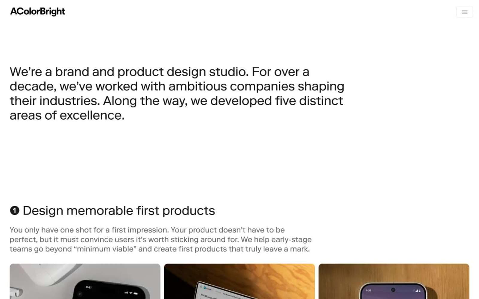
Acolorbright
Studio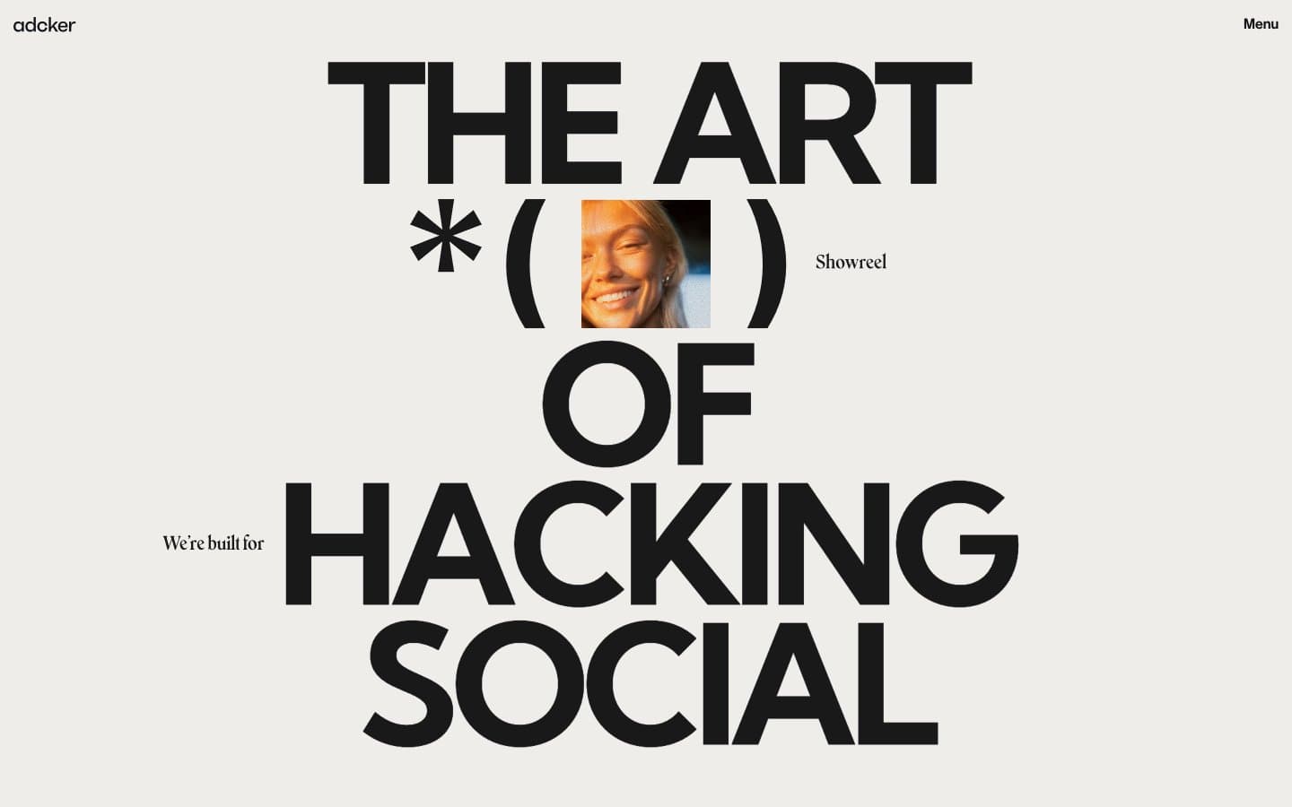
Adcker
Studio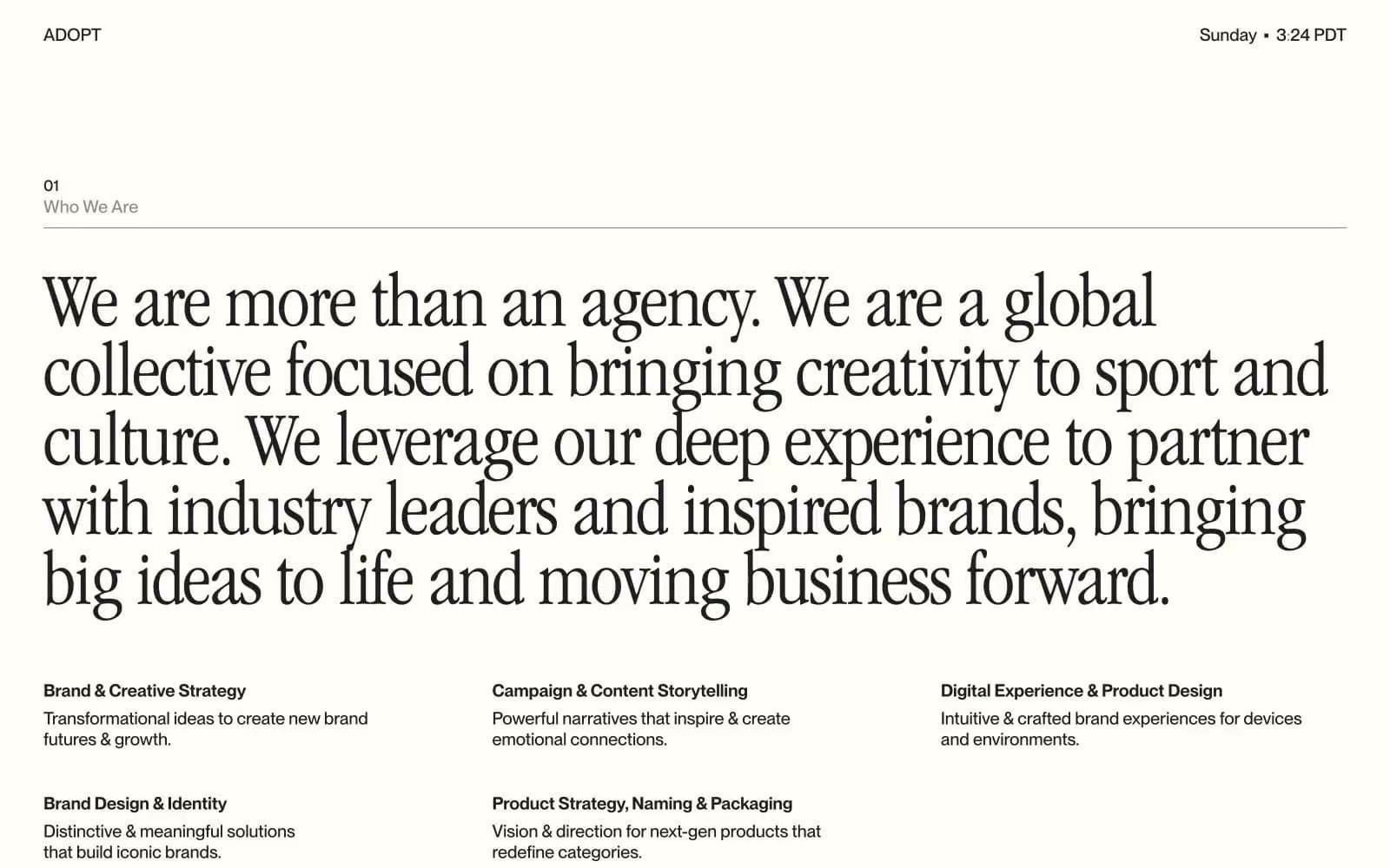
Adopt
Studio
Agence Foudre
Studio


