
Obviously. Whimsical claymation on white paper.
- AI
- Light theme
- 14 colors
- 3 typefaces
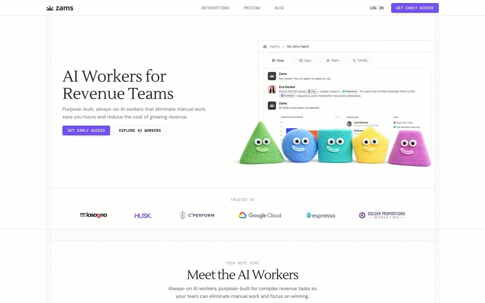
Zams runs a dual-language visual system: a rigorously minimal, serif-headed enterprise aesthetic married to a cast of chubby, candy-colored claymation characters that embody the AI workers themselves. The white canvas is intentional stage-craft — it lets the violet CTA (#7451f2), the subtle dotted-grid patterns, and the pastel mascots carry all the visual personality while the surrounding chrome (tabs, integration logos, compliance badges) stays quietly functional. Headlines use a warm serif (Lustria) with tight negative tracking, body and UI run on DM Sans, and labels like "COMING SOON", "EVAN", and "YOUR NEXT HIRE" shift into Martian Mono to give sections a technical, almost build-log voice. Components are square-jawed: 4px corners, hairline borders, one subtle button shadow, and no decorative gradients. The overall tone is enterprise-credible but never sterile — the mascots break the tension, and the monospace meta-labels signal "this product is engineered, not assembled."
Obviously design system

Brand2
Primary filled CTA buttons, active tab indicator, the single chromatic accent across the whole system. One vivid purple against a near-achromatic canvas creates brand presence without color noise
Outlined/ghost action border, secondary violet for secondary buttons and stroke accents. Darker tone of the primary — keeps the brand family intact when a softer surface is needed
Neutrals10
Maximum-contrast text, decorative SVG fills, and the deepest borders where full opacity is required
Primary text color, heading strokes, icon fills, footer text — the dominant near-black that gives the white canvas its voice
Link text and image borders where a slightly softer black than #272727 is needed
Secondary text, nav metadata, slightly darker than Slate for emphasis without going to black
Body text and the workhorse border tone — paragraphs, helper copy, and the hairline rules that separate sections
Placeholder text, low-emphasis captions, the most recessive neutral for de-emphasized meta
Muted dividers, disabled-ish rules, tertiary borders — the quietest border tone that still reads on white
Light borders, button outline borders, table dividers, card edges — the bright hairline tone
Subtle surface elevation for cards and section bands sitting on the white canvas — just enough contrast to define a panel without darkening the page
Page canvas, button text on violet fill, card surfaces, footer background — the dominant background color
semantic2
Blue state accent for badges, validation surfaces, and short status labels. Do not promote it to the primary CTA color
Neutral form states, badge text, and quiet UI feedback where color should stay understated.
Try a pairing
Pick any two colors from the palette to check whether text stays readable on top.
Aa
Paper White on Iris Violet
5.00 : 1 contrast
- Body textPasses AA 4.5
- Large textPasses AA 3
- StrictFails AAA 7























