
Not Real. A high-end catalog where only the artwork is allowed to scream with color.
- Studio
- Light theme
- 3 colors
- 2 typefaces
NotReal operates as a typographic gallery: a near-empty off-white canvas where large product renders and campaign stills do the visual talking while two custom typefaces carry the verbal load. The system is deliberately chromatic-starved — three grays compose 99% of the interface — so that every saturated pixel arrives as client artwork, never as UI chrome. Layout is editorial, not app-like: an asymmetric two-column grid where hero images land at varying vertical offsets to create z-pattern reading flow, with vertical running text and micro-metadata adding a printed-catalog rhythm. The pairing of ogg (a high-contrast didone-influenced serif) for display with telegraf (geometric sans) for everything else is the signature — a whisper-and-speak duality where the serif announces the work and the sans documents it.
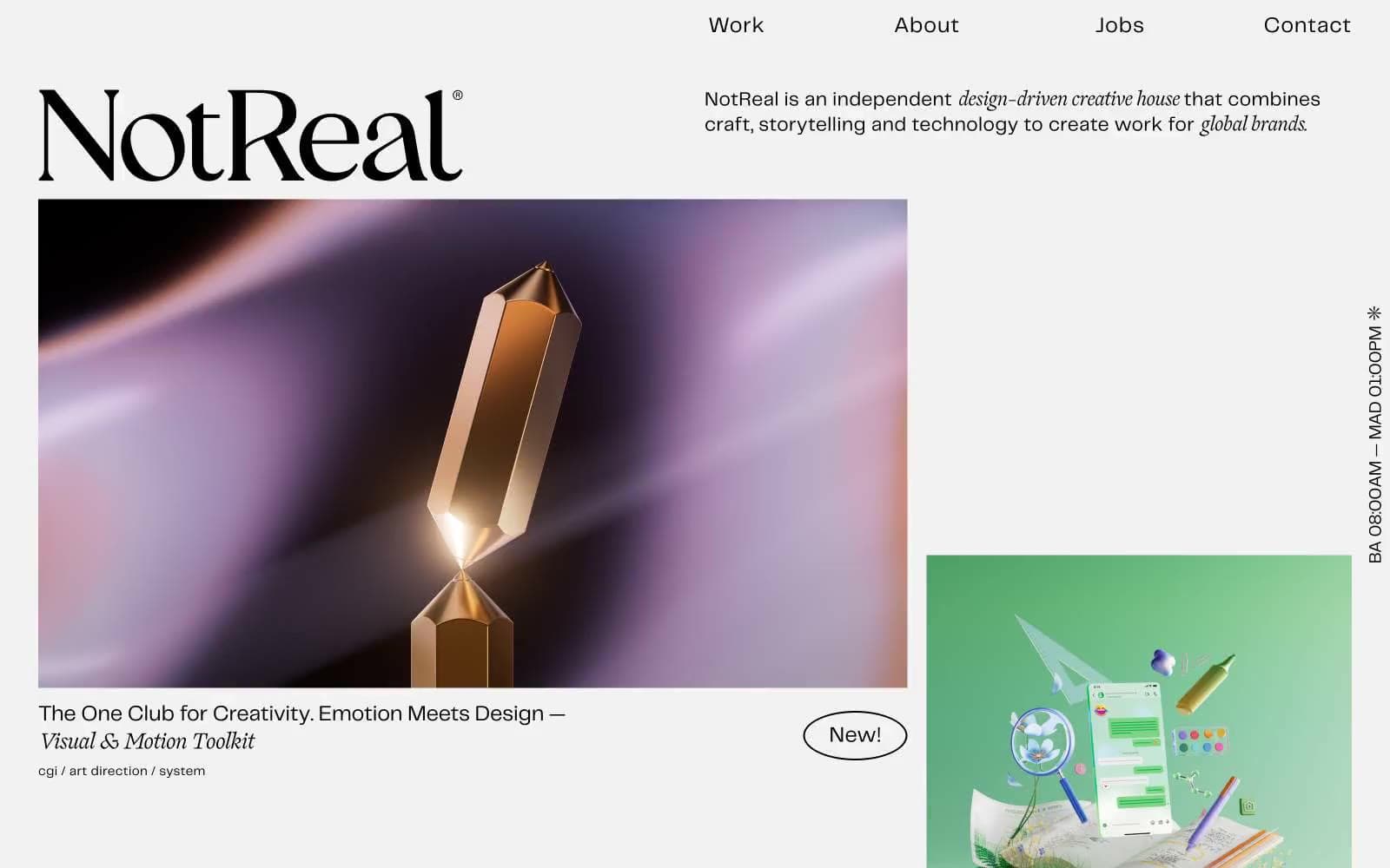
Not Real design system

Neutrals3
Link border underlines, footer text, icon strokes, image overlay text — used as a chromatic anchor only where maximum contrast against Vellum is required
Primary text, dominant border strokes (635 occurrences as borderColor), nav accents
Page canvas, card surfaces — warm-leaning off-white that gives the page a paper-stock feel rather than digital white
Try a pairing
Pick any two colors from the palette to check whether text stays readable on top.
Aa
Vellum on Full Black
18.76 : 1 contrast
- Body textPasses AA 4.5
- Large textPasses AA 3
- StrictPasses AAA 7
More DESIGN.md files. Same web, different personalities.

Rauno Freiberg
Studio
Emil Kowalski
Studio

14islands
Studio
19–86
Studio
Aaron Poe & Co
Studio
Acceptandproceed
Studio
ACCOMPANY
Studio
Acolorbright
Studio
Adcker
Studio
Adopt
Studio
Agence Foudre
Studio


