
New Genre. A single gradient arc from charred umber through steel twilight to warm parchment, against which condensed serif headlines carve like editorial mastheads.
- Studio
- Light theme
- 8 colors
- 5 typefaces
New Genre operates in a cinematic dawn-to-dusk register: near-white surfaces, a near-black text color, and one monumental gradient that arcs from charred brown through steel blue to warm cream — that gradient IS the brand. Typography is a two-voice conversation between a condensed display serif (Serrif Condensed) that fills the top of every page with editorial gravity, and a low-weight geometric sans (Saans Variable) that handles everything else with quiet precision. The system is deliberately monochromatic at the interface level — no accent buttons, no chromatic badges — letting photographic work, gradient washes, and typographic contrast carry all the emotion. Components are architectural: pill-shaped controls at 50-90px radius, 16px-radius cards, hairline dividers, and barely-there elevation. Space is compact and functional, never decorative.
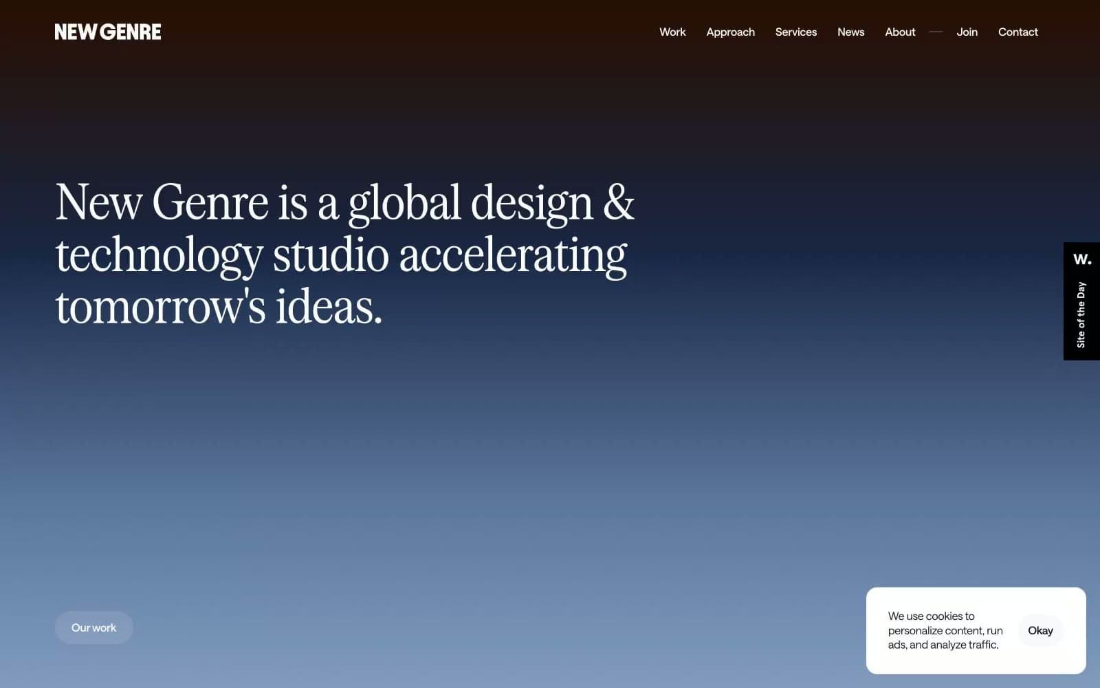
New Genre design system

Brand1
Brand signature — represents the iconic hero gradient (charred umber → steel twilight → warm parchment); used in gradient washes, atmospheric overlays, and the gradient-text reveal effect on display headlines
Accent1
Accent warmth for radial gradient highlights and hover-state glows — the golden-hour counterpoint to the cool steel-blue arc
Neutrals6
Footer text, heavy display accents, icon strokes — reserved for maximum weight moments
Primary body text, headings, input text, icon fills — blue-shifted near-black replaces pure #000 across the interface
Footer surface, dark contrast bands, gradient origin stop — warm dark anchors the bottom of the spectrum
Secondary headings, subdued labels, inactive nav — desaturated mid-gray for quiet hierarchy
Supporting neutral for secondary UI, dividers, and muted labels.
Page backgrounds, card surfaces, inverse text on dark fills
Try a pairing
Pick any two colors from the palette to check whether text stays readable on top.
Aa
Parchment Canvas on Pure Black
21.00 : 1 contrast
- Body textPasses AA 4.5
- Large textPasses AA 3
- StrictPasses AAA 7
More DESIGN.md files. Same web, different personalities.

Rauno Freiberg
Studio
Emil Kowalski
Studio

14islands
Studio
19–86
Studio
Aaron Poe & Co
Studio
Acceptandproceed
Studio
ACCOMPANY
Studio
Acolorbright
Studio
Adcker
Studio
Adopt
Studio
Agence Foudre
Studio


