
Motto®. A single confident voice announcing itself on bone-white stock.
- Studio
- Light theme
- 10 colors
- 2 typefaces
Motto® speaks in pure typographic voice: a light gray canvas, no chromatic accents, no shadows, and no decorative graphics — only two typefaces, generous whitespace, and the confidence to let a 154px headline carry an entire screen. Weight 500 is used everywhere; nothing is bold, nothing is light, so hierarchy comes from size, tracking, and whitespace rather than visual weight. Interaction is reduced to underlined text and pill-shaped controls (9999px radius), and the ® mark and asterisk-burst function as the only brand motifs. The result is a site that reads like an editorial spread rather than a product page — monochrome, declarative, and structurally disciplined.
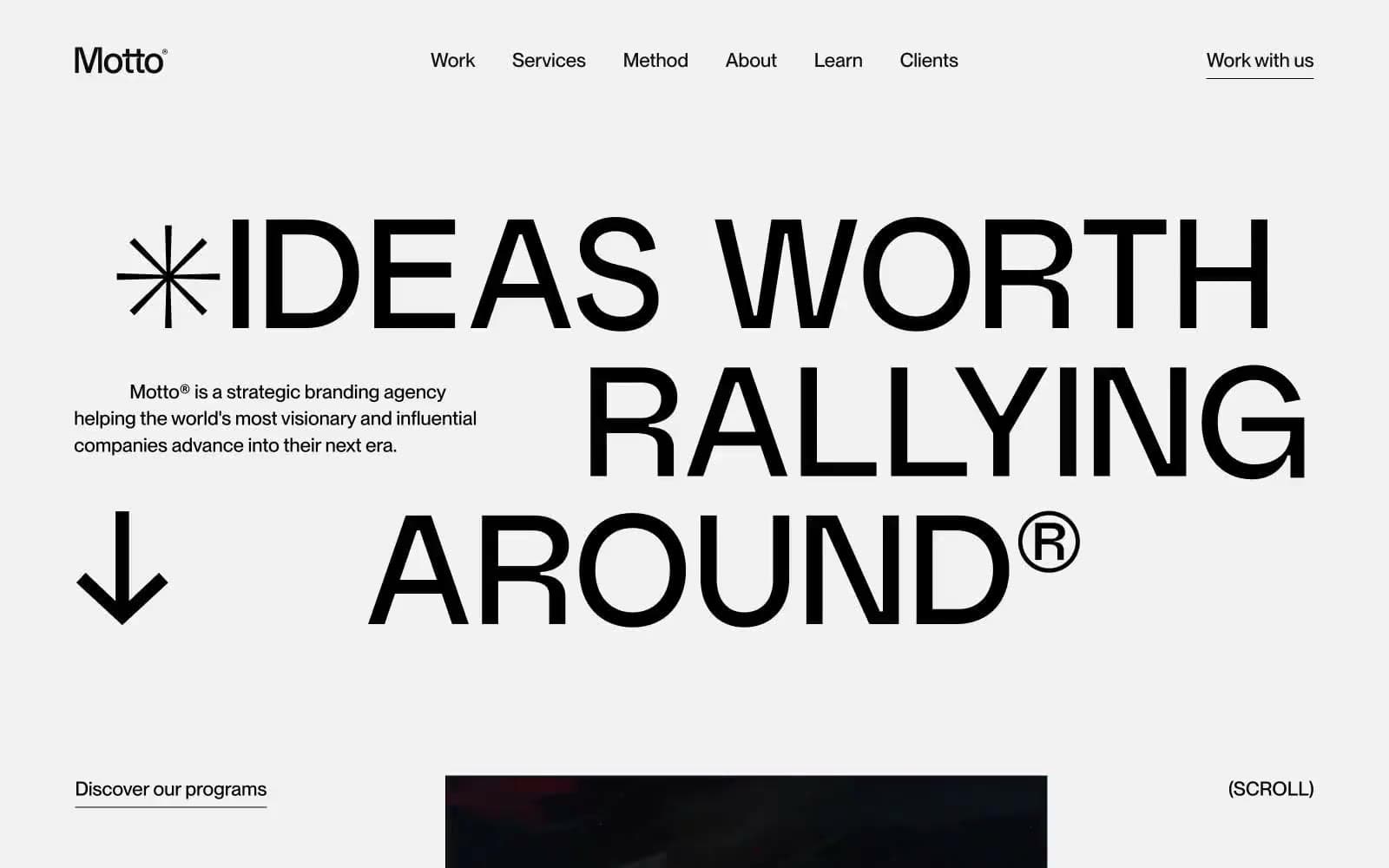
Motto® design system

Neutrals10
Primary text, headlines, logo wordmark, borders, decorative marks — the only ink in the system
Supporting neutral for secondary UI, dividers, and muted labels. Do not promote it to the primary CTA color
Body text on inverted or elevated surfaces, slightly stronger than Slate
Tertiary text, footnote-level annotations
Body secondary text, helper copy, muted annotations
Disabled nav items, list bullets, low-priority metadata, scroll cues
Input field borders, form control edges
Hairline dividers between sections, subtle separators, secondary surface
Page canvas — the default background; sections sit on this without a card wrapper
Card surfaces, testimonial panels, text on dark fills, inverted nav state
Try a pairing
Pick any two colors from the palette to check whether text stays readable on top.
Aa
Bone Paper on Motto Ink
21.00 : 1 contrast
- Body textPasses AA 4.5
- Large textPasses AA 3
- StrictPasses AAA 7
More DESIGN.md files. Same web, different personalities.

Rauno Freiberg
Studio
Emil Kowalski
Studio

14islands
Studio
19–86
Studio
Aaron Poe & Co
Studio
Acceptandproceed
Studio
ACCOMPANY
Studio
Acolorbright
Studio
Adcker
Studio
Adopt
Studio
Agence Foudre
Studio


