
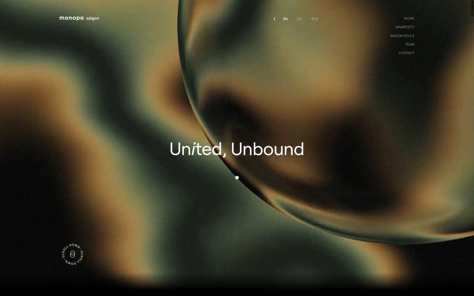
monopo saigon. A monochrome editorial gallery floating on molten light.
- Studio
- Light theme
- 8 colors
- 3 typefaces
Monopo Saigon runs on radical monochrome discipline: pure black and white with whisper-thin grays, wrapped around massive Roobert typography that breathes across full-bleed canvases. The signature contrast lives between austere editorial restraint (sharp 0px corners on navigation and text links, generous whitespace, 4px-based rhythm) and a single expressive gesture — full-pill 75px-radius buttons that float like liquid over imagery. Hero environments lean into iridescent, fluid, chromatic atmospheres (greens dissolving into amber into deep oxblood) while the interface itself never picks up a hue, creating the feeling of a black-and-white editorial gallery floating on a river of liquid light. Type sets the temperature: weight 300 at 78px whispers, weight 400 at 225px fills the viewport, and weight 400 at 11px labels everything else with confident minimalism. Motion is expressive but patient — cubic-bezier(0.19, 1, 0.22, 1) ease curves stretching up to 1.25s transform transitions, letting elements glide rather than snap.
monopo saigon design system

Brand1
Chromatic accent appearing only inside the hero gradient wash — molten oxblood anchor of the iridescent atmosphere, not used in interface controls
Neutrals7
Primary text, SVG strokes, overlay fills — pure black carries all foreground information and graphic marks
Footer body copy and secondary headings — softened black for long-form reading blocks
Filled neutral button background — the only solid fill used for actions like Accept
Muted helper text, address blocks, legal copy — quiet annotations that recede without disappearing
Secondary mid-tone neutral for hover or muted state layers
Mid-tone neutral for disabled or low-contrast surfaces in the surface stack
Light text on dark surfaces, inverse labels, and high-contrast captions. Do not promote it to the primary CTA color
Try a pairing
Pick any two colors from the palette to check whether text stays readable on top.
Aa
Paper on Obsidian
21.00 : 1 contrast
- Body textPasses AA 4.5
- Large textPasses AA 3
- StrictPasses AAA 7
More DESIGN.md files. Same web, different personalities.

Rauno Freiberg
Studio
Emil Kowalski
Studio

14islands
Studio
19–86
Studio
Aaron Poe & Co
Studio
Acceptandproceed
Studio
ACCOMPANY
Studio
Acolorbright
Studio
Adcker
Studio
Adopt
Studio
Agence Foudre
Studio


