
Mistral. Warm parchment with a campfire heart.
- AI
- Light theme
- 8 colors
- 1 typeface
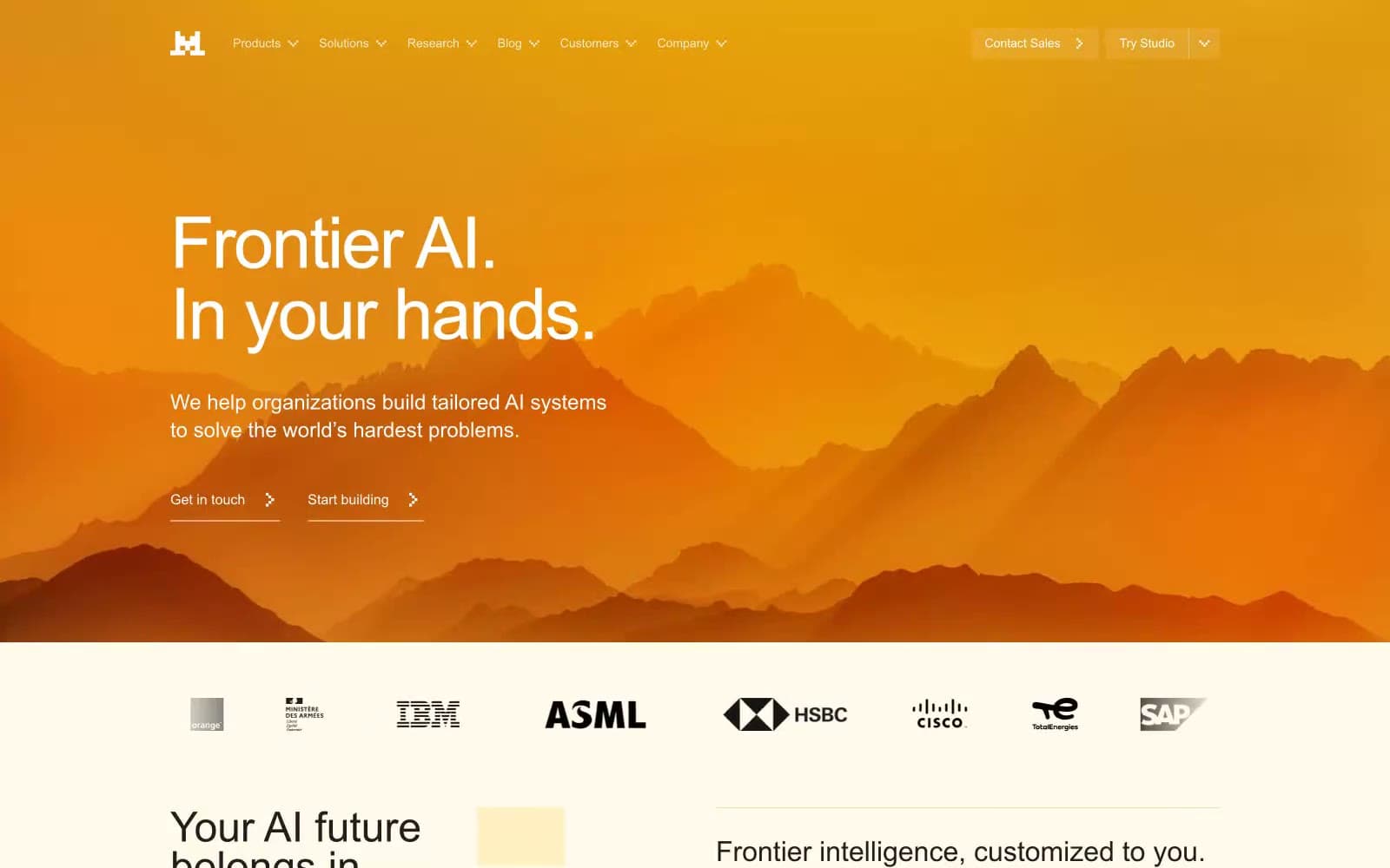
Mistral's visual system reads as a sunlit workshop on warm paper — a cream-ivory canvas (#fffaeb) that feels like aged parchment, generously padded with a single vivid orange (#fa520f) doing all the chromatic talking. The hero erupts into a dramatic amber landscape gradient with mountain silhouettes, then everything afterward returns to that quiet, warm, almost tactile quietness. Typography stays in a clean system sans (Arial) with tight -0.025em tracking that tightens the lines into one confident whisper. The system has an unusual visual signature: warm-toned shadows tinted in olive-gold rather than cool gray, giving every elevated element a 'lit from within by firelight' quality. Density is comfortable and confident, not dense — breathing room is part of the brand. The product mockups in the body break into dark UI panels floating on the cream, creating contrast between the paper-warm site shell and the structured dark application surfaces.
Mistral design system

Brand1
Brand accent — decorative arrow icons, the flag mark, section punctuation, active indicators; vivid orange against warm cream creates urgency without aggression and is the only chromatic voice in the interface
Accent2
Yellow supporting accent for decorative details and low-frequency emphasis. Do not promote it to the primary CTA color
Warm hairlines, decorative block borders, subtle dividers that need to be visible against the cream canvas without breaking the warm palette
Neutrals5
Dark supporting neutral for text, icons, and strong contrast. Do not promote it to the primary CTA color
Primary body text, headings, nav links, button text — near-black rather than pure black keeps text from feeling harsh against the warm canvas
Secondary text, button hover borders, muted supporting copy
Page background, hero body, section fills — warm cream-ivory that replaces the typical white SaaS canvas and gives the system its sunlit, paper-like quality
Card surfaces, elevated panels, feature blocks, and product mockup shells — pure white that reads brighter than the canvas and creates a subtle paper-on-paper layering
Try a pairing
Pick any two colors from the palette to check whether text stays readable on top.
Aa
Carbon on Ember
6.28 : 1 contrast
- Body textPasses AA 4.5
- Large textPasses AA 3
- StrictFails AAA 7























