
Mike Matas. Ink on fresh snow.
- Studio
- Light theme
- 2 colors
- 1 typeface
Mike Matas's site is a typographic portrait gallery: an almost-empty white canvas where a single thin-weight display headline, a tiny right-aligned link list, and photographic device mockups carry the entire visual load. The system refuses decoration — no brand color, no shadows, no gradients, no borders, no radii — letting Lab Grotesque's geometry and the negative space between elements create all the rhythm. Density is paradoxically spacious: huge horizontal margins (135px) push content into a narrow corridor while element-level gaps stay tight (9px), producing a layout that breathes vertically and focuses horizontally. The only visual material outside type and whitespace is photography of products inside MacBook and iPhone bezels, which becomes the only chromatic content on the page.
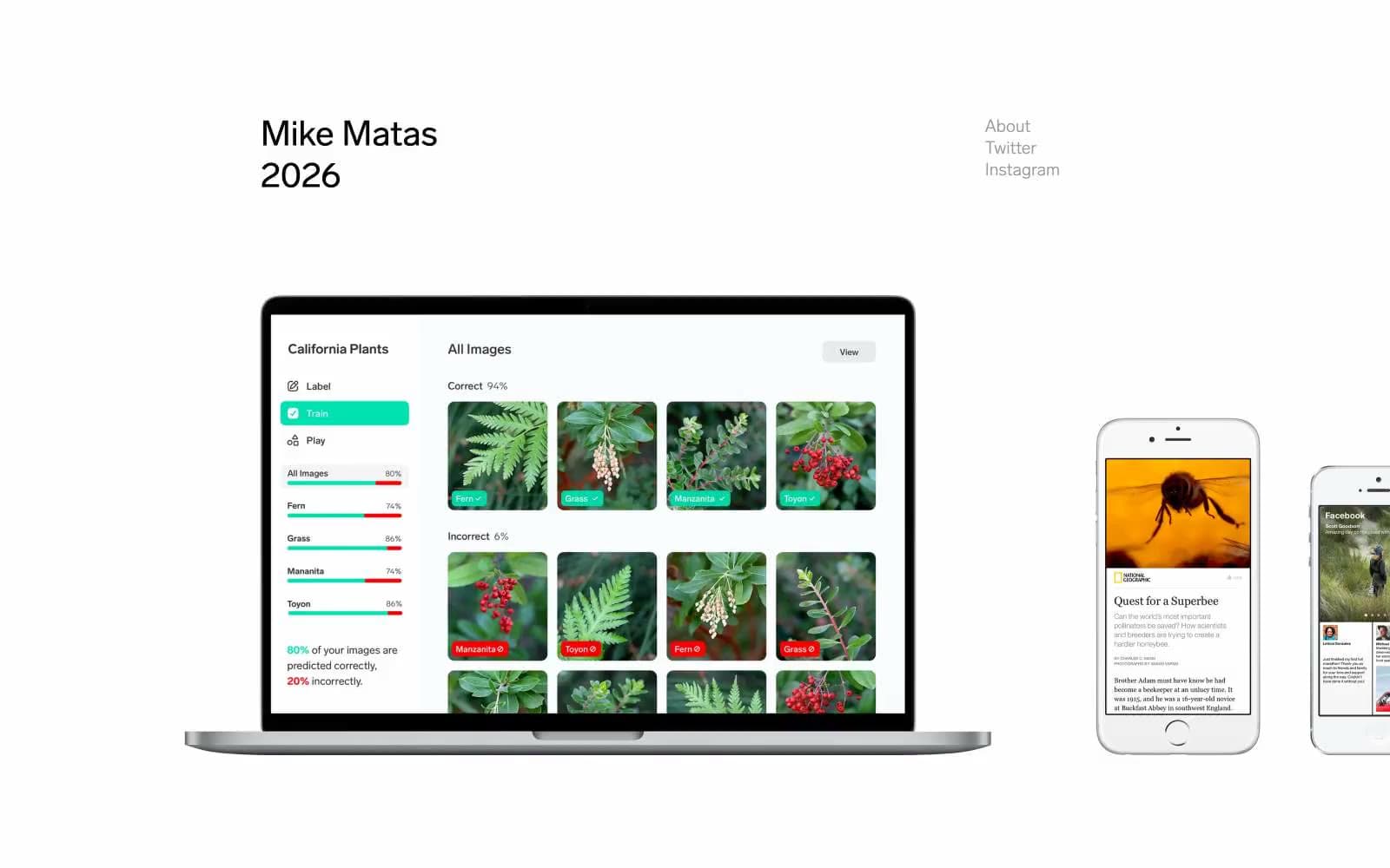
Mike Matas design system

Neutrals2
All text — display headlines, body copy, navigation links, and icon strokes
Secondary and supporting text — link hover or muted labels where visual weight must recede
Try a pairing
Pick any two colors from the palette to check whether text stays readable on top.
Aa
Ash Gray on Ink Black
7.37 : 1 contrast
- Body textPasses AA 4.5
- Large textPasses AA 3
- StrictPasses AAA 7
More DESIGN.md files. Same web, different personalities.

Rauno Freiberg
Studio
Emil Kowalski
Studio

14islands
Studio
19–86
Studio
Aaron Poe & Co
Studio
Acceptandproceed
Studio
ACCOMPANY
Studio
Acolorbright
Studio
Adcker
Studio
Adopt
Studio
Agence Foudre
Studio


