
Marylou Faure. White gallery wall for fearless color.
- Studio
- Light theme
- 10 colors
- 2 typefaces
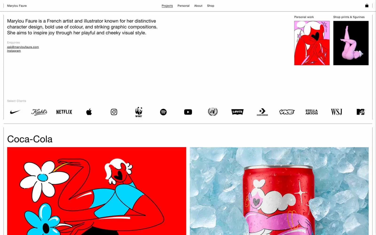
Marylou Faure is a gallery wall, not a website. The interface strips itself to a bare white canvas with hairline borders and near-microscopic UI chrome, so the illustrations — vivid reds, bubblegum pinks, electric blues, acid greens — can detonate against it. Typography is a quiet geometric sans (Helvetica Now) that never competes with the artwork; body text lives at 12-16px in near-black, nav links sit in a thin uppercase row, and the only typographic shout is the project title. The system follows one rule: the UI must be the quietest element on every page, so the art is the only thing with a voice.
Marylou Faure design system

Brand1
Red wash for highlight backgrounds, decorative bands, and soft emphasis behind content. Do not promote it to the primary CTA color
Accent6
Illustration surface — flat shapes and product packaging accents
Illustration surface — character skin, hair, soft fills
Illustration surface and link hover highlight — bright magenta accent within artwork
Illustration surface — ice, sky, cooling tones in product photography context
Illustration surface — soft blue fills, atmospheric tones
Illustration accent — rare punctuation green in character and product art
Neutrals3
All text, hairline borders, nav dividers, the structural skeleton of the page
Email link, secondary metadata text
Page background, card surfaces — the unbroken gallery wall
Try a pairing
Pick any two colors from the palette to check whether text stays readable on top.
Aa
Ink on Crimson Pop
5.25 : 1 contrast
- Body textPasses AA 4.5
- Large textPasses AA 3
- StrictFails AAA 7
More DESIGN.md files. Same web, different personalities.

Rauno Freiberg
Studio
Emil Kowalski
Studio

14islands
Studio
19–86
Studio
Aaron Poe & Co
Studio
Acceptandproceed
Studio
ACCOMPANY
Studio
Acolorbright
Studio
Adcker
Studio
Adopt
Studio
Agence Foudre
Studio


