
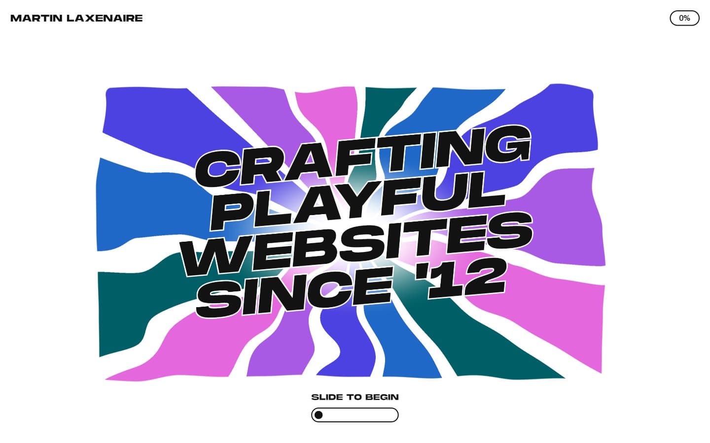
Martin Laxenaire. Kinetic poster crashing through liquid color waves.
- Studio
- Light theme
- 3 colors
- 3 typefaces
Martin Laxenaire's site operates as a kinetic poster on a white gallery wall: a near-monochrome interface where one massive black display typeface (MonumentExtended UltraBold) at sizes up to 419px does all the shouting, surrounded by generous negative space. The rest of the typography collapses into a tiny, tight utility voice (Swiss 16–21px) for links, buttons, and body — the hierarchy is binary, either whisper or roar. A single soft pink (#f9d9f7) provides the canvas for an abstract, organic wave-field of fluid color shapes that the headline text crashes through, creating the site's signature collision of brutalist black letterpress against liquid color. Components are minimal — pill-shaped controls, hairline borders, and almost no surface differentiation. The system feels like a print designer's portfolio disguised as a web dev portfolio: editorial in restraint, explosive in the focal pieces.
Martin Laxenaire design system

Accent1
Hero art backdrop, accent surface — the soft pink that hosts the fluid color-shape composition
Neutrals2
Primary text, all borders, icon strokes, the dominant UI color — every word and divider is this near-black
Page canvas, surface background, button fills for outlined ghost controls
Try a pairing
Pick any two colors from the palette to check whether text stays readable on top.
Aa
Ink Black on Blush Wash
14.54 : 1 contrast
- Body textPasses AA 4.5
- Large textPasses AA 3
- StrictPasses AAA 7
More DESIGN.md files. Same web, different personalities.

Rauno Freiberg
Studio
Emil Kowalski
Studio

14islands
Studio
19–86
Studio
Aaron Poe & Co
Studio
Acceptandproceed
Studio
ACCOMPANY
Studio
Acolorbright
Studio
Adcker
Studio
Adopt
Studio
Agence Foudre
Studio


