
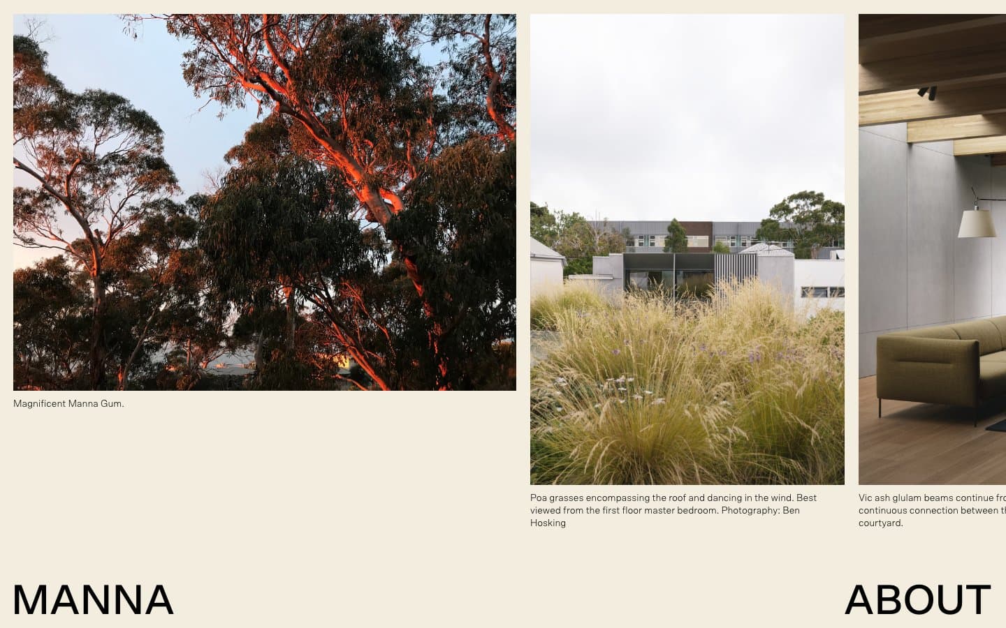
MANNA. Warm bone pages, rust accent panels, and oversized grotesk display type floating over full-bleed photography.
- Studio
- Light theme
- 3 colors
- 2 typefaces
MANNA operates as an architecture monograph laid flat on the screen: expansive photography commands the canvas, typography arrives in two scales (whisper and shout), and the page alternates between warm bone and terracotta rust like rooms in a sunlit house. There is almost no UI chrome — no buttons, no cards, no rounded containers — instead images sit edge-to-edge framed by hairline black rules, and captions float in the gutter beneath. The palette is brutally disciplined: a single chromatic accent (rust orange) used only for full-bleed section panels, everything else is bone white, black ink, and photography. Type is editorial: a geometric grotesk at weight 300 or 500 for monumental display words, a humanist sans for image captions and quiet running text. The result feels less like a website and more like the opening spread of an architecture book.
MANNA design system

Brand1
Full-bleed section panels, footer band — terracotta accent that anchors the page in earthy materiality
Neutrals2
All text, image borders, hairline rules — pure black for maximum contrast against bone
Primary canvas, page background, footer surface — warm off-white that reads as paper, not screen
Try a pairing
Pick any two colors from the palette to check whether text stays readable on top.
Aa
Ink on Rust
4.73 : 1 contrast
- Body textPasses AA 4.5
- Large textPasses AA 3
- StrictFails AAA 7
More DESIGN.md files. Same web, different personalities.

Rauno Freiberg
Studio
Emil Kowalski
Studio

14islands
Studio
19–86
Studio
Aaron Poe & Co
Studio
Acceptandproceed
Studio
ACCOMPANY
Studio
Acolorbright
Studio
Adcker
Studio
Adopt
Studio
Agence Foudre
Studio


