
Magnetism. White linen gallery wall.
- Studio
- Light theme
- 7 colors
- 2 typefaces
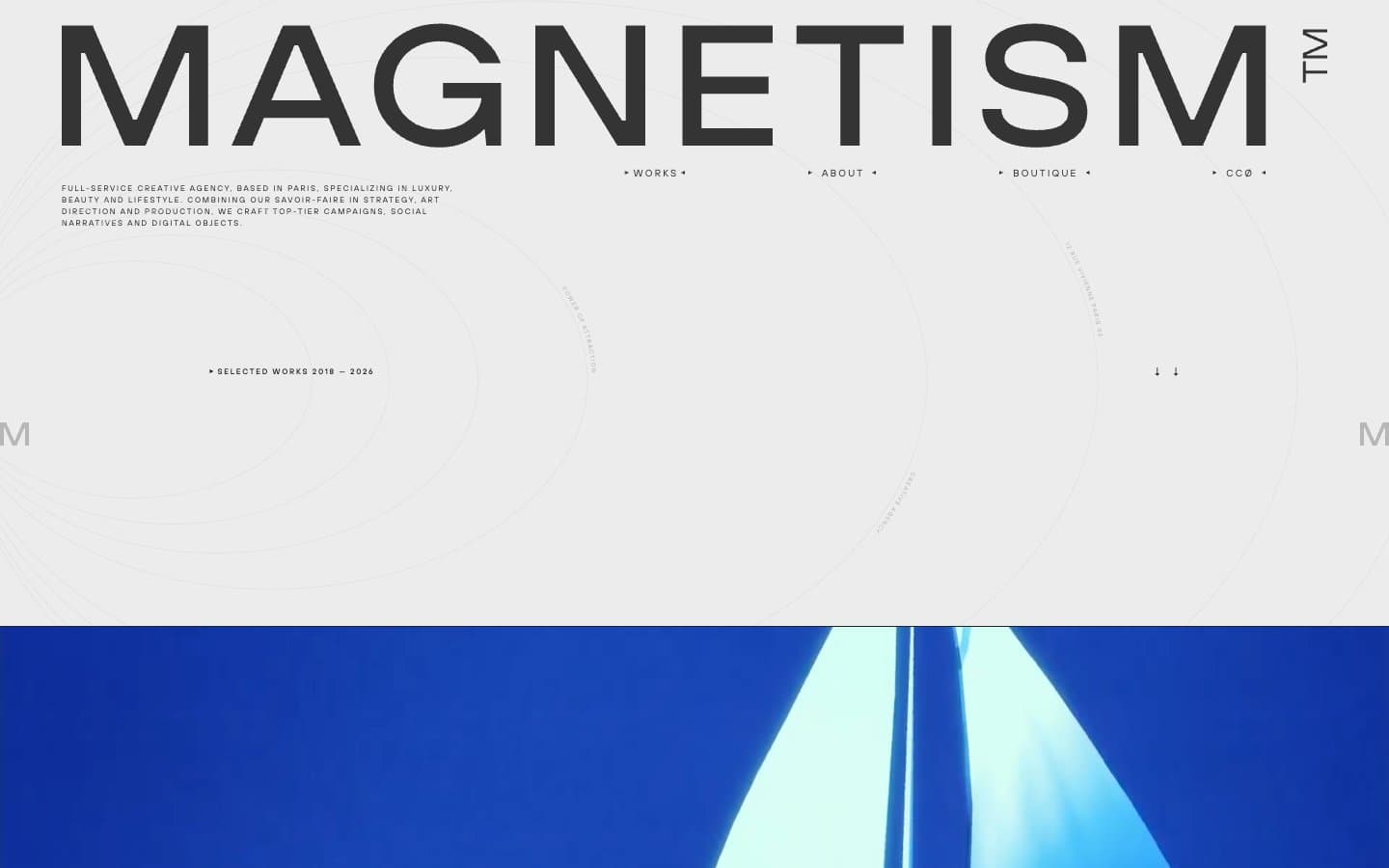
Magnetism operates as a luxury editorial canvas where the wordmark itself is the architecture. The site is almost entirely achromatic — one warm off-white surface, one near-black ink, a single mid-gray for secondary text — with all chromatic content arriving through full-bleed campaign photography. The signature is an enormous weight-300 wordmark stretched edge-to-edge at the top of every page, paired with a bullet-separated navigation that floats in extremely wide tracking. The mood is gallery-quiet: tiny tracked-out labels, hairline rules, subtle circular field-line graphics, and a repeating 'M' watermark on the left margin. Nothing competes with the photographs. The interface is a frame, not a surface.
Magnetism design system

Neutrals7
SVG illustration fills, maximum-contrast moments — used sparingly where the ink needs to be absolute
Primary text, wordmark fill, body copy — near-black with a touch of warmth, softer than pure black
Navigation text, secondary headings, muted body — the darker of the two navigation grays
Tertiary text, inactive nav items, page number indicator — sits behind primary content
Hairline dividers, section separators, subtle card backgrounds — the structural border color
Decorative stroke work, SVG compass/field-line graphics, ultra-faint border accents
Page canvas, card surfaces, border-on-hover washes — the warm off-white ground that the entire site sits on
Try a pairing
Pick any two colors from the palette to check whether text stays readable on top.
Aa
Bone White on Pure Black
16.96 : 1 contrast
- Body textPasses AA 4.5
- Large textPasses AA 3
- StrictPasses AAA 7
More DESIGN.md files. Same web, different personalities.

Rauno Freiberg
Studio
Emil Kowalski
Studio

14islands
Studio
19–86
Studio
Aaron Poe & Co
Studio
Acceptandproceed
Studio
ACCOMPANY
Studio
Acolorbright
Studio
Adcker
Studio
Adopt
Studio
Agence Foudre
Studio


