
Mage. Data alchemy on parchment.
- AI
- Light theme
- 19 colors
- 3 typefaces
Mage operates on a warm parchment canvas (#f7f7f1) that gives the data-platform brand an editorial, almost lab-notebook warmth rather than the cold gray most SaaS tools default to. The interface is deliberately quiet: soft cards on a warm white field, generous breathing room, and a single vivid electric-cobalt accent (#244cff) that acts as a switch — it appears only on primary actions, nowhere else. Typography is Inter-only, used at restrained weights (400 dominates even at display sizes), which makes the large headlines feel declarative rather than shouting. Product surfaces (the pipeline editor) are dark-mode islands embedded inside the light page, creating a clear visual contract: marketing context is warm-paper light, working context is deep-graphite dark. Decorative violet (#c3aeff) threads through the brand illustration as a secondary color note, never as UI chrome.
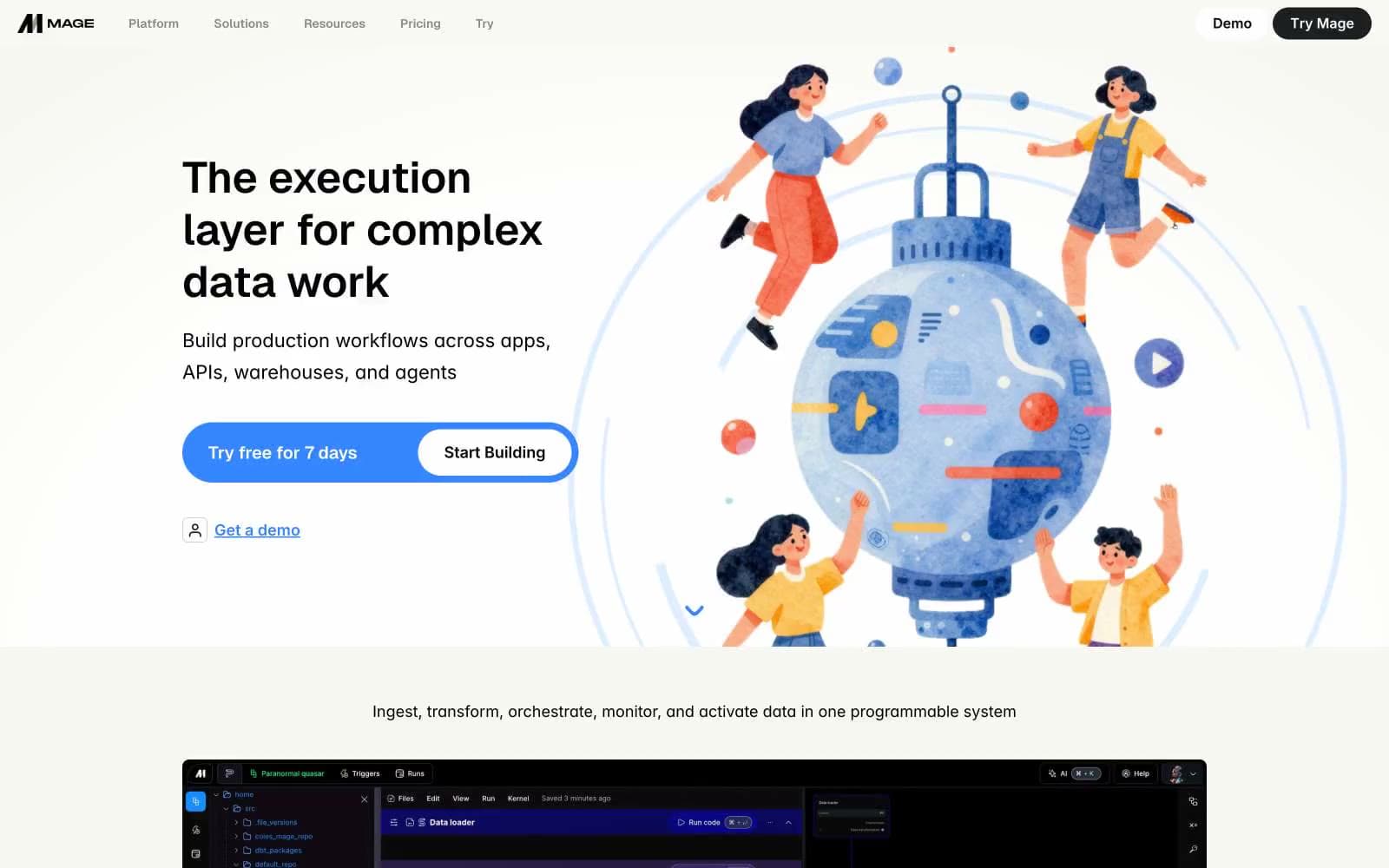
Mage design system

Brand1
Primary action fill — CTA buttons, active nav state, the single switched-on color in an otherwise muted system
Accent10
Brand illustration accent — decorative fills in the hero artwork and supporting graphics, echoes the cobalt at lower saturation
Decorative card wash — pale blue background for illustration overlays and feature card accents
Decorative card wash — warm yellow tint for illustration card backgrounds and feature highlights
Decorative card wash — soft pink for illustration card backgrounds
Decorative card wash — warm cream-yellow for illustration card backgrounds
Illustration accent — mid-blue used in hero artwork and data visualization elements
Illustration accent — muted blue for decorative borders and secondary graphic elements
Illustration accent — warm dark-yellow for decorative graphic elements
Illustration accent — vivid lavender for hero artwork highlights
Illustration accent — darker blue for hero artwork depth and contrast
Neutrals8
Primary text, hairline borders, high-contrast edges
High-contrast neutral action fill for primary buttons on light surfaces.
Secondary text, body copy on light surfaces — softer than pure black for reading comfort
Muted text — captions, helper text, secondary metadata
Borders, dividers, disabled state outlines, muted link text
Tinted card surface — subtle blue-white variant for differentiated cards (logo bar, feature callouts)
Page canvas — warm off-white background that gives the whole site its editorial, paper-like quality
Card surfaces, text on dark backgrounds, product thumbnail containers
Try a pairing
Pick any two colors from the palette to check whether text stays readable on top.
Aa
Snow on Electric Cobalt
5.91 : 1 contrast
- Body textPasses AA 4.5
- Large textPasses AA 3
- StrictFails AAA 7























