
Luffu. Editorial restraint meets intimate warmth, executed in two weights of a single serif-adjacent type system on a near-parchment ground.
- AI
- Light theme
- 9 colors
- 2 typefaces
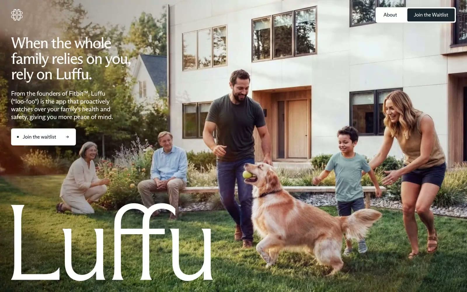
Luffu feels like late afternoon sun through a kitchen window — warm, unhurried, intimate. The cream-tan background (#f5f5ee) and near-black text (#2f3136) create a paper-and-ink warmth far from the cold blues of health tech. Two custom ABC Arizona typefaces do the heavy lifting: Flare at massive display sizes with -0.05em letter-spacing renders the brand name as a piece of editorial typography, while Sans handles navigation and body with similar optical tightening. The hero is full-bleed lifestyle photography — a real family, natural light, golden retriever — with oversized logotype overlaid at near-opacity, bleeding into the image. Color restriction is extreme: no accent color anywhere, just dark ink, warm cream, and white, with a single dark-teal (#192830) reserved for the primary CTA button.
Luffu design system

Brand1
Primary CTA button fill, nav border, interactive controls — this single dark-teal anchor is the only departure from the black/cream palette, creating a subtle aquatic undertone that reads health-adjacent without being clinical
Neutrals8
Maximum contrast text, SVG fills
Body text, headings, primary readable content
Tertiary text, footer links, subdued labels
Secondary body text, captions, supporting copy
Tertiary surface, card backgrounds in feature sections
Subtle section dividers, secondary surface tinting
Page background, section fills — the slight warm-green cast separates this from pure white and prevents sterility
Button text on dark fills, icon fills, overlay text on photography
Try a pairing
Pick any two colors from the palette to check whether text stays readable on top.
Aa
White on Deep Ink
15.13 : 1 contrast
- Body textPasses AA 4.5
- Large textPasses AA 3
- StrictPasses AAA 7























