
Lovi. Prescription violet on porcelain.
- AI
- Light theme
- 15 colors
- 5 typefaces
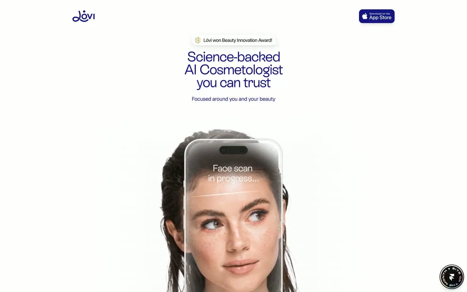
Lóvi operates as a prescription-grade beauty interface: deep indigo ink on near-white porcelain, with a single saturated violet as the brand voice. The visual system is deliberately clinical-minimal — almost all surfaces are paper-white or bone, borders are hairline or non-existent, and the only significant shadow is a single low-opacity elevation wash. Typography is split between a custom geometric display face (ES Rebond Grotesque) for headlines and a neutral sans (Inter) for body, creating a clear hierarchy without color shouting. The rich chromatic spectrum detected in raw data (pinks, greens, oranges) is almost entirely decorative or illustrative — design-system tokens are austere: one brand violet, a muted lavender for secondary text, and a handful of semantic accents. Every screen should feel like a clinical leaflet: calm, confident, printed rather than rendered.
Lovi design system

Brand3
Primary headlines, body emphasis, and brand voice — this is the only color that carries the brand identity. All top-level headings and primary body text are set in this violet rather than black, giving every screen a tinted authority without ever feeling decorative
Violet supporting accent for decorative details and low-frequency emphasis. Do not promote it to the primary CTA color; Voice-bar and scan-overlay gradient sweeping Electric Violet → Lilac → Petal Blush — the signature visual of the AI interaction moment
Secondary body text, muted links, and sub-labels — sits one step down from Indigo Ink on the same hue, creating a tonal ladder without introducing a different color family
Accent5
Decorative and illustrative accent — used in iconography, gradient midpoints, and the scan/voice visual treatment rather than for UI controls
Decorative accent in illustrations and the brand gradient — supports the scan/face-overlay visual treatment, not part of the UI palette
Green supporting accent for decorative details and low-frequency emphasis. Use as a supporting accent, not as a status color
Red supporting accent for decorative details and low-frequency emphasis. Use as a supporting accent, not as a status color
Blue supporting accent for decorative details and low-frequency emphasis. Use as a supporting accent, not as a status color
Neutrals7
Dark mode text and icon fills — near-black with a faint warm cast, used when maximum contrast is needed against light surfaces
Secondary metadata, timestamps, and de-emphasized body text — sits between Graphite and Pebble in the neutral scale
Inactive controls, placeholder fills, and tertiary borders — warm gray that recedes
Hairline borders, divider lines, and the ambient shadow tint source — the only structural gray in the system
Warm surface for review cards and section blocks that need tonal separation from the cool Porcelain canvas
Dominant page canvas — every section breathes on this near-white, slightly cool surface
Card surfaces, phone mockup screen, and elevated content blocks — sits one step above Porcelain for subtle layering
Try a pairing
Pick any two colors from the palette to check whether text stays readable on top.
Aa
Paper White on Indigo Ink
14.42 : 1 contrast
- Body textPasses AA 4.5
- Large textPasses AA 3
- StrictPasses AAA 7























