
Look inc. White-walled gallery on a press proof.
- Studio
- Light theme
- 4 colors
- 3 typefaces
Look inc operates as a monochrome editorial gallery — the absence of color is the brand. The interface is a white canvas where serif headlines (Old Standard) and geometric sans (GT America) frame full-bleed project photography, letting the work itself supply all visual interest. Typography is the entire decorative system: a classical serif headline next to a modern grotesque body creates editorial tension that mirrors the agency's positioning as 'a non-traditional agency with roots in journalism.' Components are austere — no cards with shadows, no rounded containers, no accent buttons — just image tiles sitting directly on white with a small caption stack beneath. The grid is the design: equal-weight rectangular tiles arranged in rows, each tile a self-contained editorial spread.
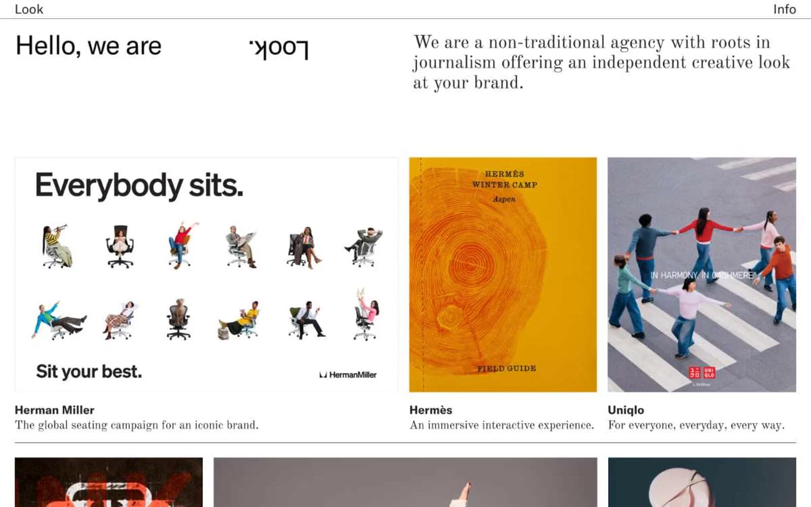
Look inc design system

Neutrals4
Headlines, body text, navigation links, hairline dividers — the single dark mark in the system
Muted captions, secondary metadata, editorial sub-labels — appears sparingly under project titles
Hairline nav dividers, ultra-subtle structural separators — the faintest non-black non-white mark allowed
Page canvas, tile backgrounds, the only surface tone in the system
Try a pairing
Pick any two colors from the palette to check whether text stays readable on top.
Aa
Proof White on Press Black
21.00 : 1 contrast
- Body textPasses AA 4.5
- Large textPasses AA 3
- StrictPasses AAA 7
More DESIGN.md files. Same web, different personalities.

Rauno Freiberg
Studio
Emil Kowalski
Studio

14islands
Studio
19–86
Studio
Aaron Poe & Co
Studio
Acceptandproceed
Studio
ACCOMPANY
Studio
Acolorbright
Studio
Adcker
Studio
Adopt
Studio
Agence Foudre
Studio


