
Locomotive. Monochrome zine between blood-red slides.
- Studio
- Light theme
- 2 colors
- 2 typefaces
Locomotive operates a strict two-color monochrome system — black ink on white paper, nothing else. The visual language is editorial and gallery-like: massive display type at 110px sets a museum-catalogue tone, while a single weight 400 across all text avoids the visual noise of bold or light variants, letting scale alone carry hierarchy. Full-bleed dramatic photography supplies all color and atmosphere; the interface itself never does. Generous vertical breathing room (150px section padding) and hairline horizontal dividers create a Swiss-style zine rhythm. The result feels like flipping through a high-end art monograph where typography is the architecture and images are the exhibits.
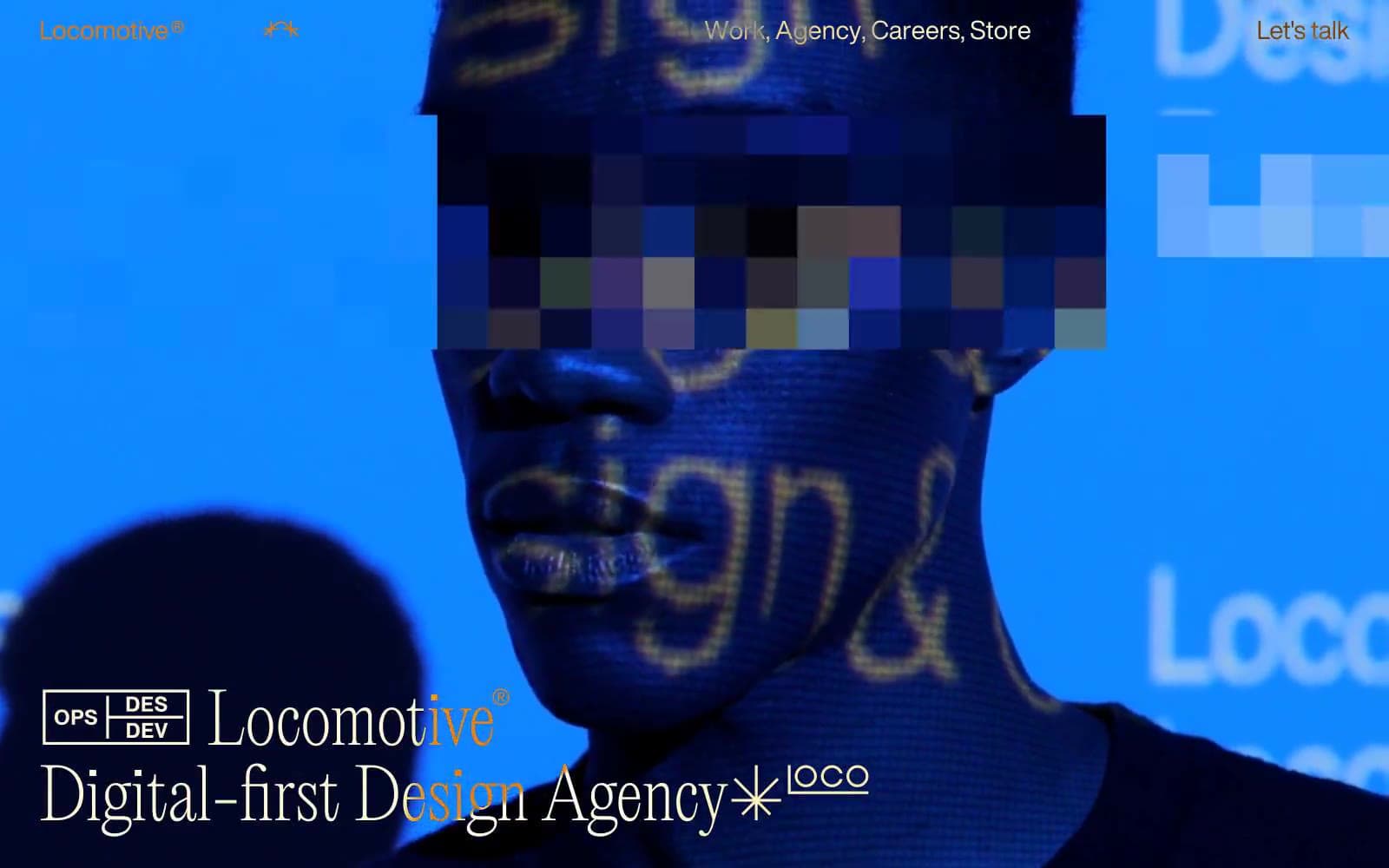
Locomotive design system

Neutrals2
Body text, headings, footer text, inverted section backgrounds, cards, borders, nav — the universal structural color
Page canvas, card surfaces on dark sections, text on inverted black backgrounds
Try a pairing
Pick any two colors from the palette to check whether text stays readable on top.
Aa
Paper on Ink
21.00 : 1 contrast
- Body textPasses AA 4.5
- Large textPasses AA 3
- StrictPasses AAA 7
More DESIGN.md files. Same web, different personalities.

Rauno Freiberg
Studio
Emil Kowalski
Studio

14islands
Studio
19–86
Studio
Aaron Poe & Co
Studio
Acceptandproceed
Studio
ACCOMPANY
Studio
Acolorbright
Studio
Adcker
Studio
Adopt
Studio
Agence Foudre
Studio


