Liron Moran Interiors. Fashion editorial on dark linen.
- Studio
- Light theme
- 7 colors
- 5 typefaces
Liron Moran Interiors operates as an editorial gallery portal: a near-colorless canvas of warm off-whites and charcoal olives, punctuated by oversized serifs that consume the viewport and physically intersect photography. The interface recedes — hairline borders, ghost controls, zero elevation — while the typography carries every ounce of visual weight, with letterforms at 185–260px acting as both heading and compositional frame. Sections alternate between light linen surfaces and deep charcoal bands, but the overall rhythm stays sparse and curatorial, with generous edge padding (130–173px) and vast vertical breathing room. Color is deliberately absent; every hue in the system is a desaturated neutral, so contrast and scale do all the expressive work.
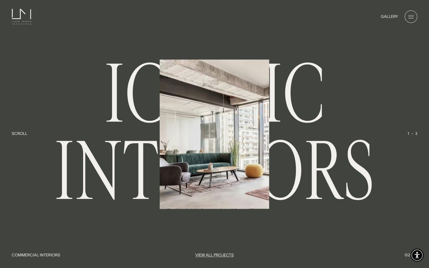
Liron Moran Interiors design system
Neutrals7
Icon strokes, strong borders, body text emphasis — the sharpest neutral in the system
Deepest dark for filled button backgrounds, high-contrast overlays
Hero section backgrounds, dark band surfaces — the deep warm-charcoal that grounds the editorial typography
Mid-tone neutral for secondary text and muted UI elements
Muted background washes, secondary card surfaces, subdued borders
Hairline borders, divider lines, light text on dark sections, icon strokes — the most-used neutral, threading structure through every screen
Primary page canvas, card surfaces, heading fills — the warm off-white that gives the site its gallery-walls aesthetic
Try a pairing
Pick any two colors from the palette to check whether text stays readable on top.
Aa
Warm Linen on Pure Black
18.46 : 1 contrast
- Body textPasses AA 4.5
- Large textPasses AA 3
- StrictPasses AAA 7
More DESIGN.md files. Same web, different personalities.

Rauno Freiberg
Studio
Emil Kowalski
Studio

14islands
Studio
19–86
Studio
Aaron Poe & Co
Studio
Acceptandproceed
Studio
ACCOMPANY
Studio
Acolorbright
Studio
Adcker
Studio
Adopt
Studio
Agence Foudre
Studio


