
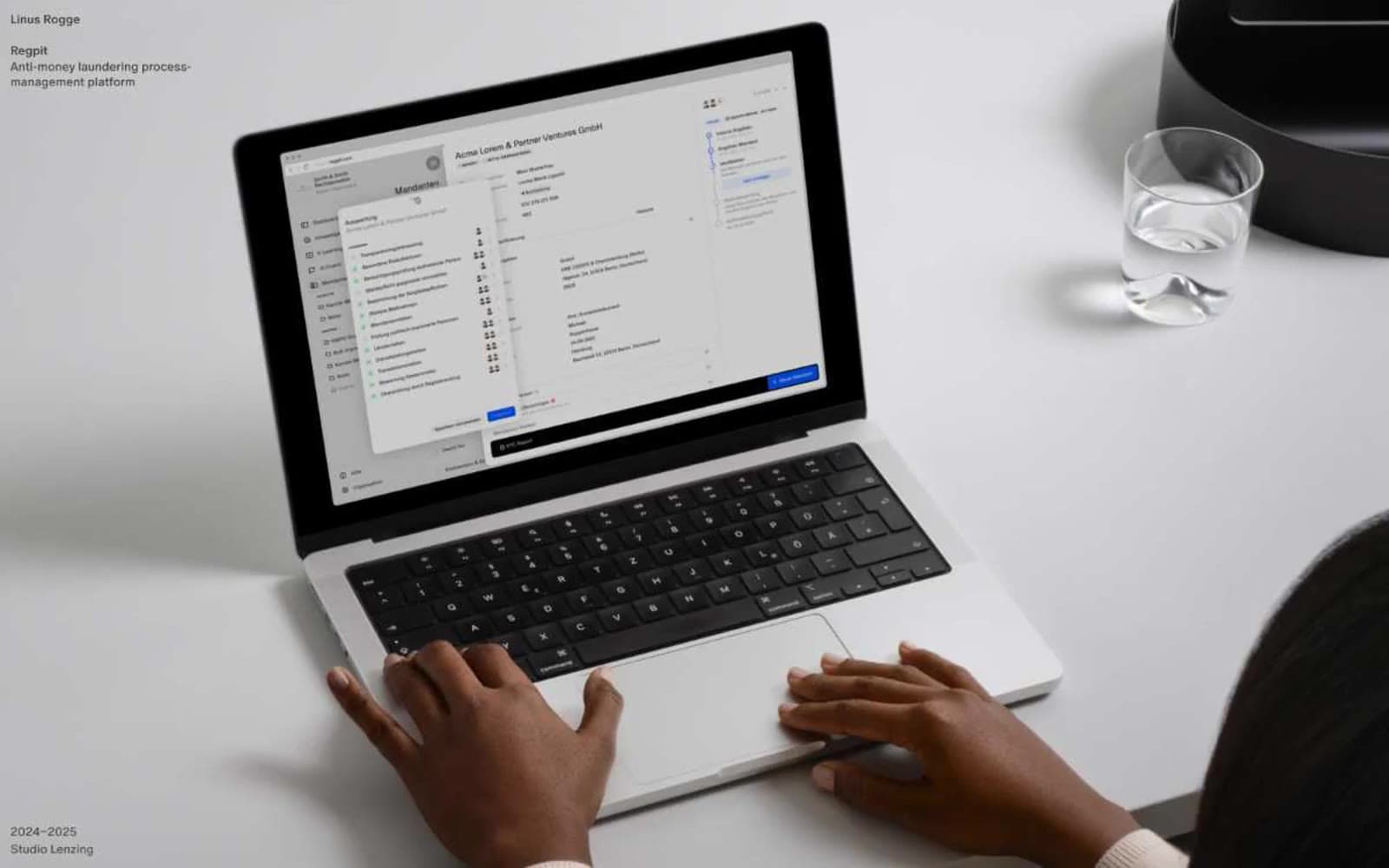
Linus Rogge. Each project a wall-sized photograph with whisper-quiet captions in the corner.
- Studio
- Light theme
- 9 colors
- 1 typeface
Linus Rogge is a personal portfolio built on radical typographic restraint: a single 14px type size across all text, only two colors (pure black and pure white), and gallery-scale photography as the only visual voice. Hierarchy is created through weight (400 vs 500) and generous negative space, not through size escalation. Each project is presented as a sparse left-aligned label paired with a full-bleed photograph, reading like museum wall text beside a large print. Components are nearly invisible — no shadows, no rounded corners on the canvas, no decorative color — letting the work itself carry the page.
Linus Rogge design system

Neutrals9
Dark supporting neutral for text, icons, and strong contrast. Do not promote it to the primary CTA color
Dark section background for content blocks (writing index, project list) — near-black avoids the harshness of pure #000
Secondary dark surface for stacked dark sections
Strongest muted text before full black, subtle emphasis
Secondary muted text, labels, non-active annotations
Muted helper text, metadata dates, tertiary annotations on white
Tertiary surface, alternating section rhythm dividers
Secondary surface for section bands, footer background washes
Primary canvas, all text on dark surfaces, inverted button text
Try a pairing
Pick any two colors from the palette to check whether text stays readable on top.
Aa
Paper White on Ink Black
21.00 : 1 contrast
- Body textPasses AA 4.5
- Large textPasses AA 3
- StrictPasses AAA 7
More DESIGN.md files. Same web, different personalities.

Rauno Freiberg
Studio
Emil Kowalski
Studio

14islands
Studio
19–86
Studio
Aaron Poe & Co
Studio
Acceptandproceed
Studio
ACCOMPANY
Studio
Acolorbright
Studio
Adcker
Studio
Adopt
Studio
Agence Foudre
Studio


