
Limitless. Monochrome editorial on plaster white.
- AI
- Light theme
- 11 colors
- 1 typeface
Limitless reads as a restrained editorial spread — white paper, a single neutral typeface doing all the talking, and almost no color anywhere. The interface depends on weight contrast inside one font family (Greycliff at 300 for display, 500–600 for body and UI) rather than color or ornament to create hierarchy. Surfaces are nearly invisible: the page is #f2f3f5, cards barely register above it at #ffffff or #e5e7eb tints, and the only true color in the system is a single small violet spark in the wordmark. The personality is funeral-formal-meets-product-page — wide left-aligned headlines at 60px, generous 48–80px vertical breathing room, and one subtle 16px corner radius to keep things from feeling boxy.
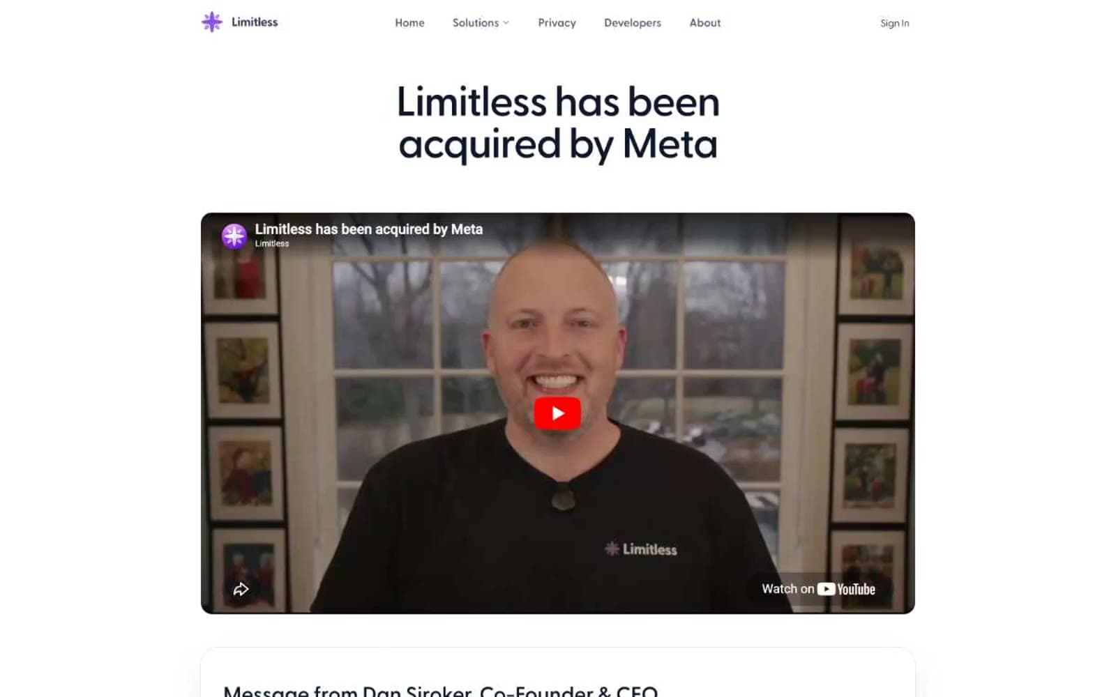
Limitless design system

Brand1
Wordmark icon and the sole chromatic accent in the entire system — used at the smallest possible size to mark the brand without coloring the interface
Neutrals10
Maximum-contrast text where #0f172a still feels too soft (rare)
Primary heading text, high-emphasis body copy, nav logo wordmark
Secondary headings, medium-emphasis text, icon strokes
Body text, nav links, button labels — the everyday workhorse neutral
Muted helper text, secondary links, metadata
Disabled state text, tertiary captions, low-emphasis labels
Stronger dividers, disabled icon strokes, secondary borders
Card surfaces, placeholder image wells, subtle inset zones
Page background, full-bleed canvas
Elevated card surfaces when differentiation from Plaster is needed
Try a pairing
Pick any two colors from the palette to check whether text stays readable on top.
Aa
Chalk on Spark Violet
5.15 : 1 contrast
- Body textPasses AA 4.5
- Large textPasses AA 3
- StrictFails AAA 7























